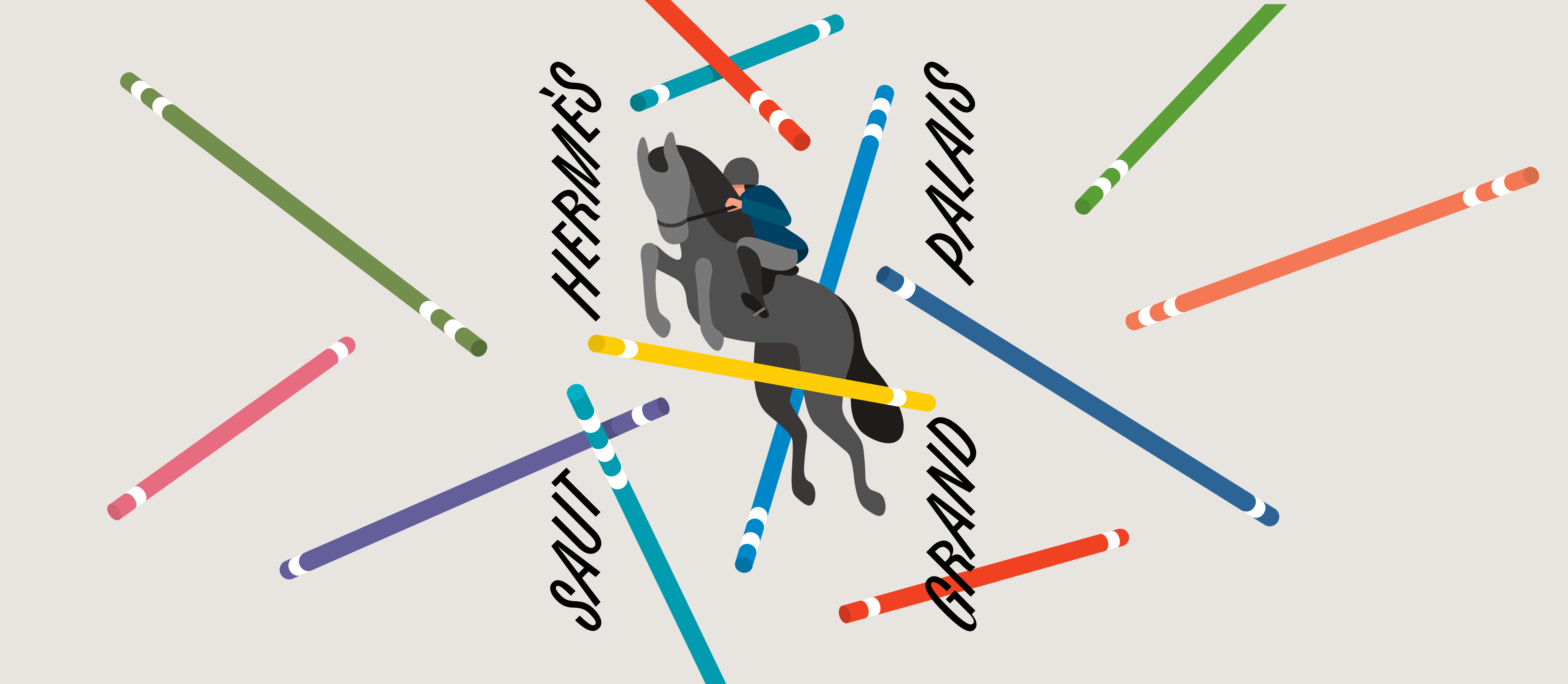
Bourrasque
Bourrasque is a character that “that ruffles the woods, steals from the roofs, lifts up the dresses.”1
- Art Direction:
Yoann Minet
- Typeface design:
Yoann Minet
- Design date:
2014
- Published by:
Bureau Brut
- Initial release:
2018
- Current version:
3.1
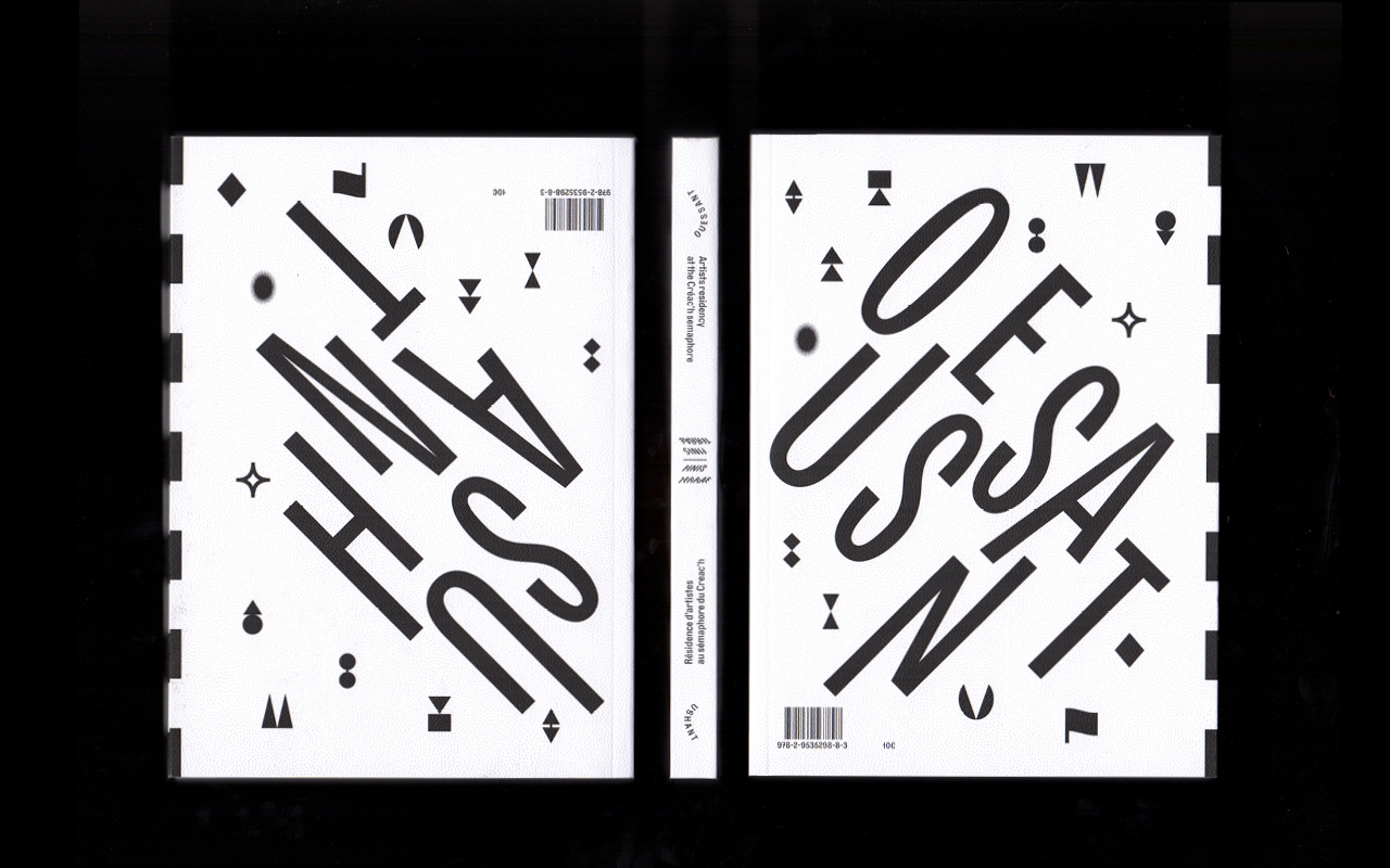
Bourrasque2 comes from a simple design challenge: can we design a 45° slanted typeface? This research follows the italic experimentation made on Ostia Antica, already 35° tilted, when usual italics have a 10° slopes. The graphic answer found was an italic and rotalic in-between shape. An italic, broadly speaking, is a typeface whose glyphs are slanted horizontally. A rotalic is a typeface in which each glyph rotates on its own axis.3
Bourrasque is a combination of these two techniques: except we had to get crafty. The character doesn’t entirely pivot, but each stroke is slanted independently while staying aligned on the baseline4. The name of each style indicates the degree and direction of the tilt, while extending the wind metaphor. You probably understood the origin of the name now: we called it Bourrasque because Mistral was already taken!
- From “Le Vent”(november, 1953), a George Brassens’ song, translated into English. The French version says: “rebrousse les bois, détrousse les toits, retrousse les robes.”
- A “bourrasque” in French is a sudden gust of wind.
- IMAGES
- IMAGES
Family overview
Type tester
OpenType features
Character set
🡢 Share your project