Boogy Brut Wild
- Art Direction:
Julien Priez & Yoann Minet
- Typeface design:
Julien Priez & Yoann Minet
- Design date:
2020
- Published by:
Bureau Brut
- Initial release:
2020
- Current version:
2.1
The Entire Boogy Brut collection lies in one ambition: transforming calligraphic research into a complete typographic system. Boogy Brut Wild is the freest and most expressive version of it.
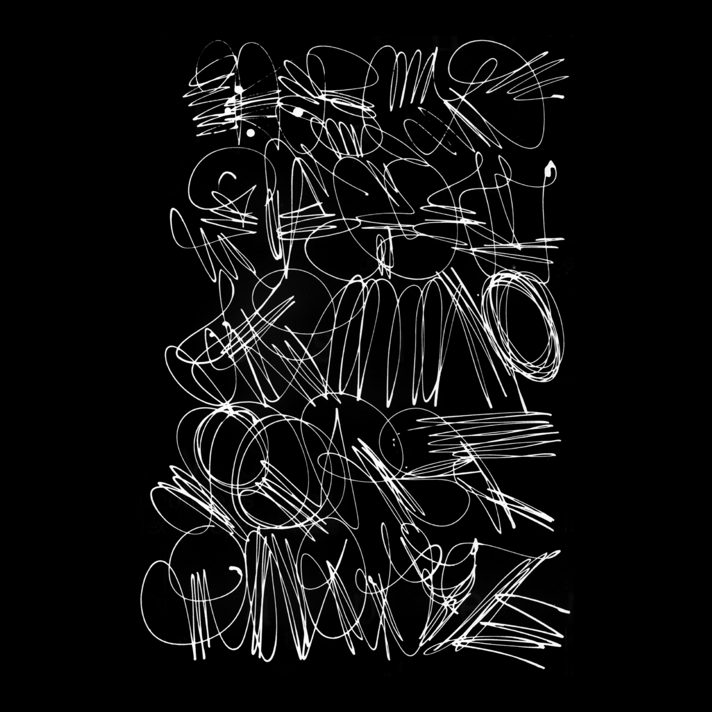
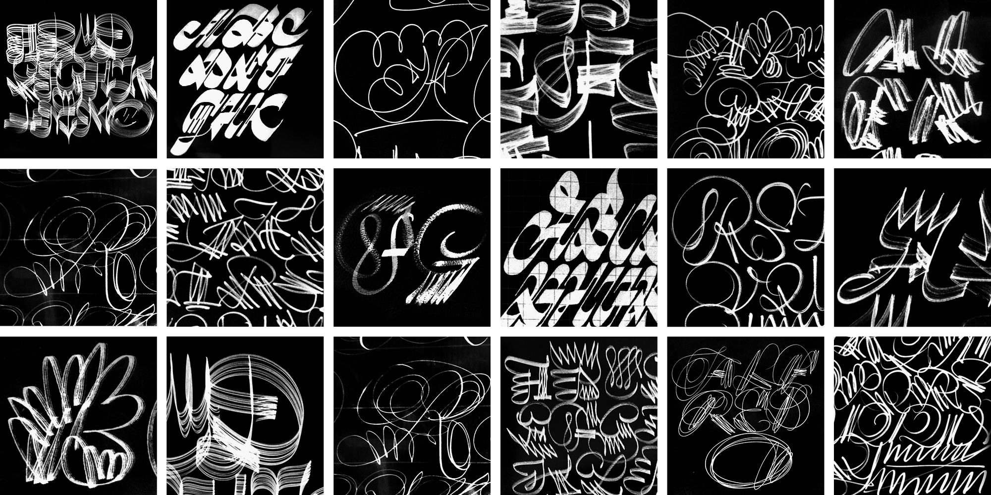
It grew out of Julien Priez’s alphabets, research and experimentation. It doesn’t strive to recreate calligraphy, but rather to translate its movement, rhythm and intensity into a comtempory typographic language.
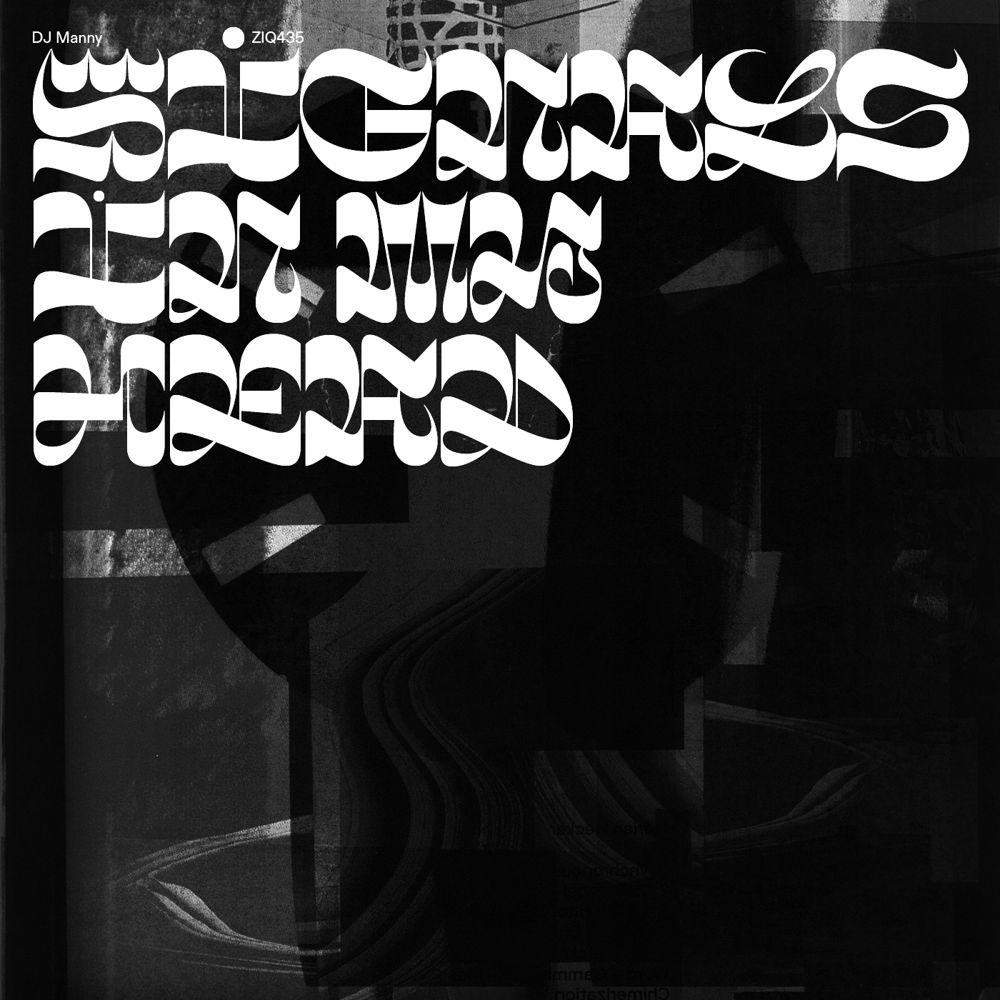
Boogy Brut Wild doesn’t strive to be legible. It is an exploration of what’s beyond typography’s main role: emotion, expressivity and the letter’s visual presence.
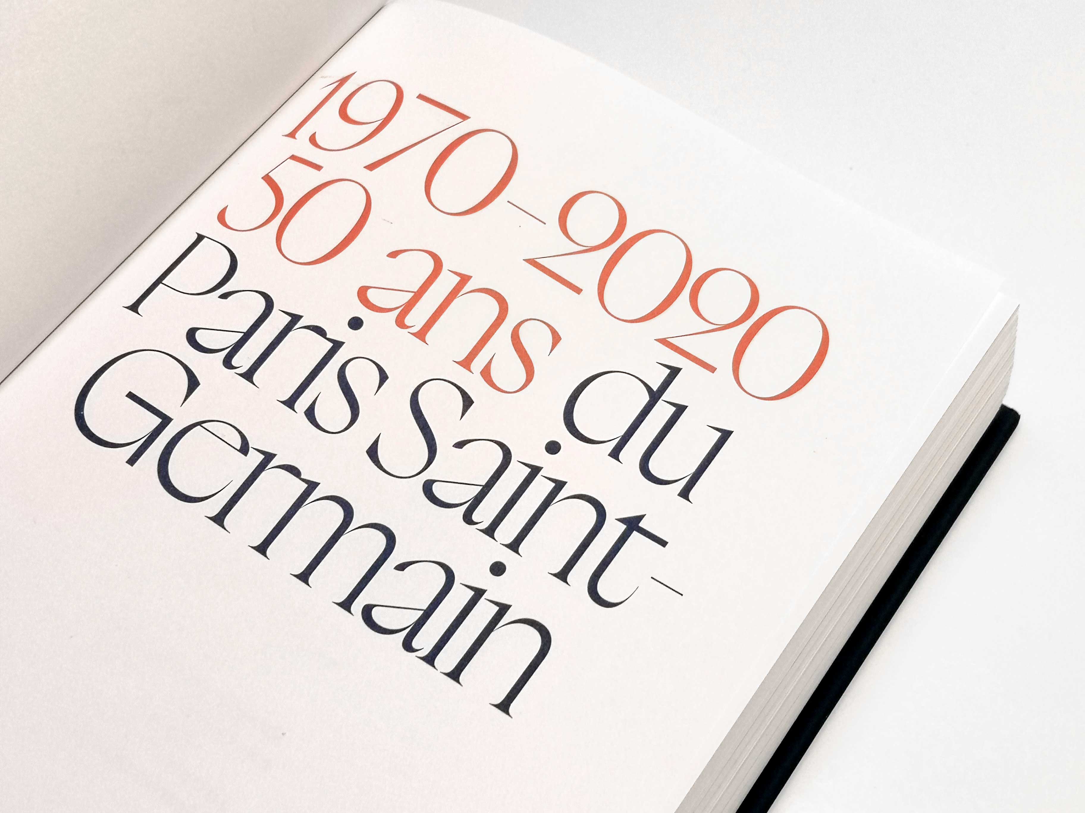
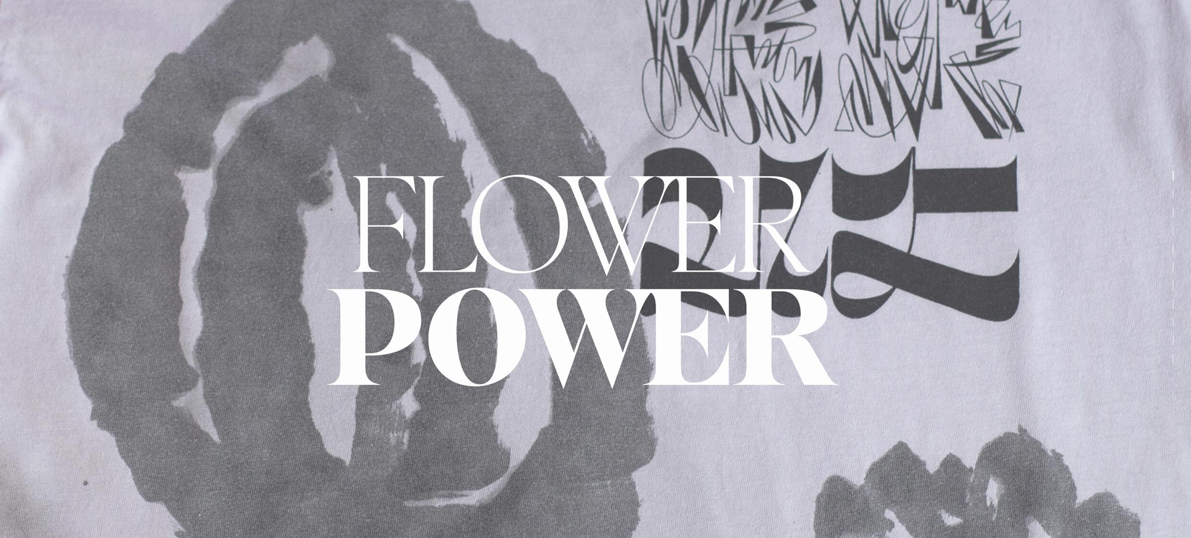
Built like a set of initials, it works complementarily with Boogy Brut Poster. Both families share the same style names (Black and White) in order to make their association and use easier.
Boogy Brut Wild Black navigates density, strength and blackness, like some occidental black letter letterings. These shapes are a particularly rich testing ground. Julien’s research aimed to move away from a stiff-coded environment towards a modern one, by questioning the common aspects between structure, space and rhythm. In his research, he was also inspired by Ikko Tanaka’s work, especially by his posters, in which the relationship between signs, spaces and density reveals his mastery of contrast. The tension between the open and bright forms and the more massive and dense characters led Julien to impose himself a heavy constraint: to keep the letter in a squared, monospaced structure. That rule transformed the black letter heritage into a new graphic system, where each shape must find its own balance between thickness and thinness. A second experiment led his research even further by taking the writing tool into account: what if the angle of the pen or the brush was modified? The contrast inverts, and the black letter construction becomes a space of expressive experimentation.
The White version originated from a different story. It originated in Julien Priez’s “Angry Calligraphies”, initiated in 2014. These experiments came from an enlarged vision of graffiti as a part of hip-hop culture, but also as a historical practice of human freedom, ideas, and emotions. From the walls of Pompeii to the metro’s windows, the buildup of strokes creates a feeling of density and transforms the gesture’s delicacy into a strong visual presence. Boogy Brut Wild White follows this principle by inverting Black’s logic. The buildup of strokes simulates Black’s weight. It doesn’t strive to recreate the manual layout, but to keep its structure while seizing the energy, movement and vibration of the scratches. Both weights are then able to overlap and communicate. This version has also been designed to work with Boogy Brut Poster White. Its layout is not one-lined: it keeps a contrast that answers to the thickness of Boogy Brut Poster White.
Boogy Brut Wild White is not a “graffiti font”: it integrates this graphic heritage into a broader thought of modern letters that stand between calligraphy, typography and visual expression, inside what Steven Heller calls “Type Expressionism”.
Boogy Brut Wild is part of the Boogy Brut Collection
-
- Boogy Brut Light
- Boogy Brut Light Italic
- Boogy Brut Book
- Boogy Brut Book Italic
- Boogy Brut Regular
- Boogy Brut Italic
- Boogy Brut Medium
- Boogy Brut Medium Italic
- Boogy Brut Bold
- Boogy Brut Bold Italic
-
- BBWW
- BBWB
-
- Boogy Brut Poster White
- Boogy Brut Poster White Italic
- Boogy Brut Poster White Wild
- Boogy Brut Poster Black
- Boogy Brut Poster Black Italic
- Boogy Brut Poster Black Wild
Family overview
Type tester
OpenType features
Character set
🡢 Share your project