YET
PERFECTLY
ROUND
Round Condensed
- Art Direction:
Bureau Brut
- Typeface design:
Yoann Minet
- Design date:
2024
- Published by:
Bureau Brut
- Initial release:
2024
- Current version:
2.1
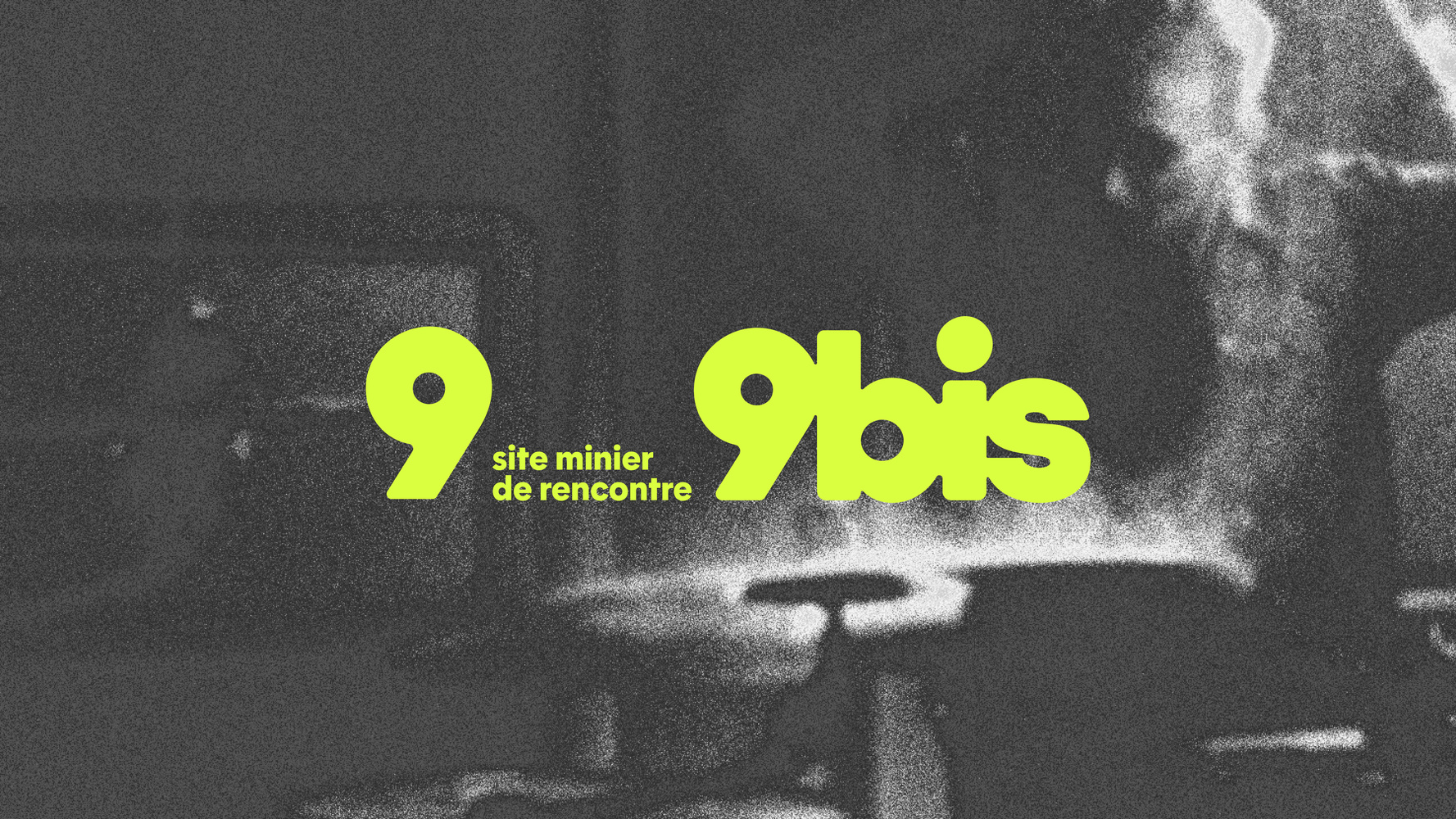
Round Condensed is characterized by its narrow proportions, while staying faithful to Round’s essence, where round letters retain their size. As for Round, the circular shapes are crossed by straight strokes, giving the typeface a subtle balance between fluidity and geometrical structure. The lowercase “b”; “d”; “q”; “o” and the capitals “O” and “Q” follow these rules. Every other character is condensed, which enhances the presence of round letters. They stand out even more.
Designed to work in a perfect complementarity with Round, Round Condensed shares the same number of styles and weights. The round letters stay strictly the same in both families; the only difference resides in the metrics. Their compatibility enhances the possibilities of creation; it offers dynamic composition insights between body and display texts.
If Round is perfect for text, Round Condensed excels in display size. Thought for titles, editorial design or visual identities, it expands your typographic compositions with a graphic presence that is not to be forgotten.
Round Condensed is part of the Round Collection
-
- Round Light
- Round Light Italic
- Round Book
- Round Book Italic
- Round Regular
- Round Italic
- Round Medium
- Round Medium Italic
- Round Bold
- Round Bold Italic
- Round Extrabold
- Round Extrabold Italic
- Round Black
- Round Black Italic
-
- Round Ultra Light
- Round Ultra Light Italic
- Round Ultra Book
- Round Ultra Book Italic
- Round Ultra Regular
- Round Ultra Italic
- Round Ultra Medium
- Round Ultra Medium Italic
- Round Ultra Bold
- Round Ultra Bold Italic
- Round Ultra Extrabold
- Round Ultra Extrabold Italic
- Round Ultra Black
- Round Ultra Black Italic
-
- Round Condensed Light
- Round Condensed Light Italic
- Round Condensed Book
- Round Condensed Book Italic
- Round Condensed Regular
- Round Condensed Italic
- Round Condensed Medium
- Round Condensed Medium Italic
- Round Condensed Bold
- Round Condensed Bold Italic
- Round Condensed Extrabold
- Round Condensed Extrabold Italic
- Round Condensed Black
- Round Condensed Black Italic
Family overview
Type tester
OpenType features
Character set
🡢 Share your project