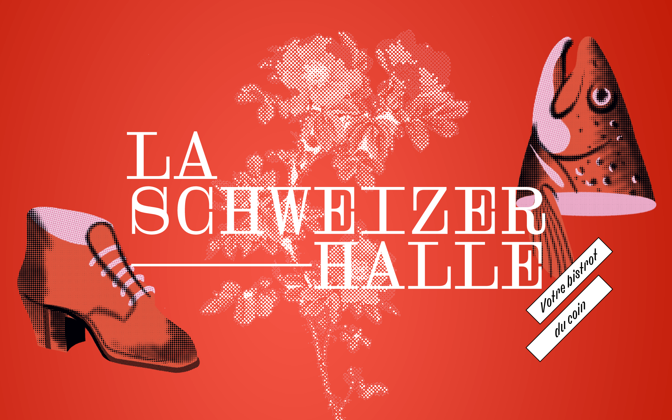
Branding for La Schweizerhalle, a bistro established in 1872.
For its 150th anniversary, the restaurant La Schweizerhalle changes its owners and gets a new face. The building is located on Rue des Epouses in the gothic city of Fribourg, Switzerland.
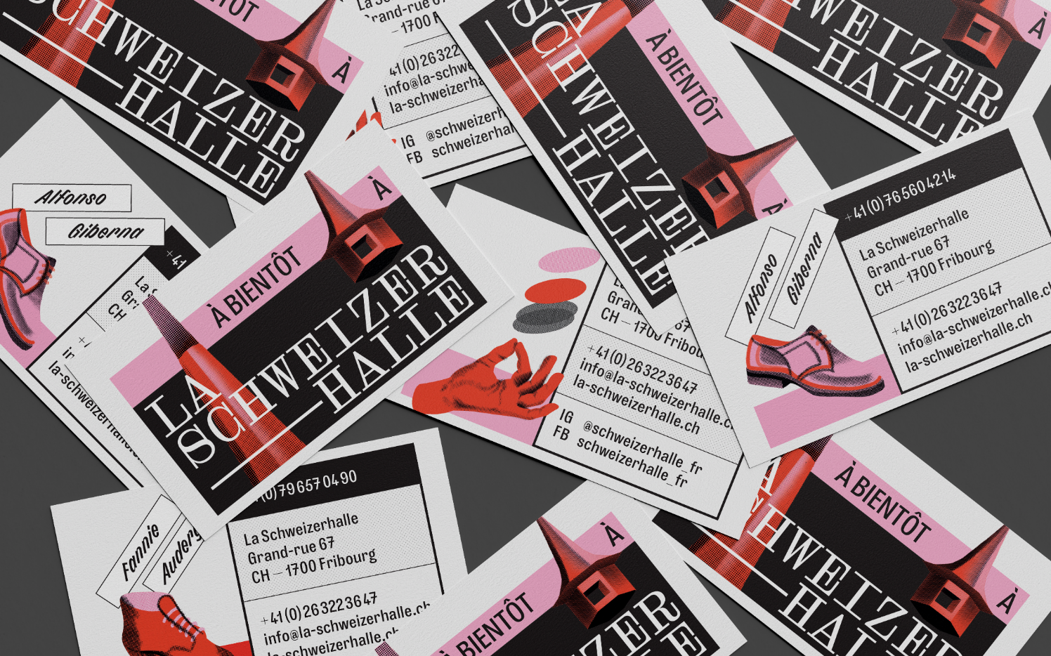
As a commitment to this historical place, F+F studio, branding and design studio, imagines a visual identity made of anecdotes and encounters.
The mission is twofold: to announce the new, while honoring the past and the people who have contributed to the life of the restaurant so far.
Poets, literary figures, artists, lovers, local residents.
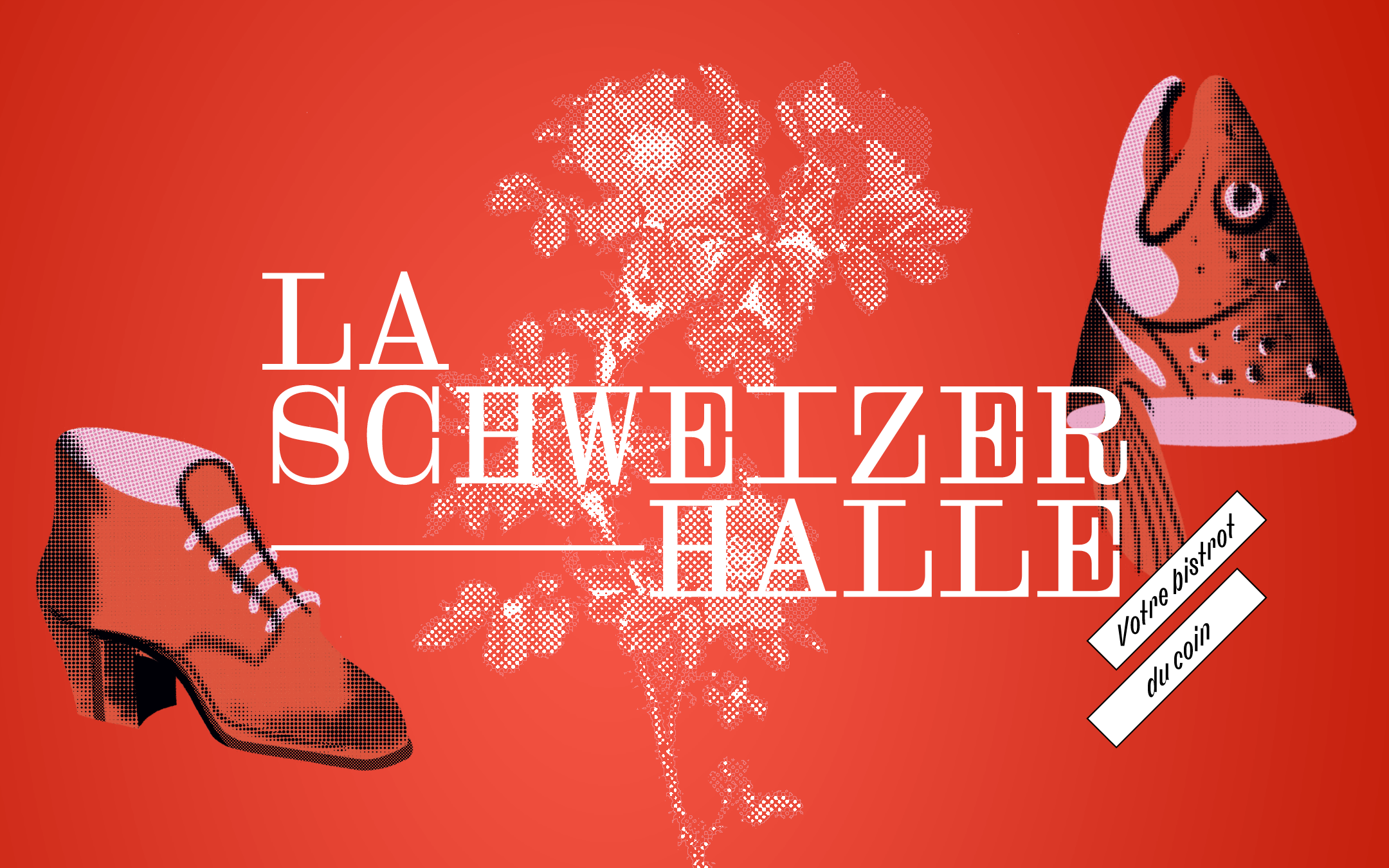
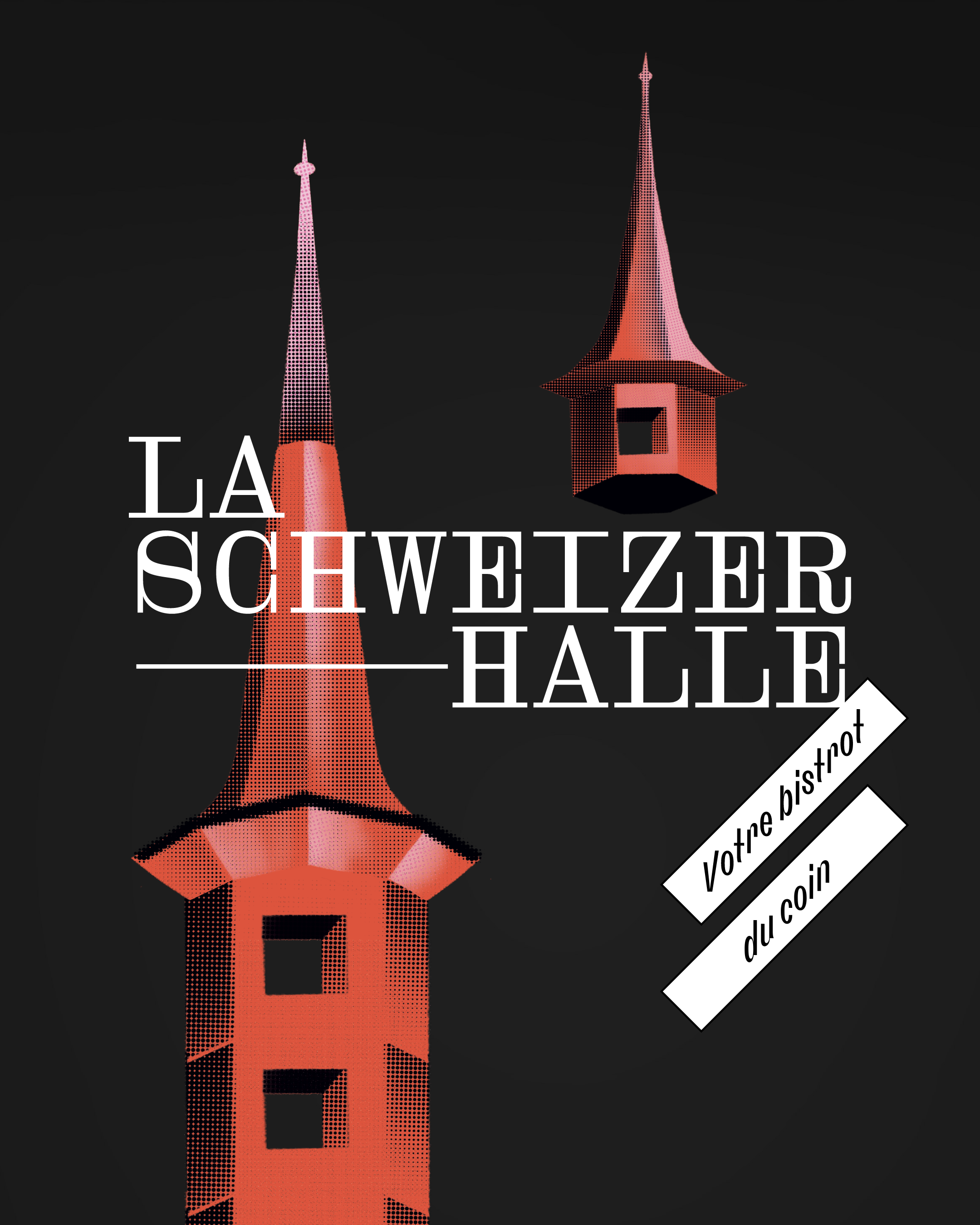
A logo was designed, with a character design that draws inspiration from the past, makes it its own, and creates the future.
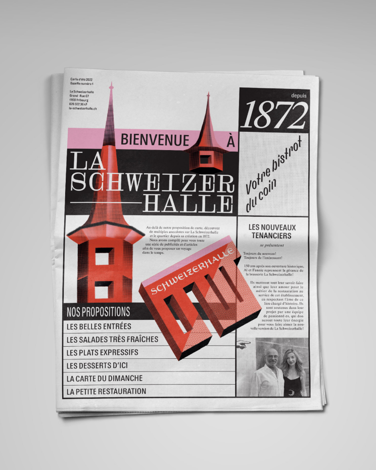
A bright and bold color palette, modern halftone illustrations refer to the process of printing photographs in newspapers of yesteryear.
As a vehicle for stories through time, the newspaper seemed to be the ideal medium for a food menu. It tells stories and reflects the values of the Schweizerhalle.



🡢 Partagez votre projet avec nous