imperfections
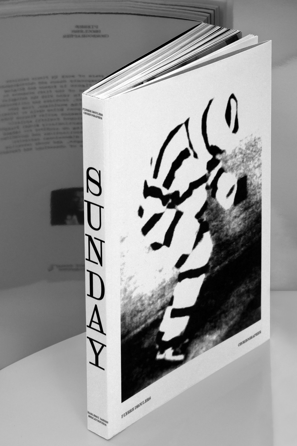
Droulers
Get in the DeLorean. We are going to the 19th century to witness the birth of the first typewriters!
- Art Direction:
Bureau Brut
- Typeface design:
Yoann Minet
- Design date:
2016
- Published by:
Bureau Brut
- Initial release:
2017
- Current version:
7.1
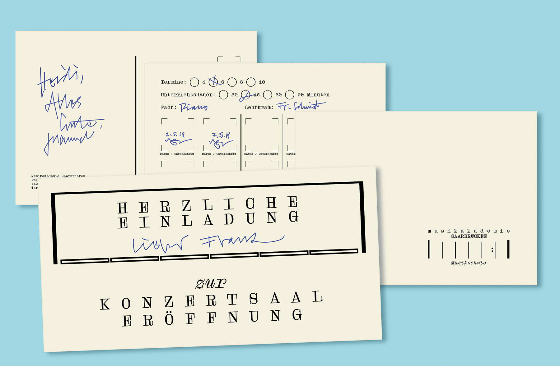
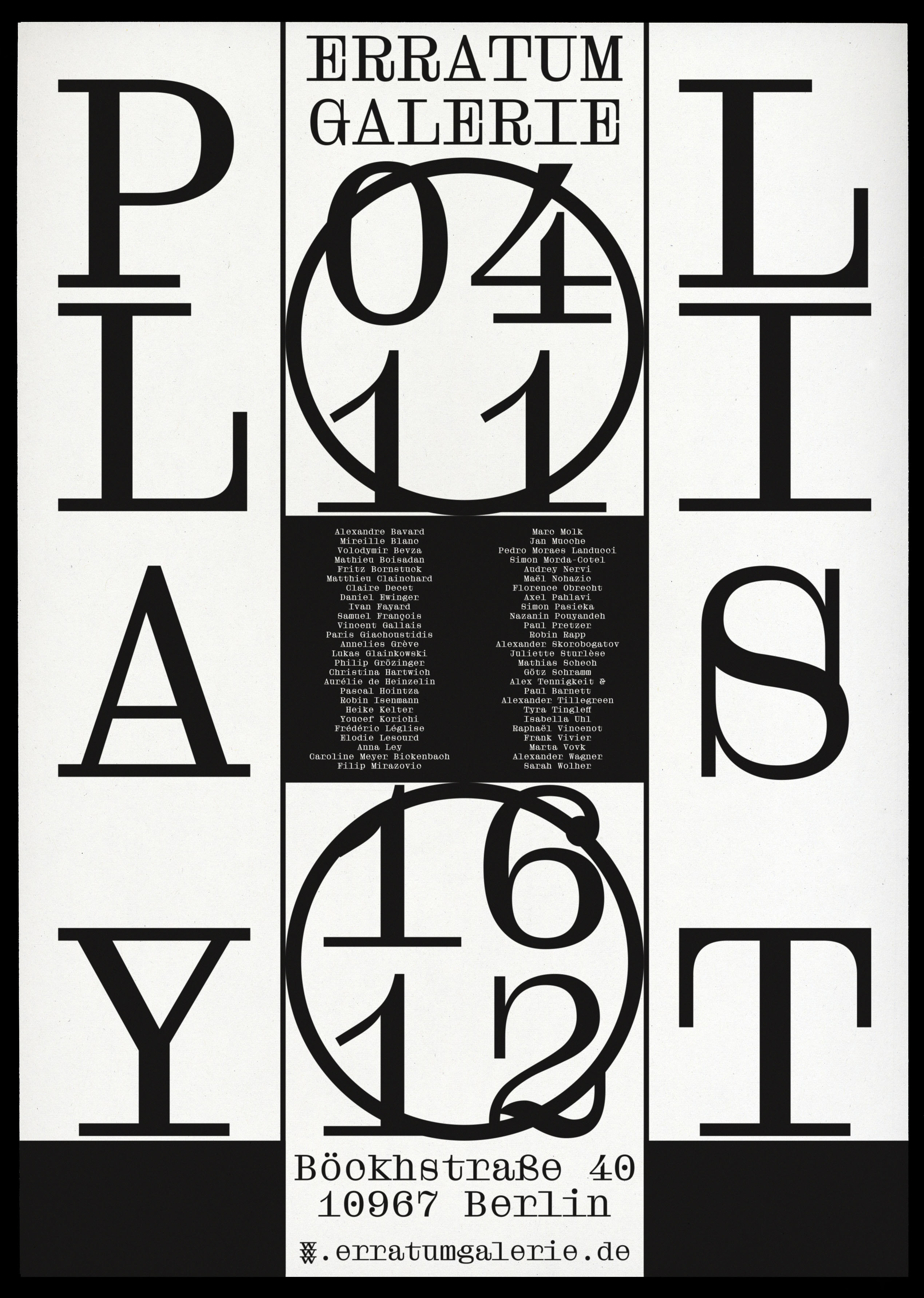
This is where Droulers starts. The family is inspired by typewritten documents1, and, more broadly, by the archetype of the “typewriter aesthetic.” However, it is not an imitation, but a contemporary interpretation of its shapes, rhythms and restraints.
Its main characteristics come from the imperfections happening when using a typewriter: the ink filling the letters, closed counterpunches, serifs sticking together, etc.2 These accidents are becoming drawing rules, reviewed in a vectorial style as refined as possible.
Droulers keeps the morphological markers of its genre: monospace, a relatively light weight with no contrasts, rectangular serifs and a few distinctive shapes ( “a”, “g”, “R”, “Q”).
The italic is not a simple slant of the Roman, but a real italic with calligraphic elements, where each letter finds its own angle and rhythm.
- This character was originally designed for a retrospective publication on Pierre Drouler’s career in dancing and choreographing. This typeface is inspired by his archives, and specifically the typewritten ones.
- In essence, the deformations are created by the type bar, which hits the ink ribbon on the typewriter to write on the paper.
Droulers is part of the Droulers Collection
-
- Droulers Clarendon Line
- Droulers Clarendon Line Italic
- Droulers Clarendon Light
- Droulers Clarendon Light Italic
- Droulers Clarendon Book
- Droulers Clarendon Book Italic
- Droulers Clarendon Regular
- Droulers Clarendon Italic
- Droulers Clarendon Medium
- Droulers Clarendon Medium Italic
- Droulers Clarendon Bold
- Droulers Clarendon Bold Italic
- Droulers Clarendon Extrabold
- Droulers Clarendon Extrabold Italic
- Droulers Clarendon Black
- Droulers Clarendon Black Italic
Family overview
Type tester
OpenType features
Character set
🡢 Share your project