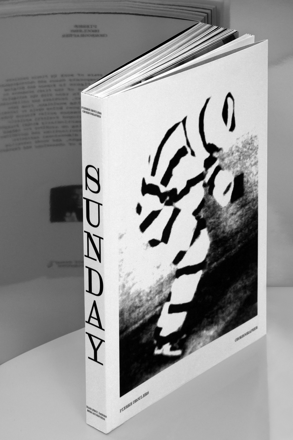
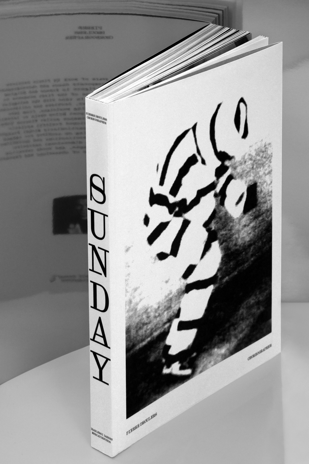
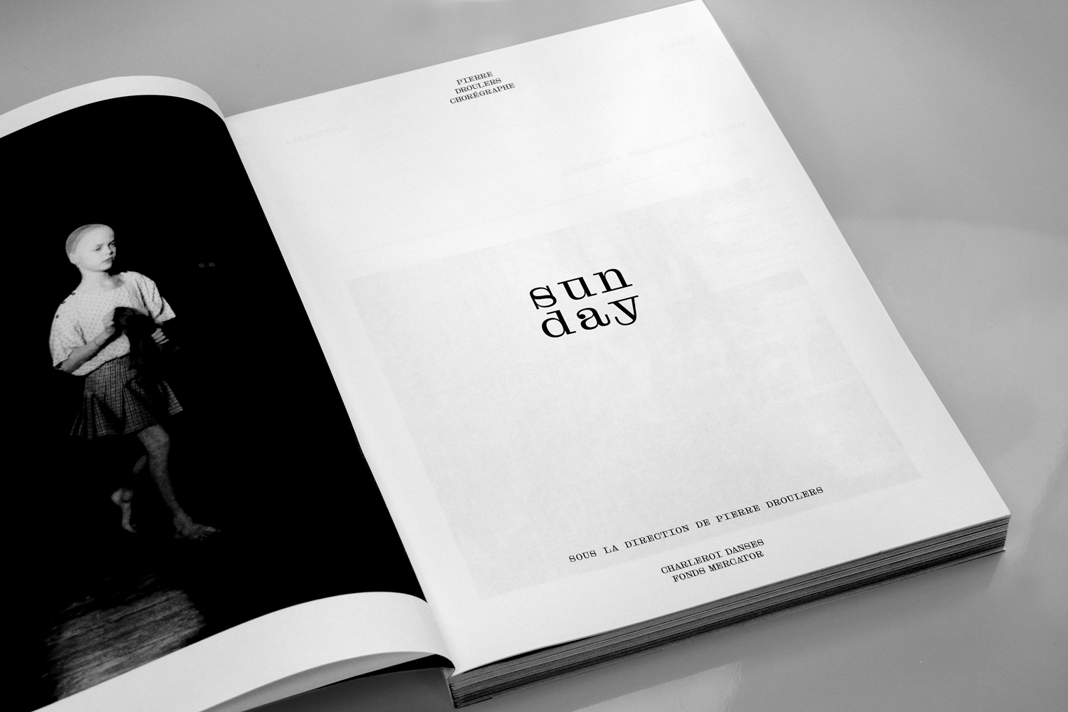
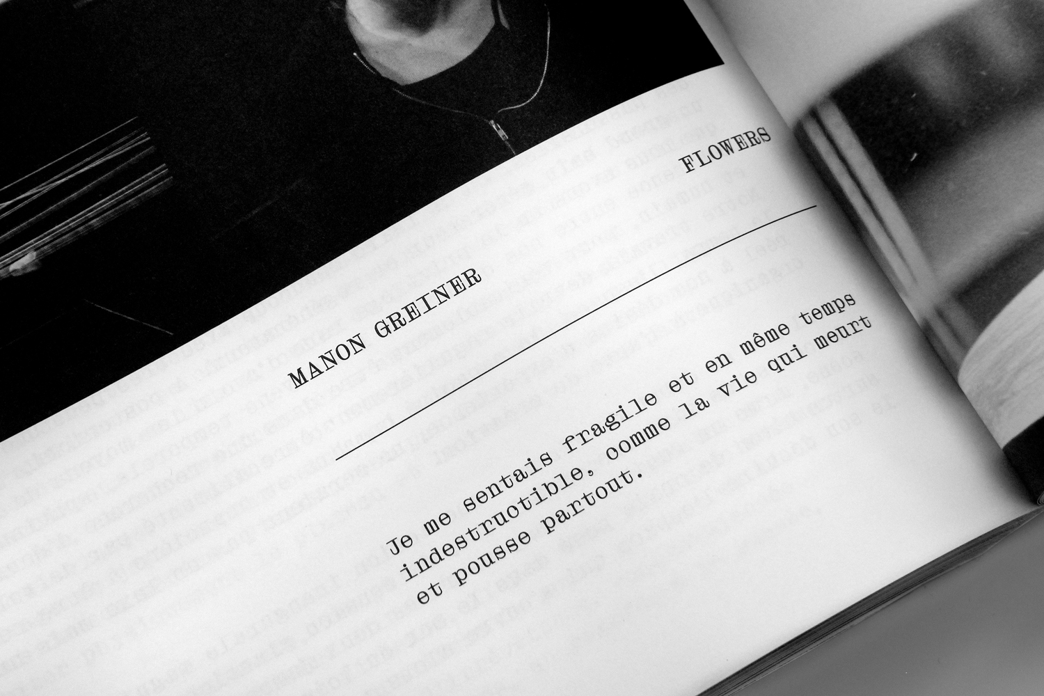
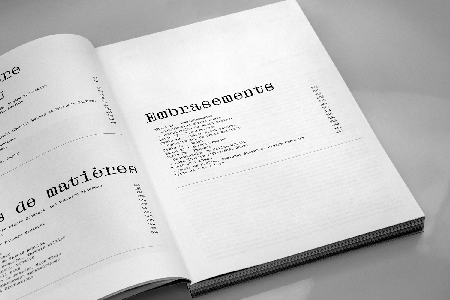
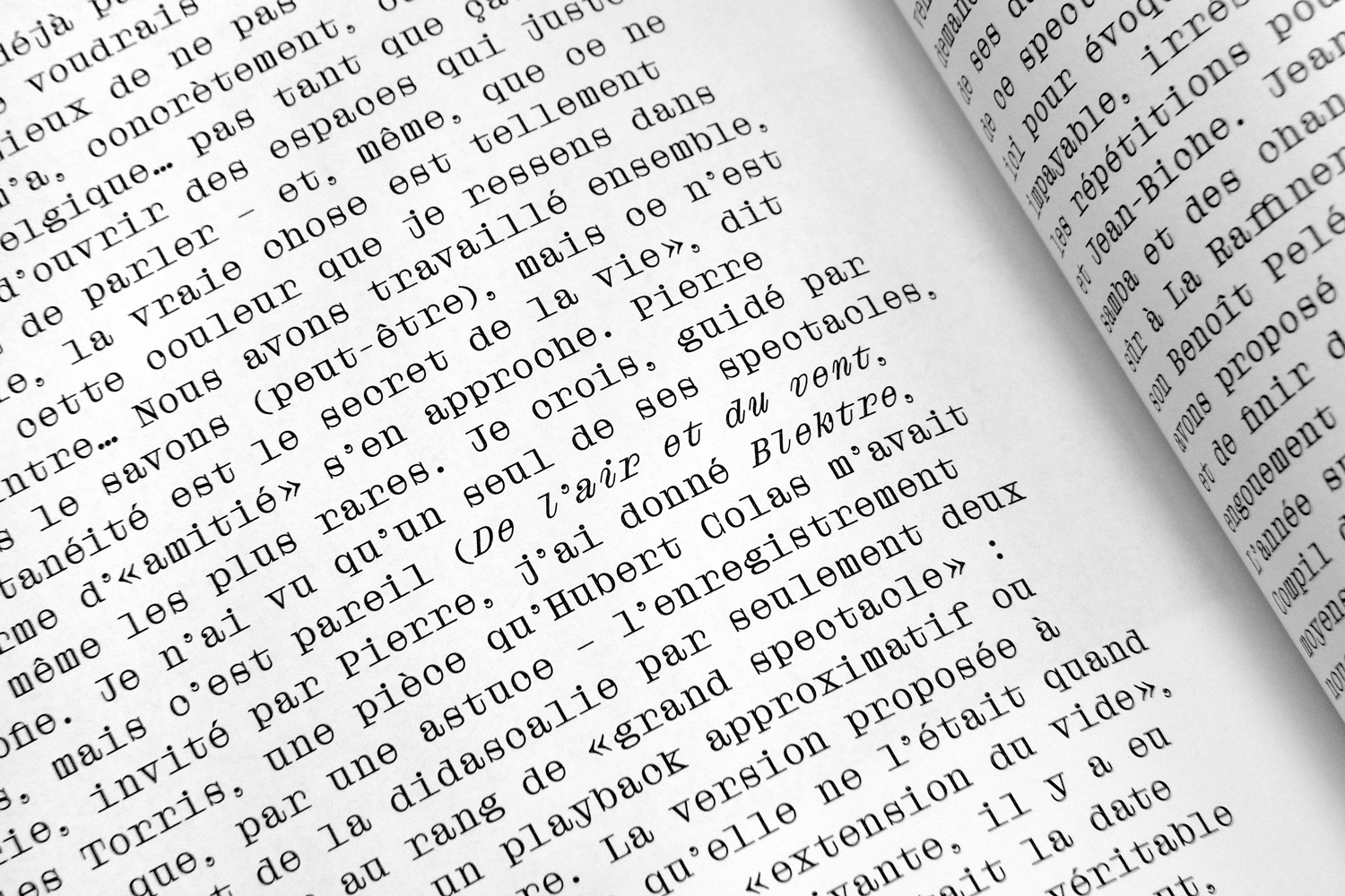
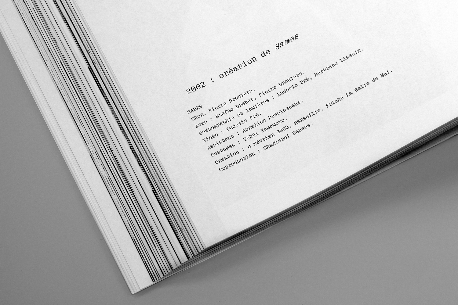
The Droulers typeface was designed by Bureau Brut for a retrospective book on the life and work of the dancer and choreographer Pierre Droulers. It originates from printed matter found in his personal archive and, in particular, some notes written with a typewriter. Questioning both the specific rhythm and shapes of typewriter fonts, the design is inspired by the distortions and accidents generated by this technique (letters clogged with ink, counterforms that are closing in and so on).
More fonts in use
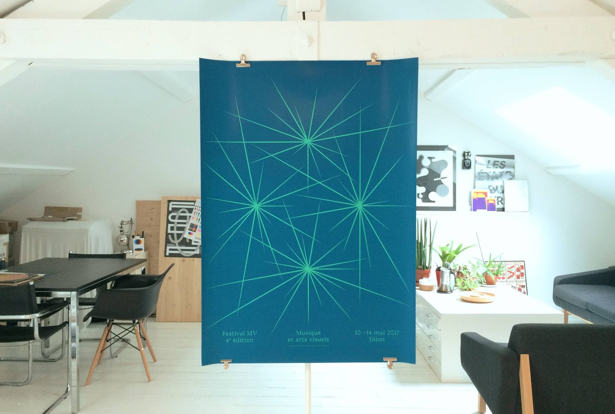
Traulha –
used by Atelier Tout Va Bien for Festival MV
Boogy Brut Poster –
used by Hey Low for Hey Low
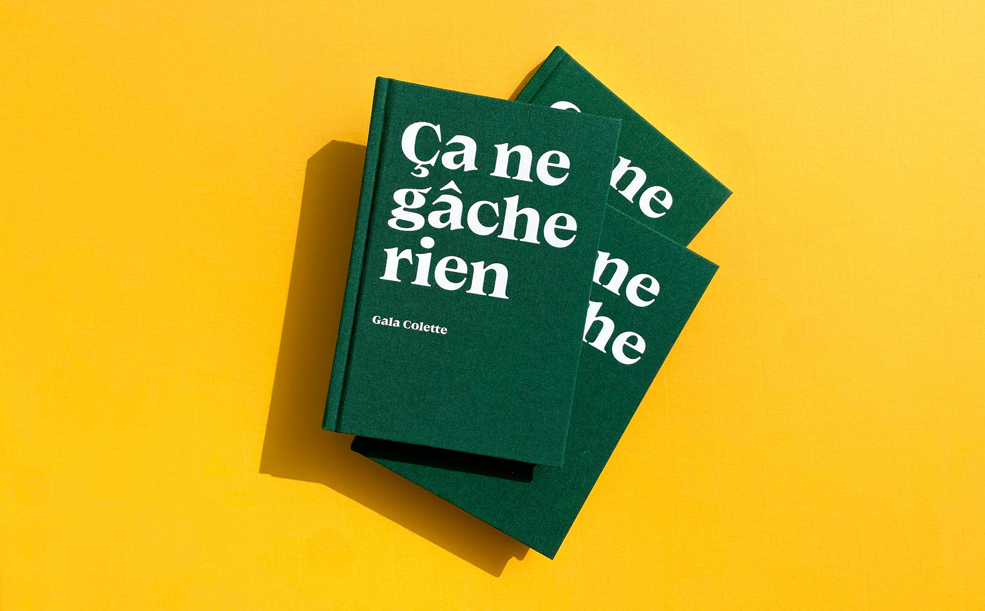
Matorral –
used by Elodie Campo for Les Éditions de l’Épure
Did you use our fonts?
🡢 Share your project
🡢 Share your project