the round.
Rouding
the square.
Round
This is the story of a beautiful contradiction.
We finally succeeded in squaring the circle!
- Art Direction:
Bureau Brut
- Typeface design:
Yoann Minet
- Design date:
2020
- Published by:
Bureau Brut
- Initial release:
2021
- Current version:
2.1
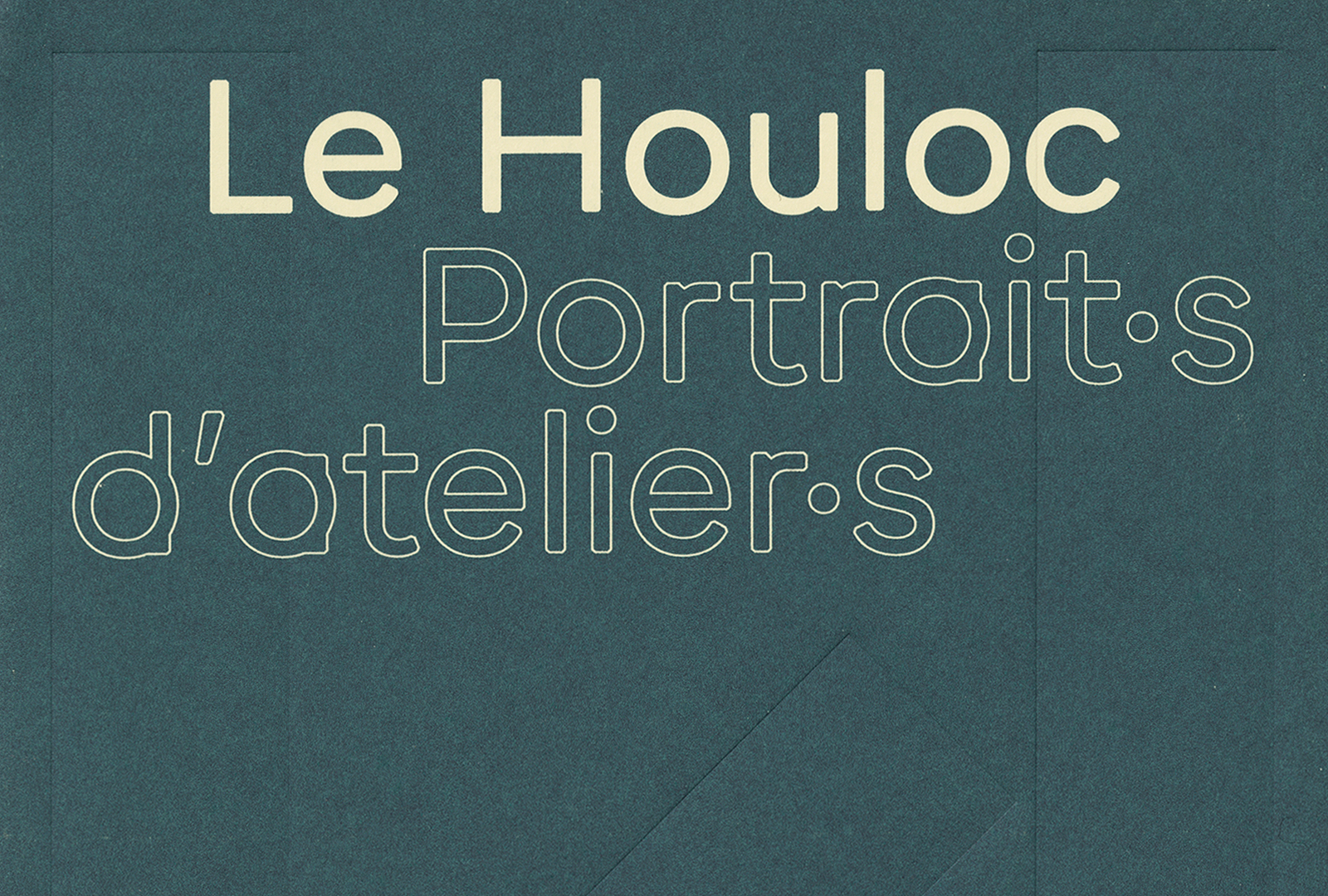
The unique characteristics of this typeface can be seen in the lowercases “b”, “d”, “p” and “q”: the vertical strokes cut precisely the rounded letters. And because we like to play, Round isn’t Rounded! The strokes’ angles are beveled. When used in small size or seen from afar, the corners change into a rounded shape, which gives it the softness of a Rounded typeface. Looking closer, the 45° angles give a geometrical and graphic dimension to the characters, the square morphing into a circle, the angle defying the curve. This graphic stance fits well with any logotype or brand-related project. Round is optimized for small-text sizes, and is perfectly legible in any size.
Round has two more families, even more radical: Round Condensed & Round Ultra.
Round is part of the Round Collection
-
- Round Light
- Round Light Italic
- Round Book
- Round Book Italic
- Round Regular
- Round Italic
- Round Medium
- Round Medium Italic
- Round Bold
- Round Bold Italic
- Round Extrabold
- Round Extrabold Italic
- Round Black
- Round Black Italic
-
- Round Ultra Light
- Round Ultra Light Italic
- Round Ultra Book
- Round Ultra Book Italic
- Round Ultra Regular
- Round Ultra Italic
- Round Ultra Medium
- Round Ultra Medium Italic
- Round Ultra Bold
- Round Ultra Bold Italic
- Round Ultra Extrabold
- Round Ultra Extrabold Italic
- Round Ultra Black
- Round Ultra Black Italic
-
- Round Condensed Light
- Round Condensed Light Italic
- Round Condensed Book
- Round Condensed Book Italic
- Round Condensed Regular
- Round Condensed Italic
- Round Condensed Medium
- Round Condensed Medium Italic
- Round Condensed Bold
- Round Condensed Bold Italic
- Round Condensed Extrabold
- Round Condensed Extrabold Italic
- Round Condensed Black
- Round Condensed Black Italic
Family overview
Type tester
OpenType features
Character set
🡢 Share your project