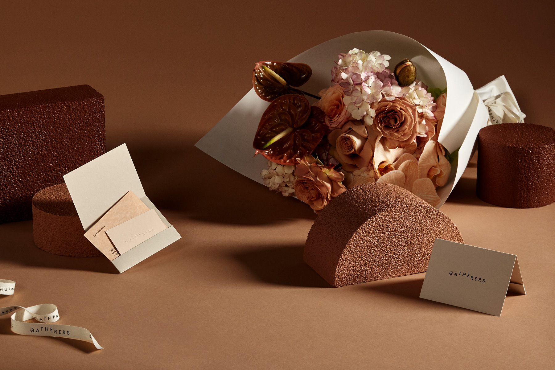
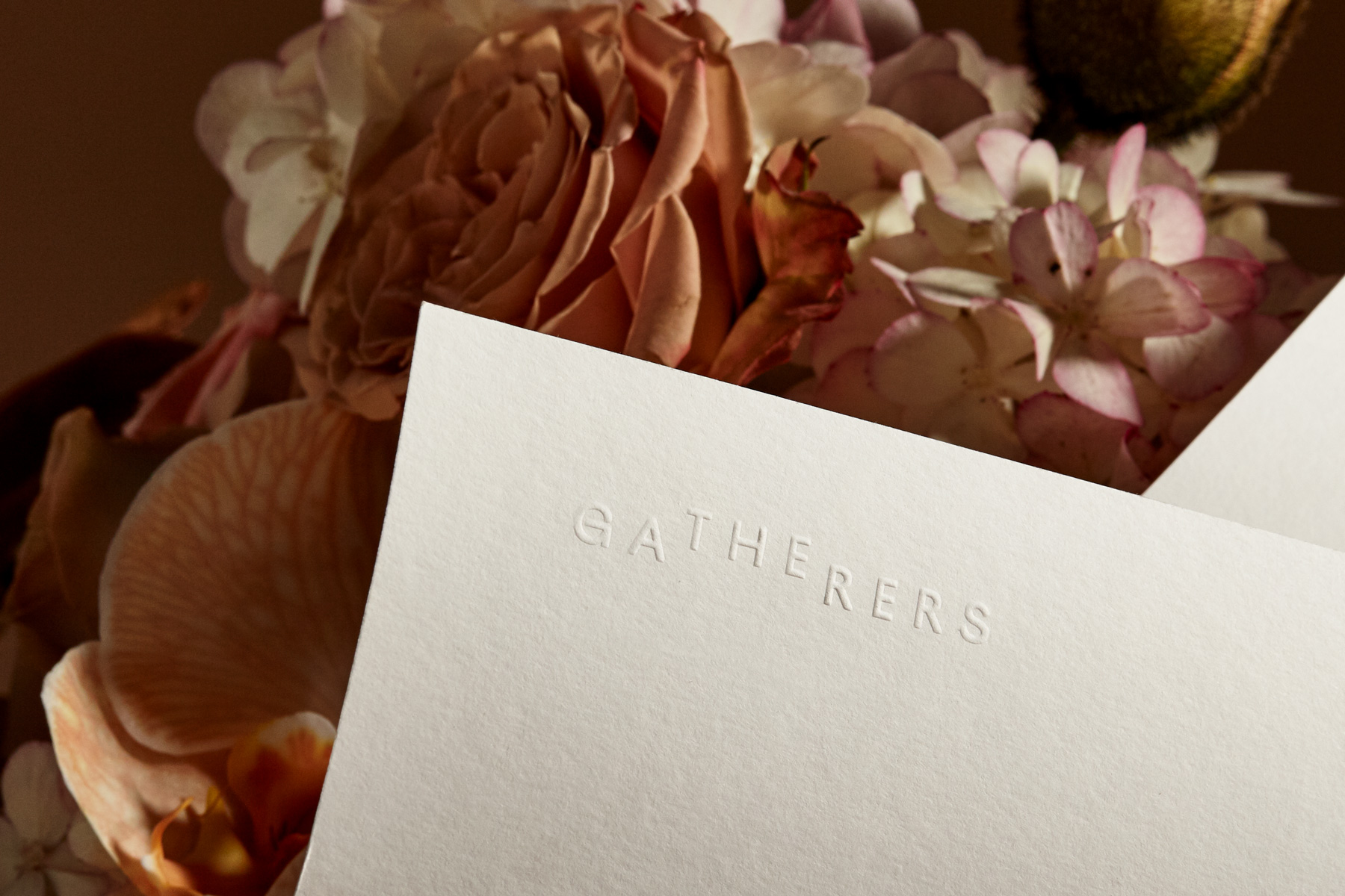
New brand identity by Mildred & Duck for The Gatherers, a New Zealand-based floral studio, specializing in arrangements that embrace and celebrate the natural environment.
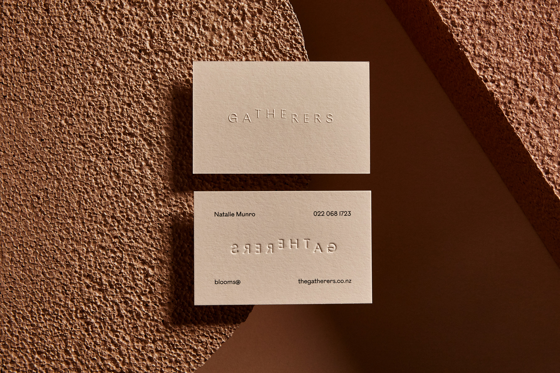
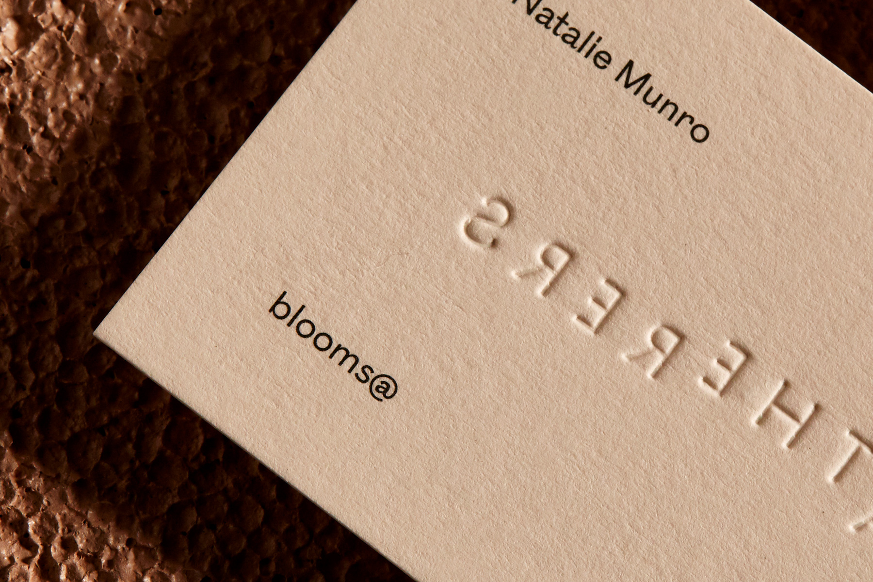
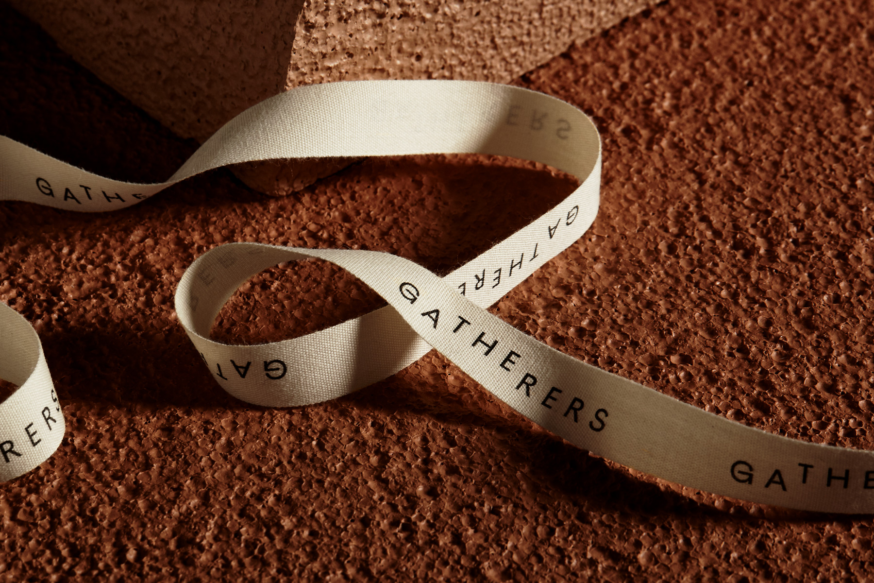
The application of the new identity seeks to enhance rather than overpower the arrangements it sits alongside; incorporating the soft warm tones of various uncoated paper stocks, natural cotton ribbon and embossed elements to subtly introduce texture. A layered approach ensures the brand is embedded throughout the customer experience, with considered details like the tear-off notecard section of the custom folders.
Folio photography by Shelley Horan.


More fonts in use
Totentanz –
used by Florian Chevillard for Collectif Rond Point
Ostia Antica –
used by Carles Rodrigo Monzó for City of Valencia
Did you use our fonts?
🡢 Share your project
🡢 Share your project