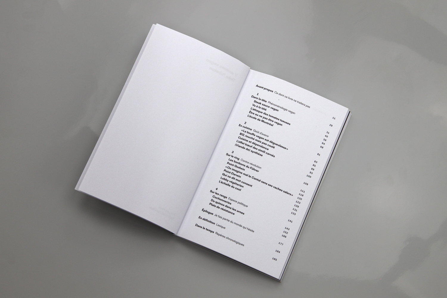
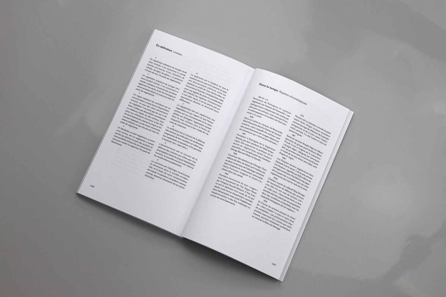
Project: V comme Vegan by Théo Ribeton, Éditions Nova
Designers: Bureau Brut
Typefaces:
Designers: Bureau Brut
Typefaces:
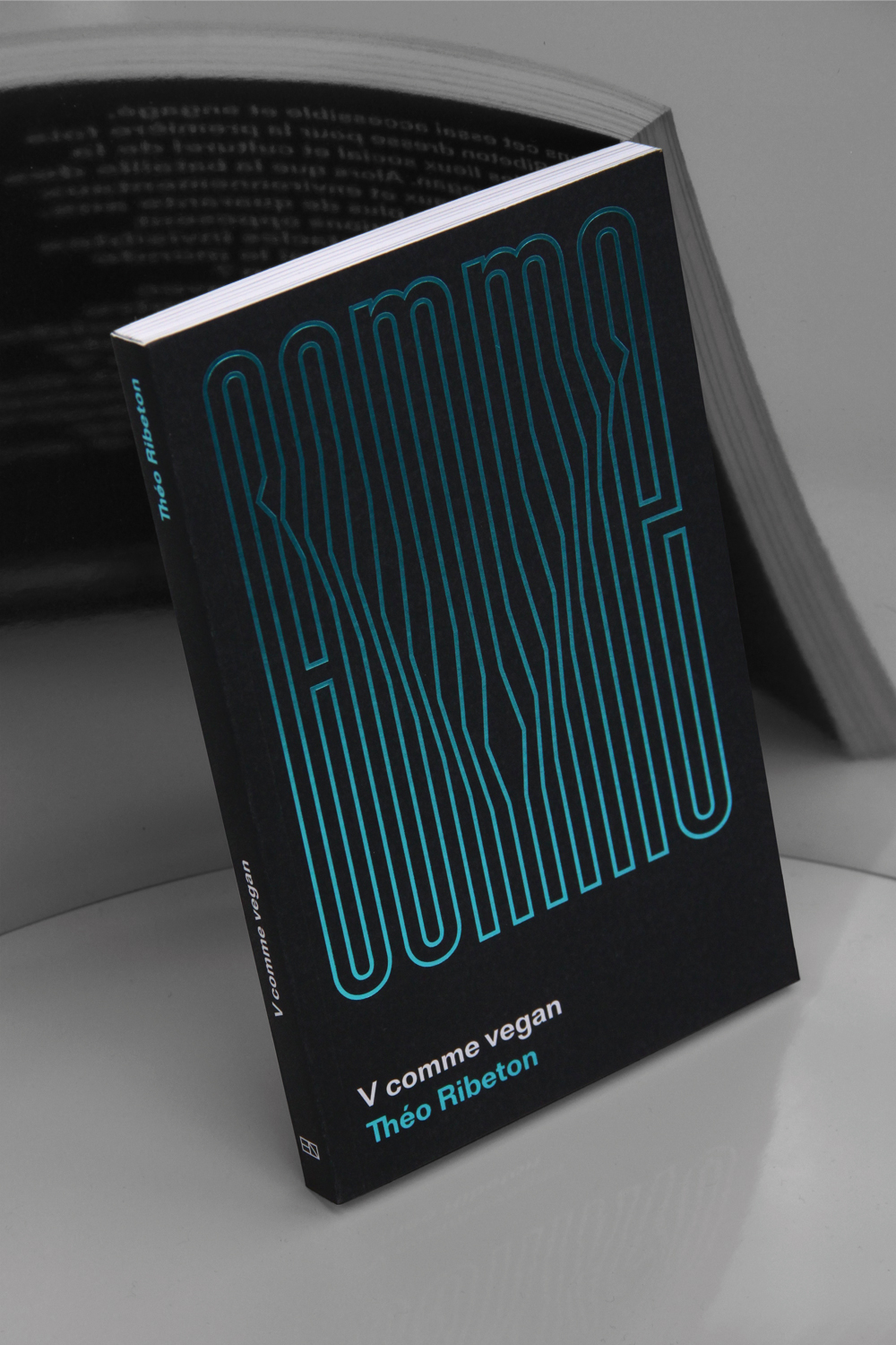
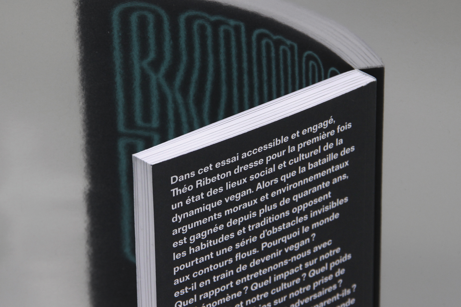
Bureau Brut designs the paperback collection “Parallaxe” for Éditions Nova, beginning with the book V comme vegan by Théo Ribeton. Each author of this collection, rooted in reality, takes a fresh look at the world he lives in, he invites us to do the same and look at it from a new perspective. To imagine a world that seems impossible and ask each of us “why not reconsider what I believe and stand for?”. Here are the graphic ideas we explored for the design of the collection covers, inviting the reader to take a second look at the world and the cover.

More fonts in use
Did you use our fonts?
🡢 Share your project
🡢 Share your project