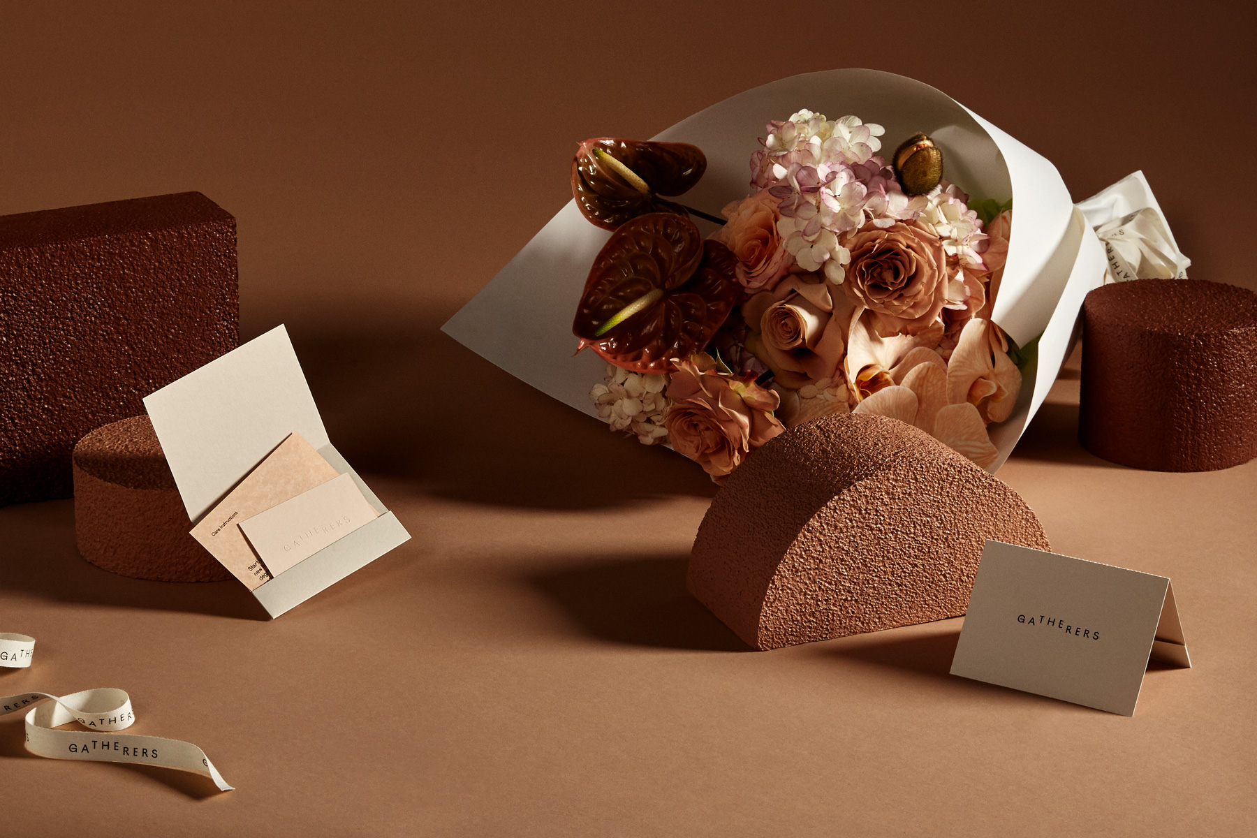
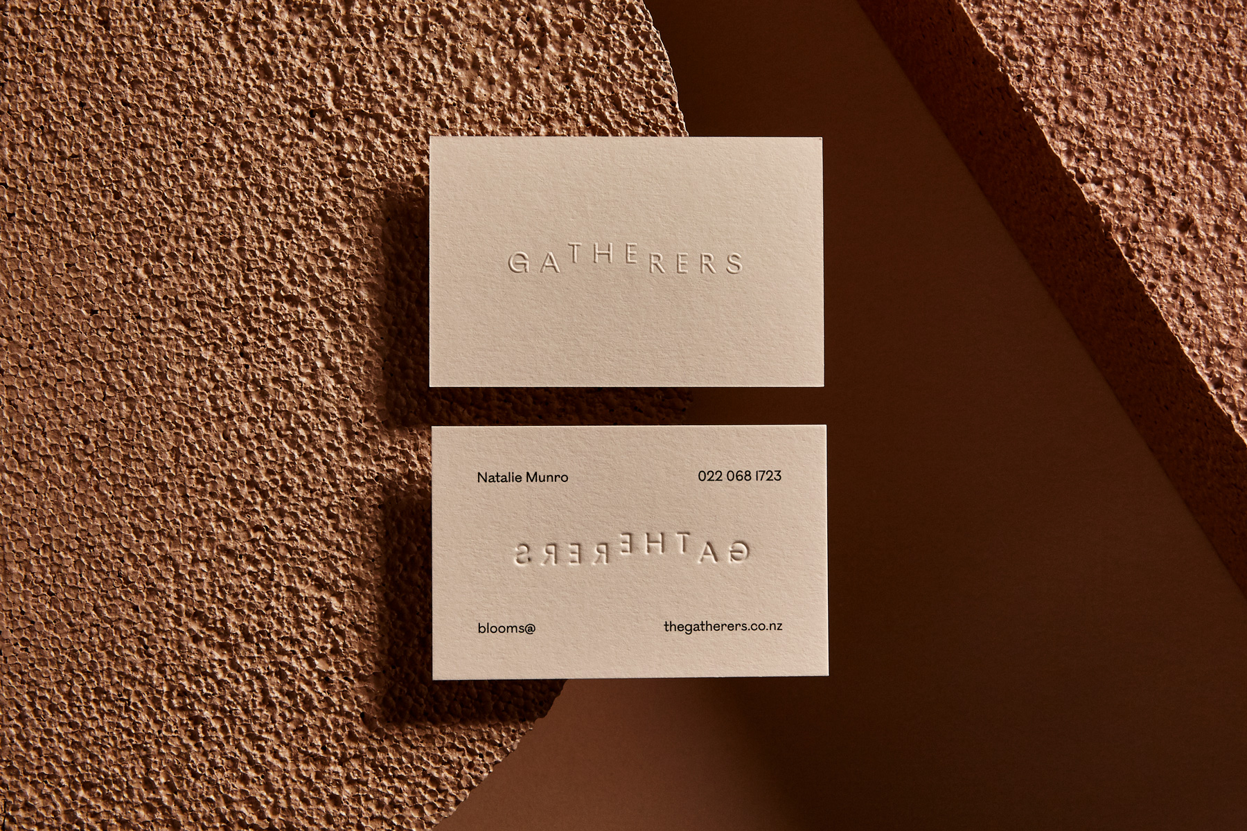
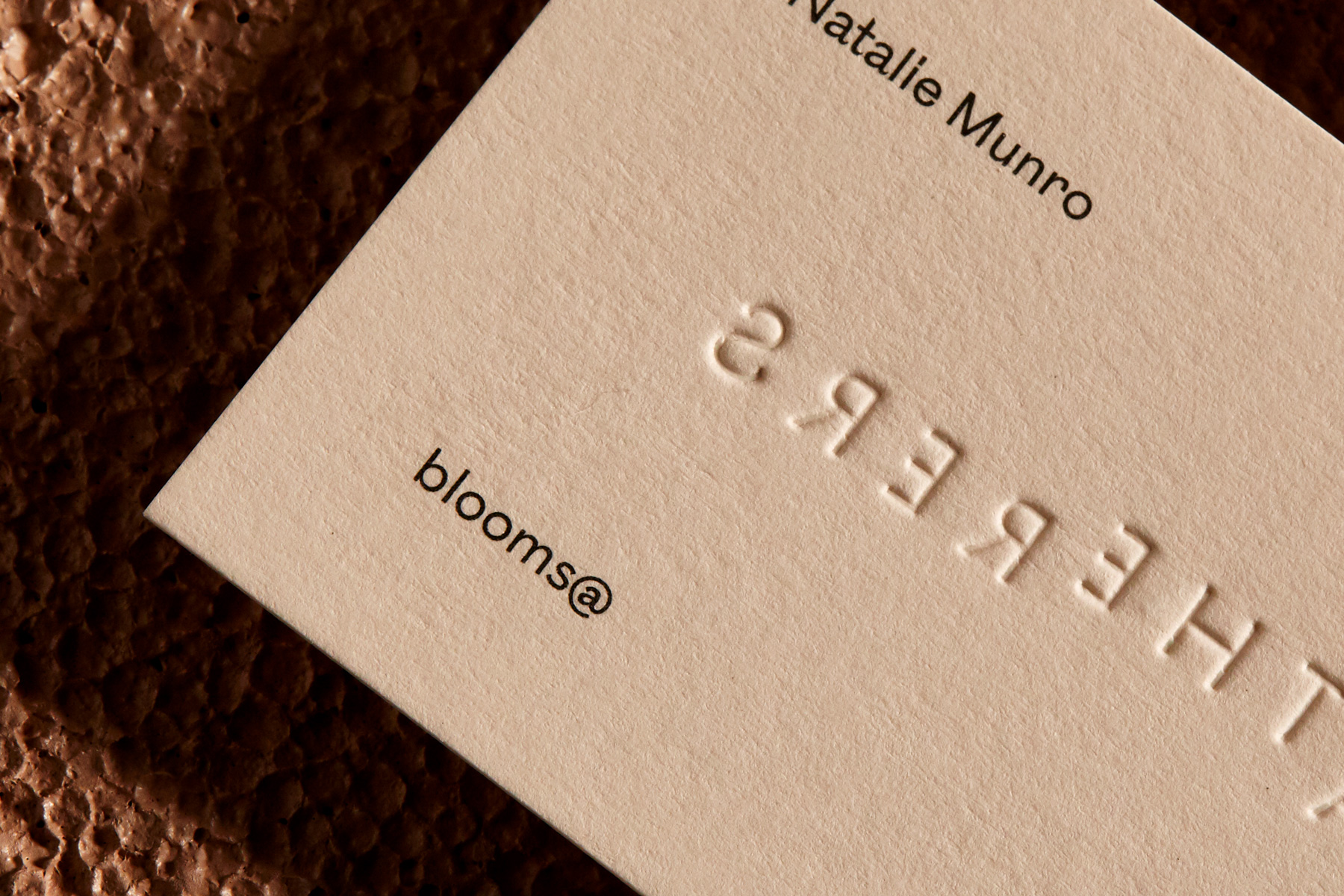
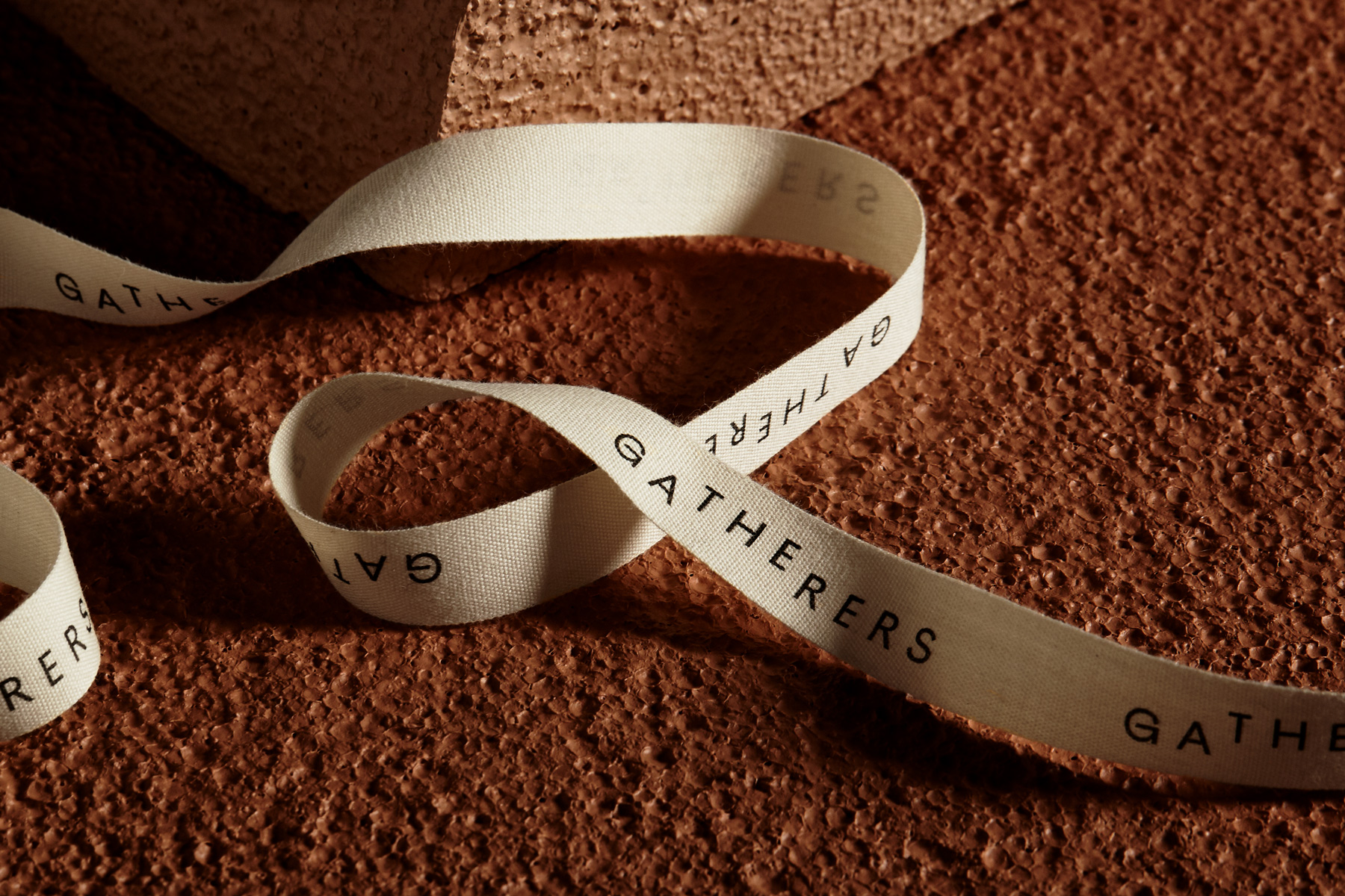
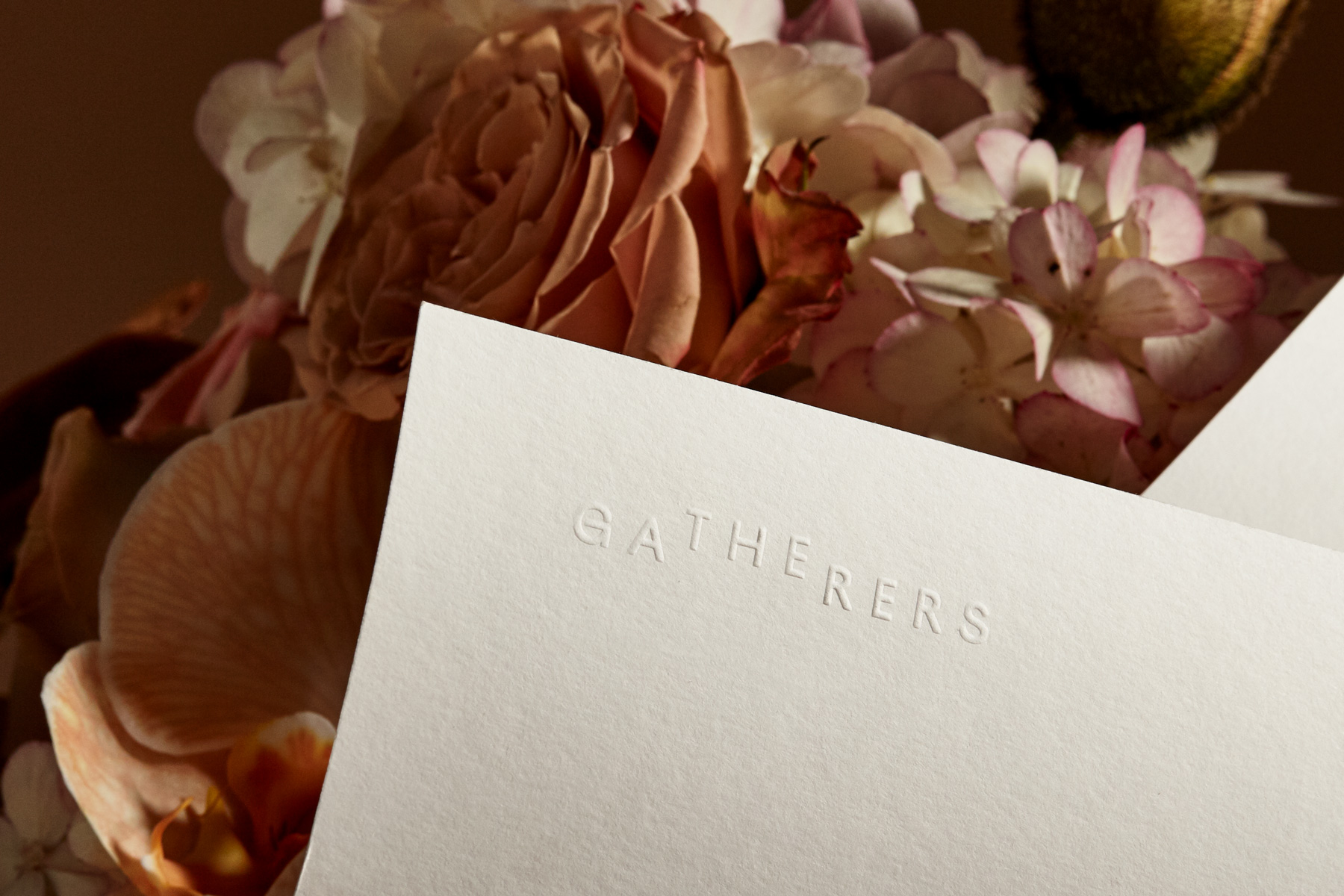
New brand identity by Mildred & Duck for The Gatherers, a New Zealand-based floral studio, specializing in arrangements that embrace and celebrate the natural environment.
The application of the new identity seeks to enhance rather than overpower the arrangements it sits alongside; incorporating the soft warm tones of various uncoated paper stocks, natural cotton ribbon and embossed elements to subtly introduce texture. A layered approach ensures the brand is embedded throughout the customer experience, with considered details like the tear-off notecard section of the custom folders.
Folio photography by Shelley Horan.


More fonts in use
Bourrasque –
used by Aéro Club, Pedro Cardoso for Bureau des guides du GR2013

Ostia Antica –
used by Brest Brest Brest for Musilac Festvals
Avez-vous utilisé une de nos polices ?
🡢 Partagez votre projet avec nous
🡢 Partagez votre projet avec nous