Building Paris:
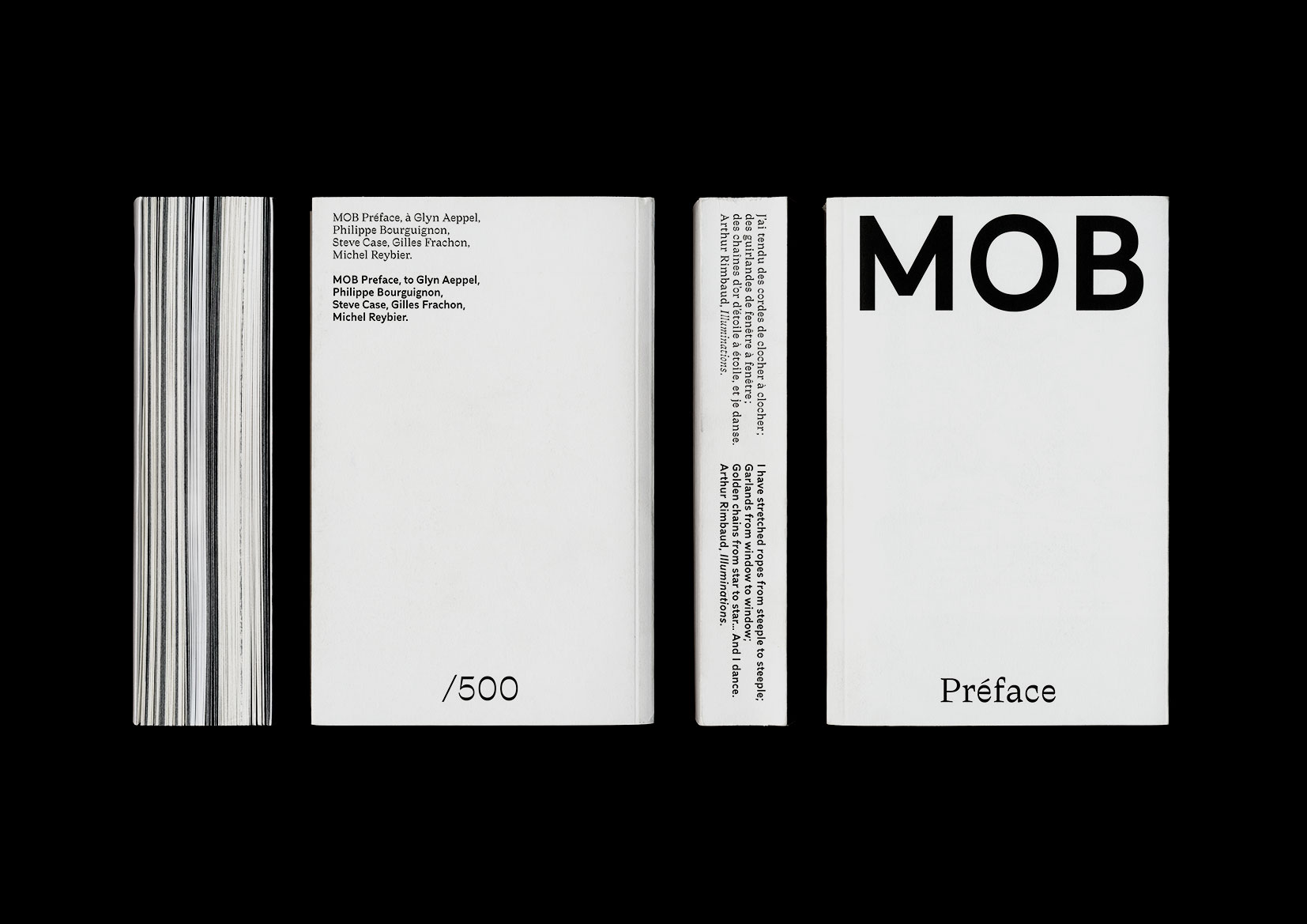
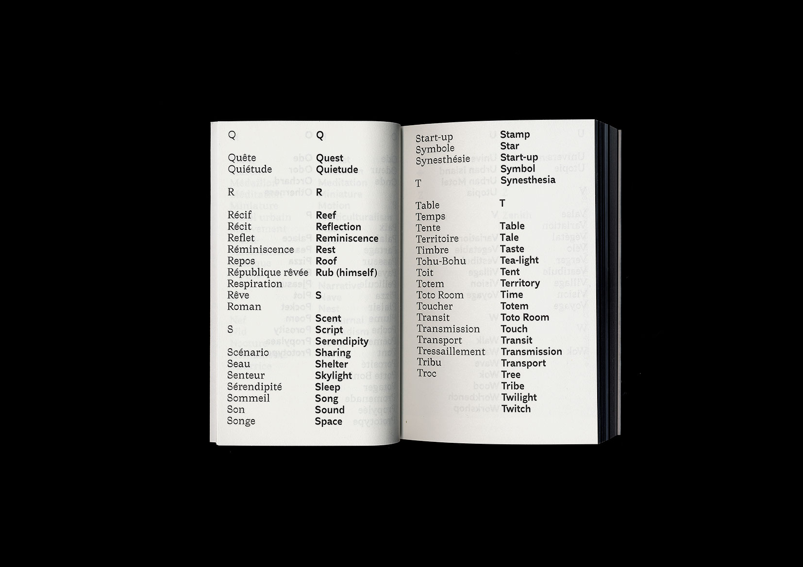
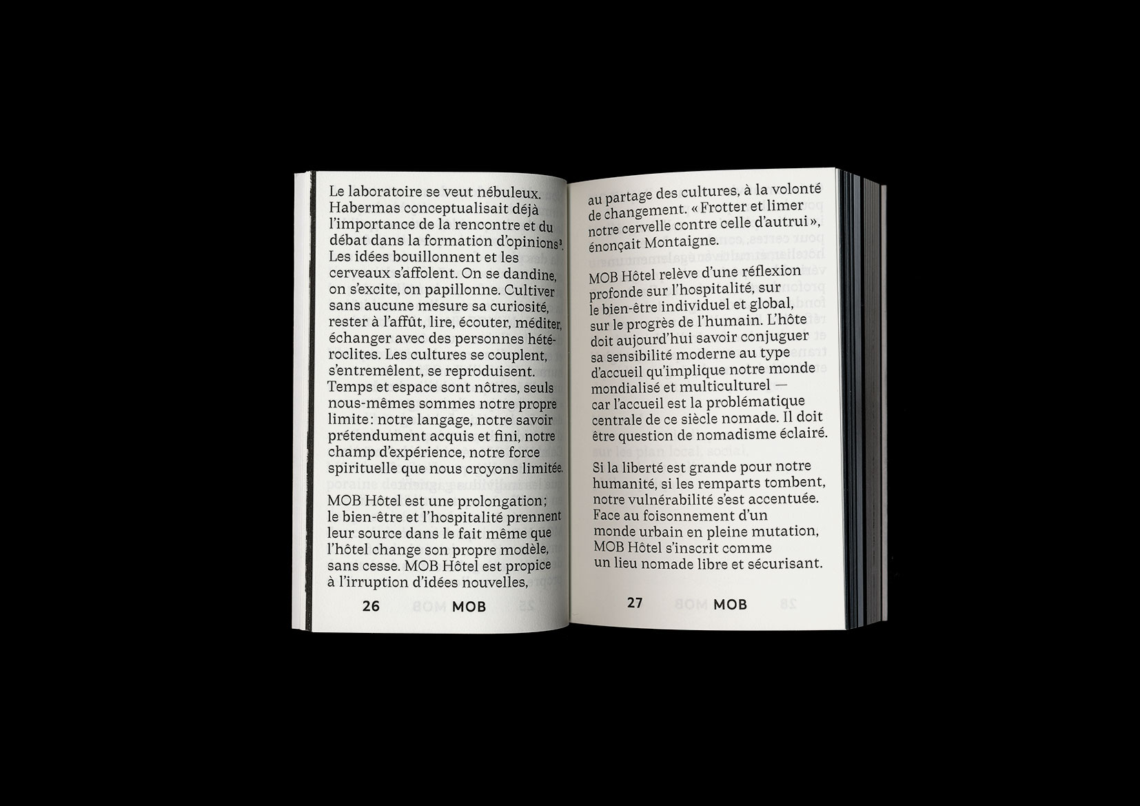
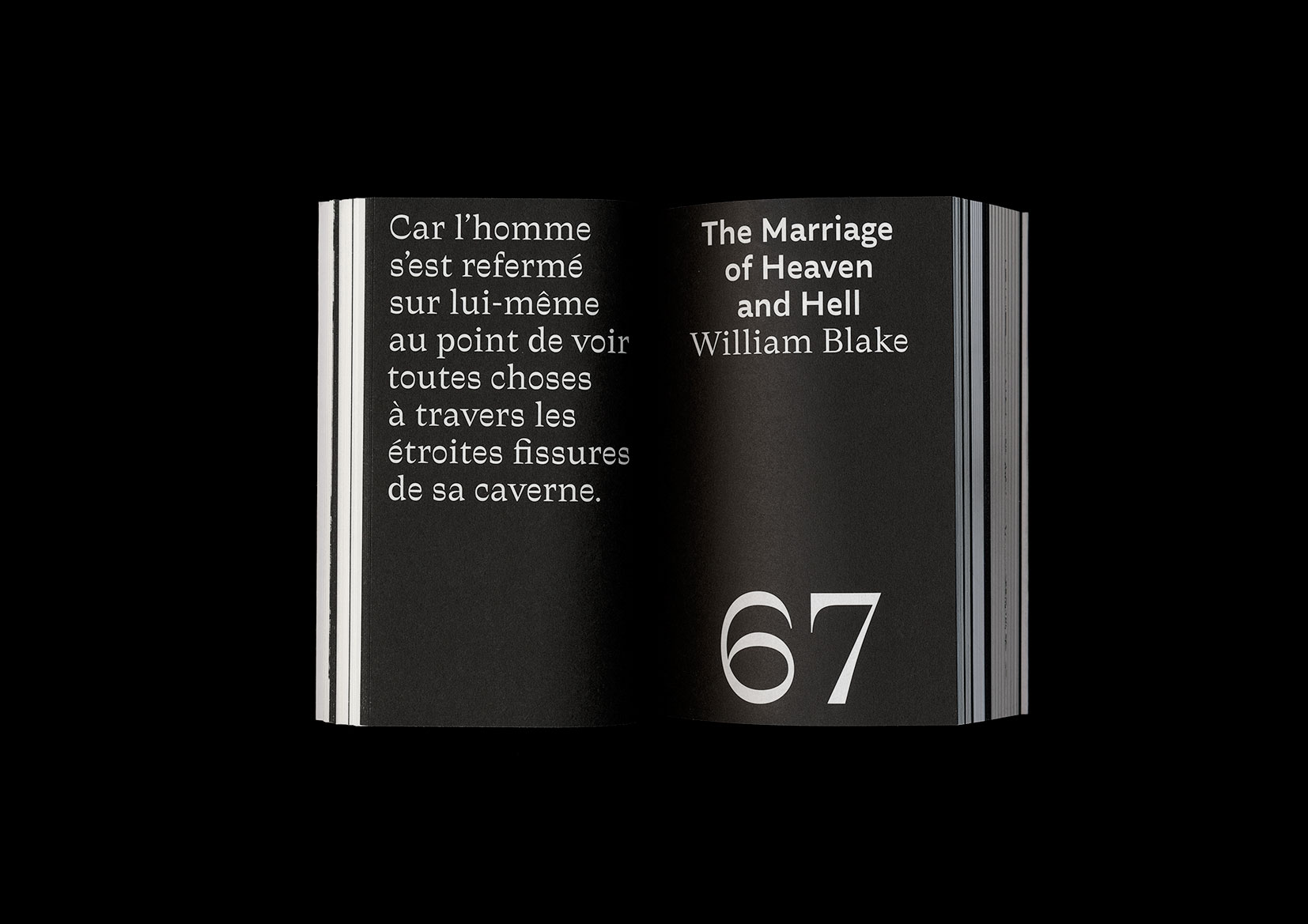
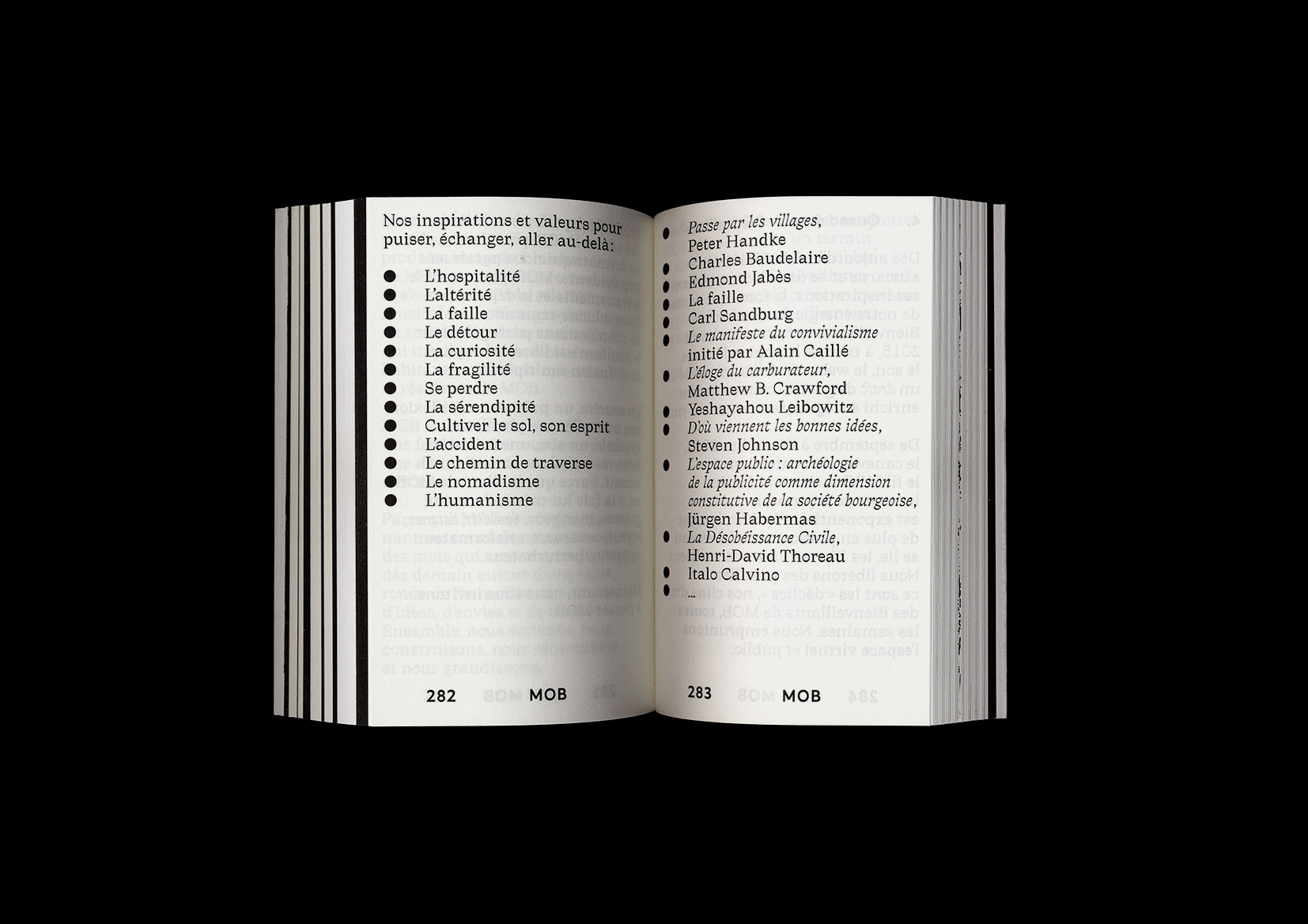
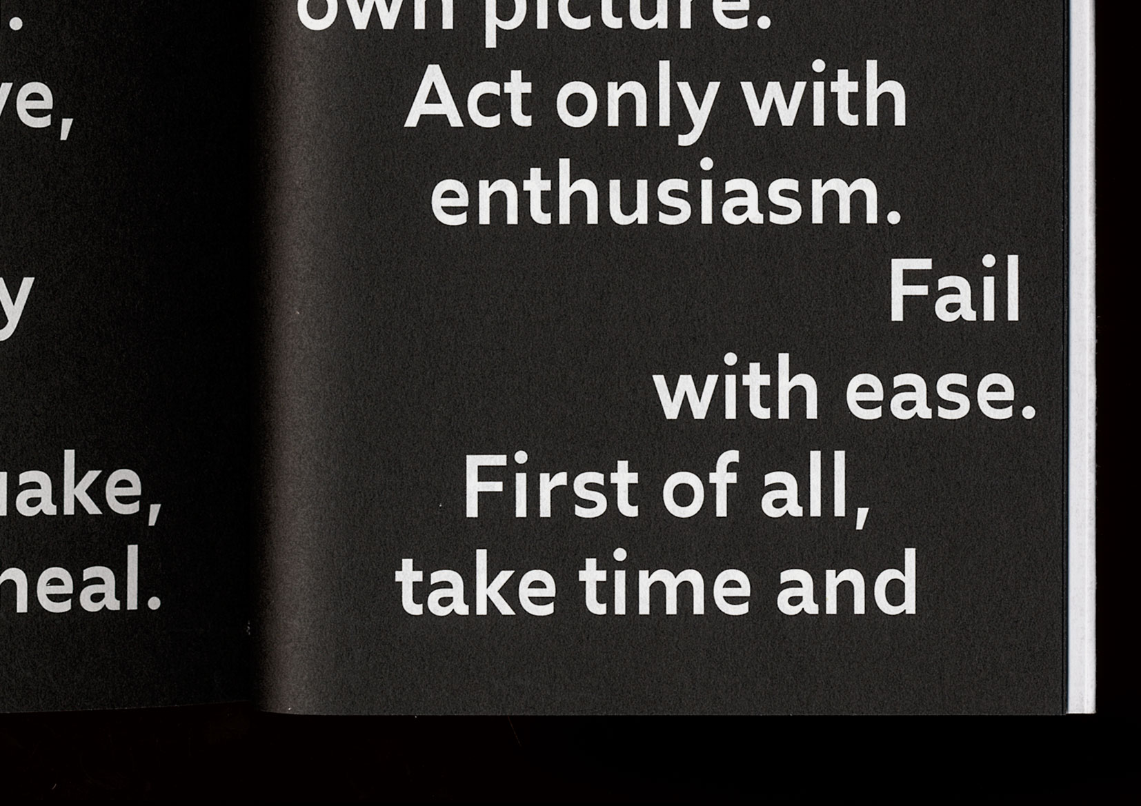
"MOB Préface is the name of this cute and 432-pages thick book we conceived and designed with and for MOB Hôtel, aiming to reflect the hospitality philosophy developed in their future hotels.
It gathers many inspirations and contributions in the form of texts, pictures, drawings etc. and was strictly typeset in Traulha. It has been beautifully printed and bound in Italy by Musumesci."
More fonts in use
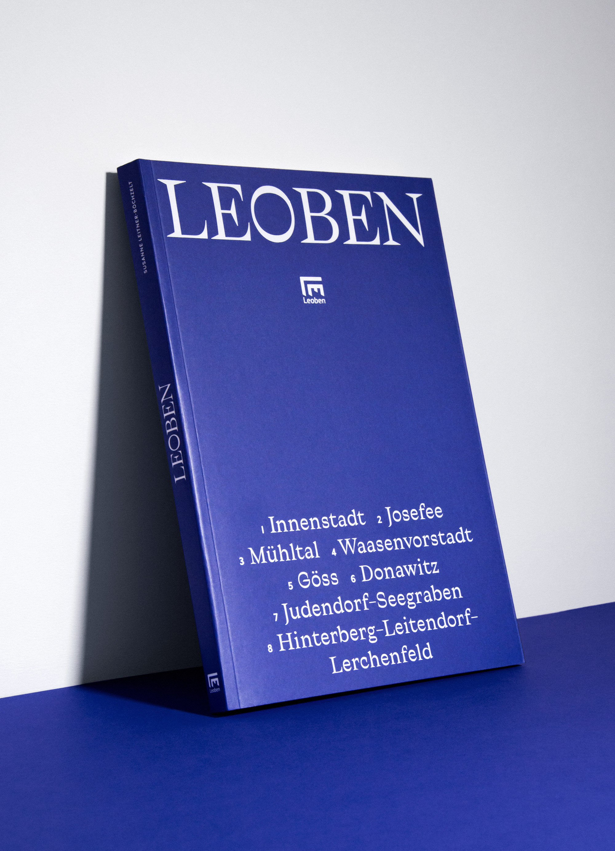
Traulha –
used by Marie Zieger for MuseumsCenter, City of Leoben
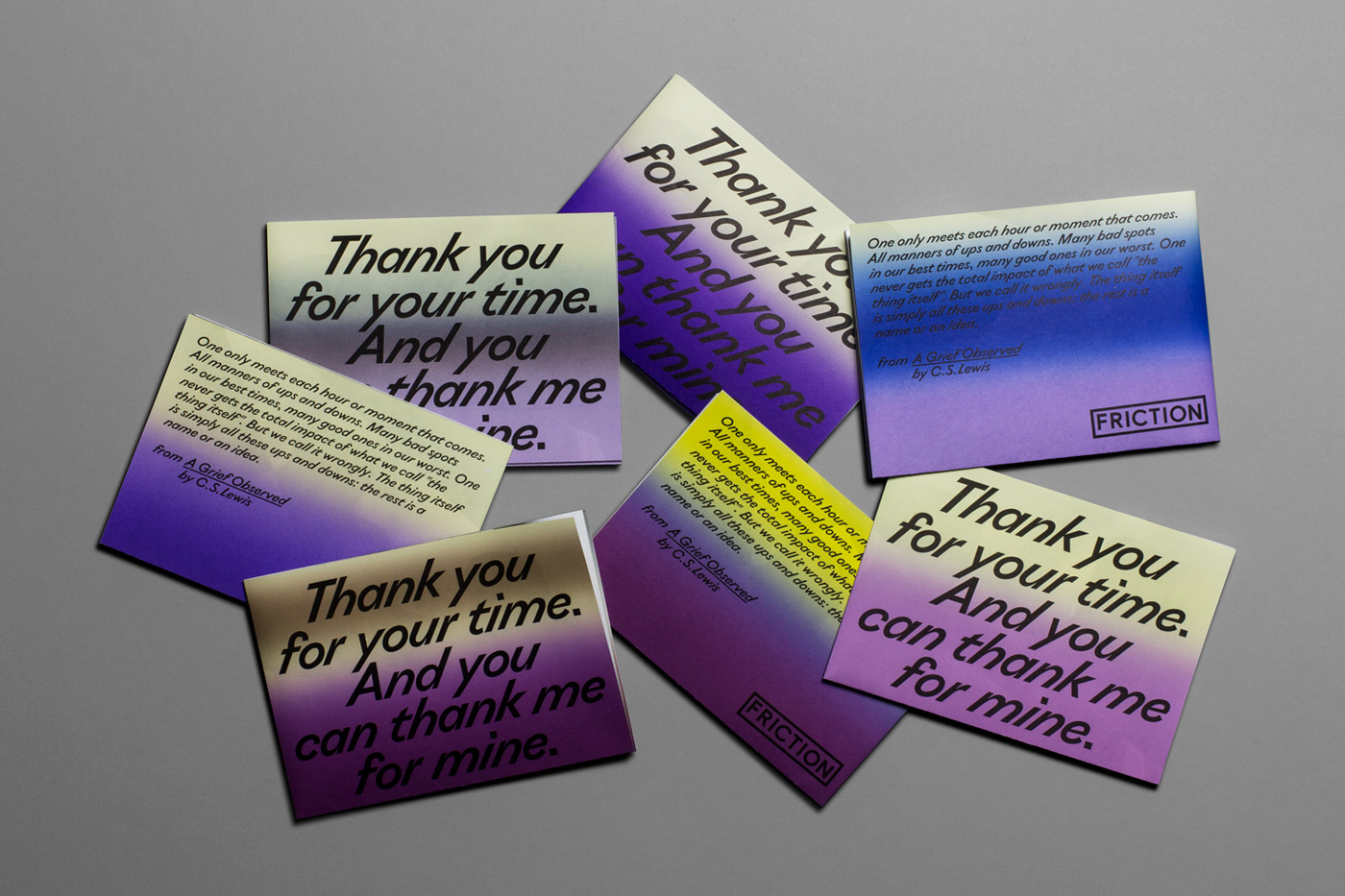
Ostia Antica –
used by Badesaison for Friction
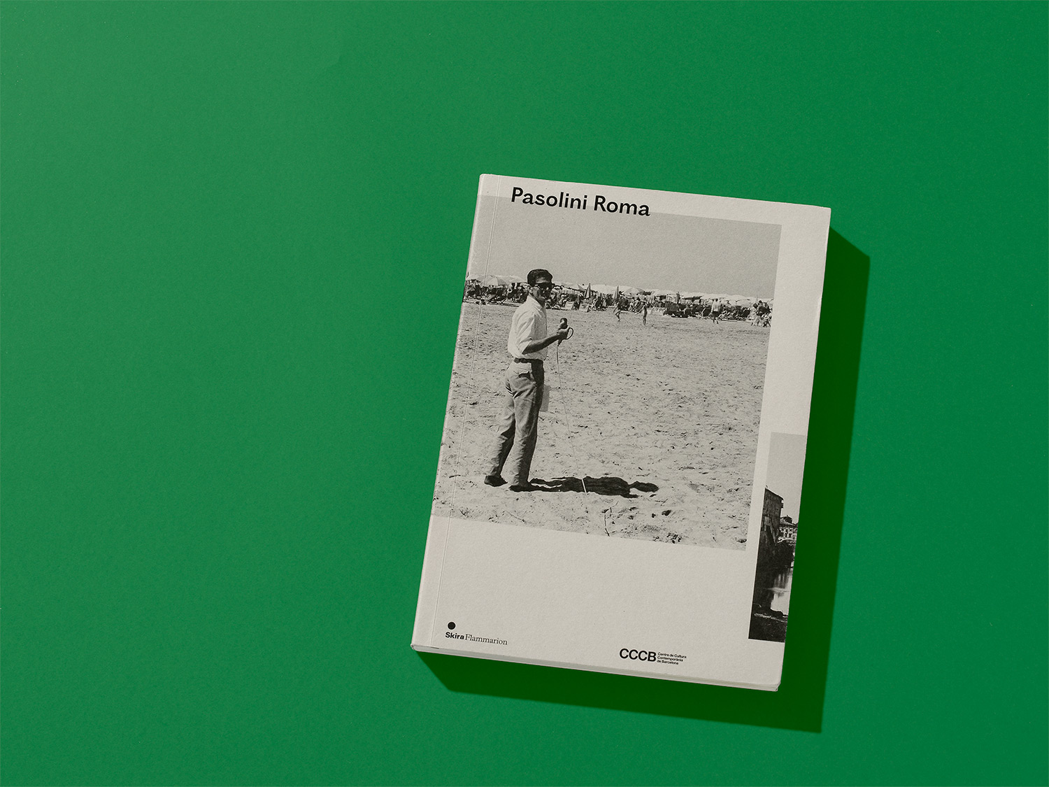
Did you use our fonts?
🡢 Share your project
🡢 Share your project