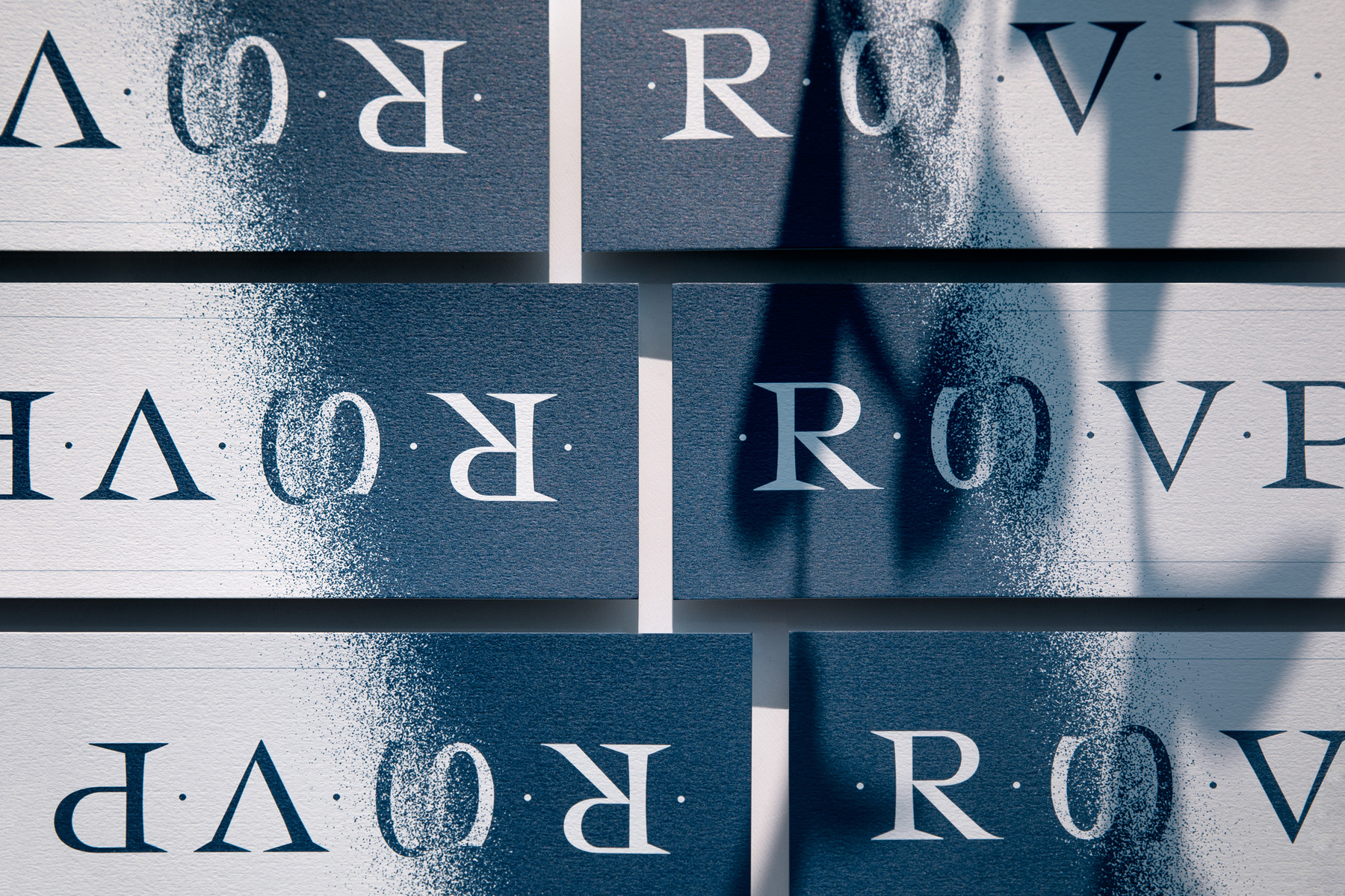
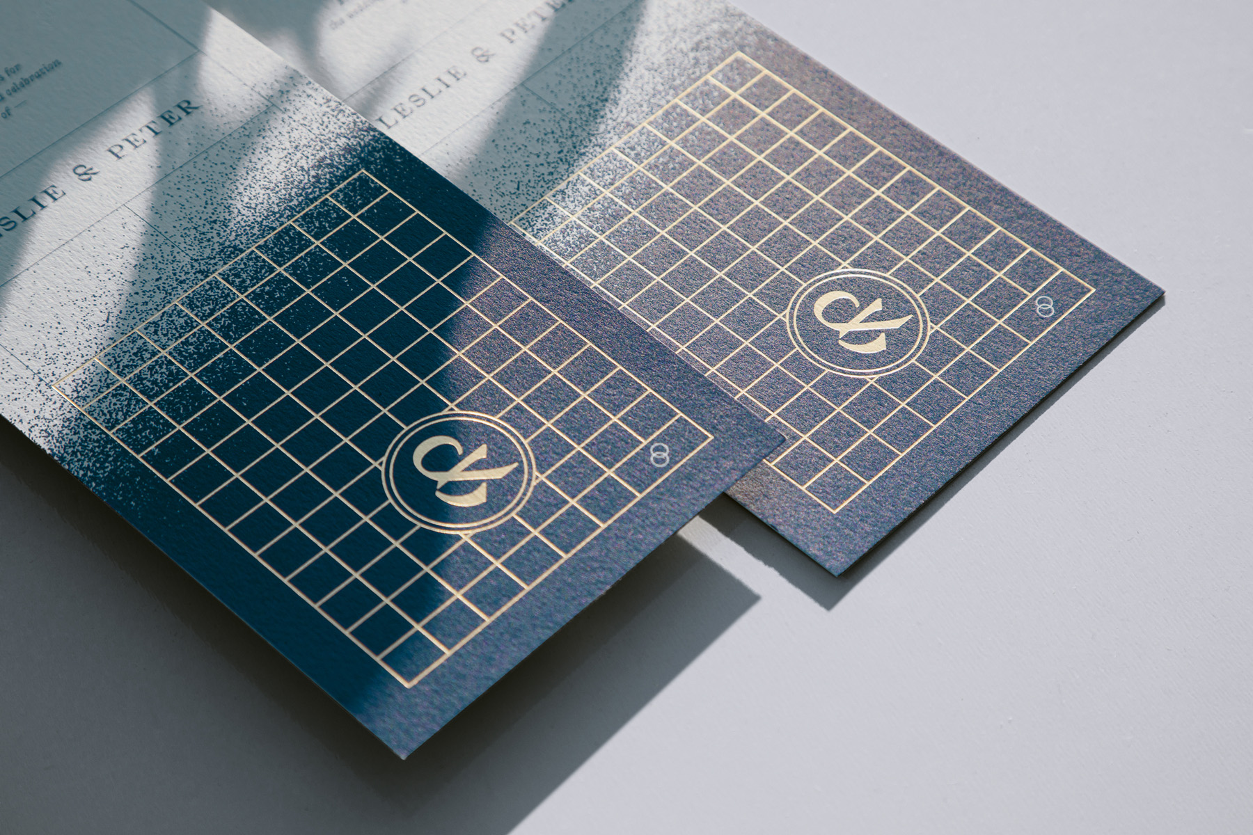
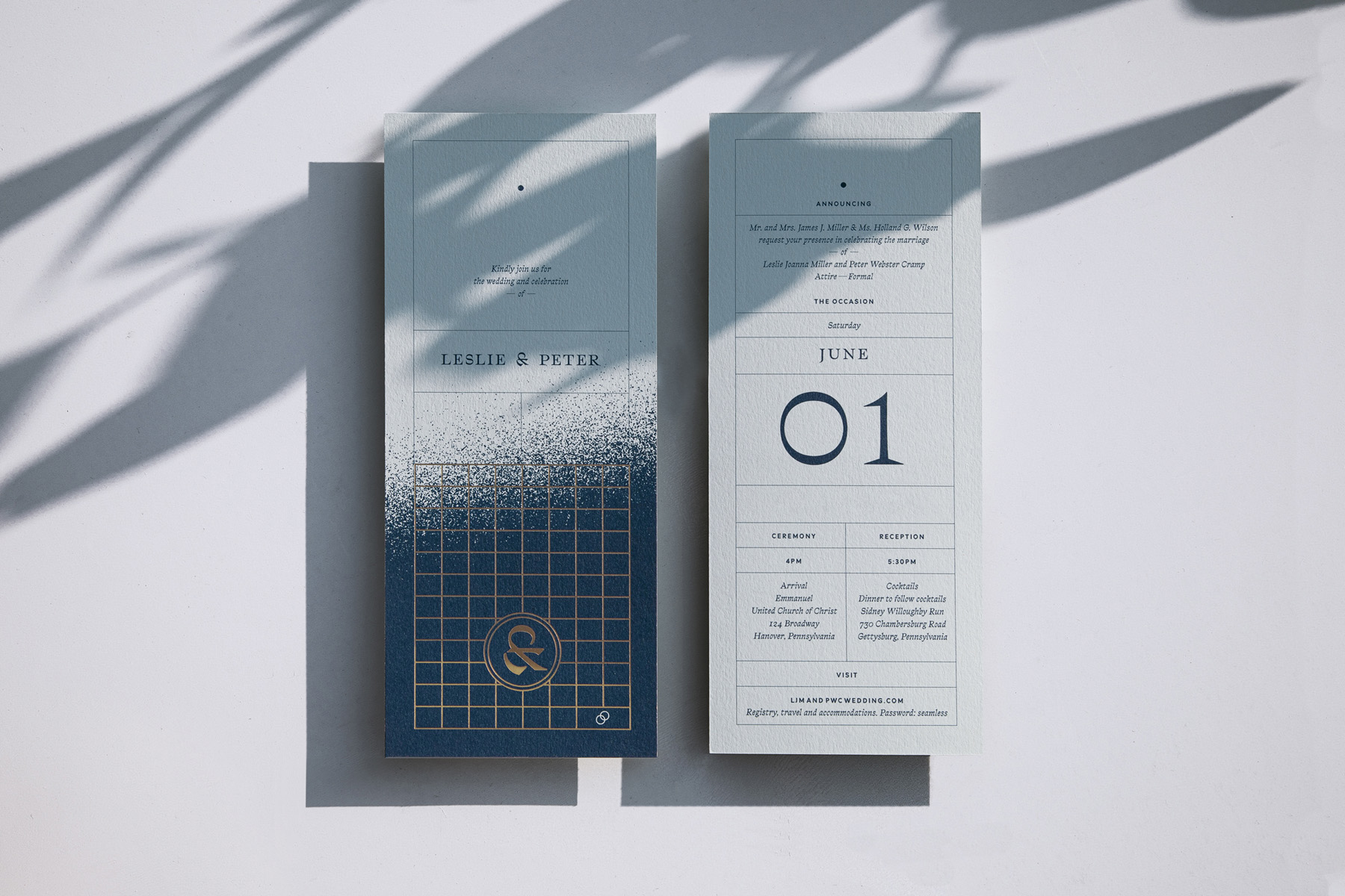
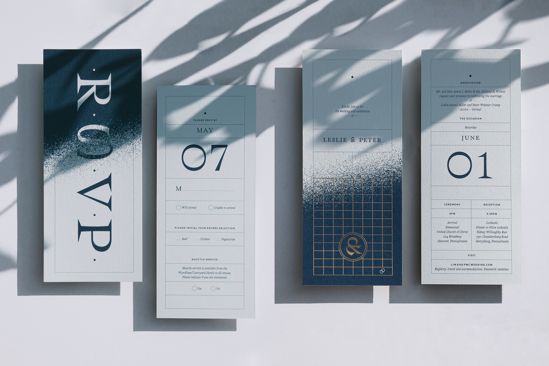
Uniting classic, contemporary and energetic tones, a combination of meaningful and personal graphic elements anchor this sharp and timeless custom wedding invitation design. A custom logo combining L and P as a unique ampersand, sits alongside strong, unexpected, edge-to-edge, handmade textural gradients. Balancing classic with fresh, the energy is made visual through large and loud use of Bureau Brut’s reverse contrast serif font, Traulha, supported by its sans-serif counterpart Traulha Lineara.
Representing the couples storied past and vast future, a foil stamped grid and textured gradient augment on-theme colors, gold accents and layered elements. The design is meant to feel spontaneous and structural, timeless and temporary.
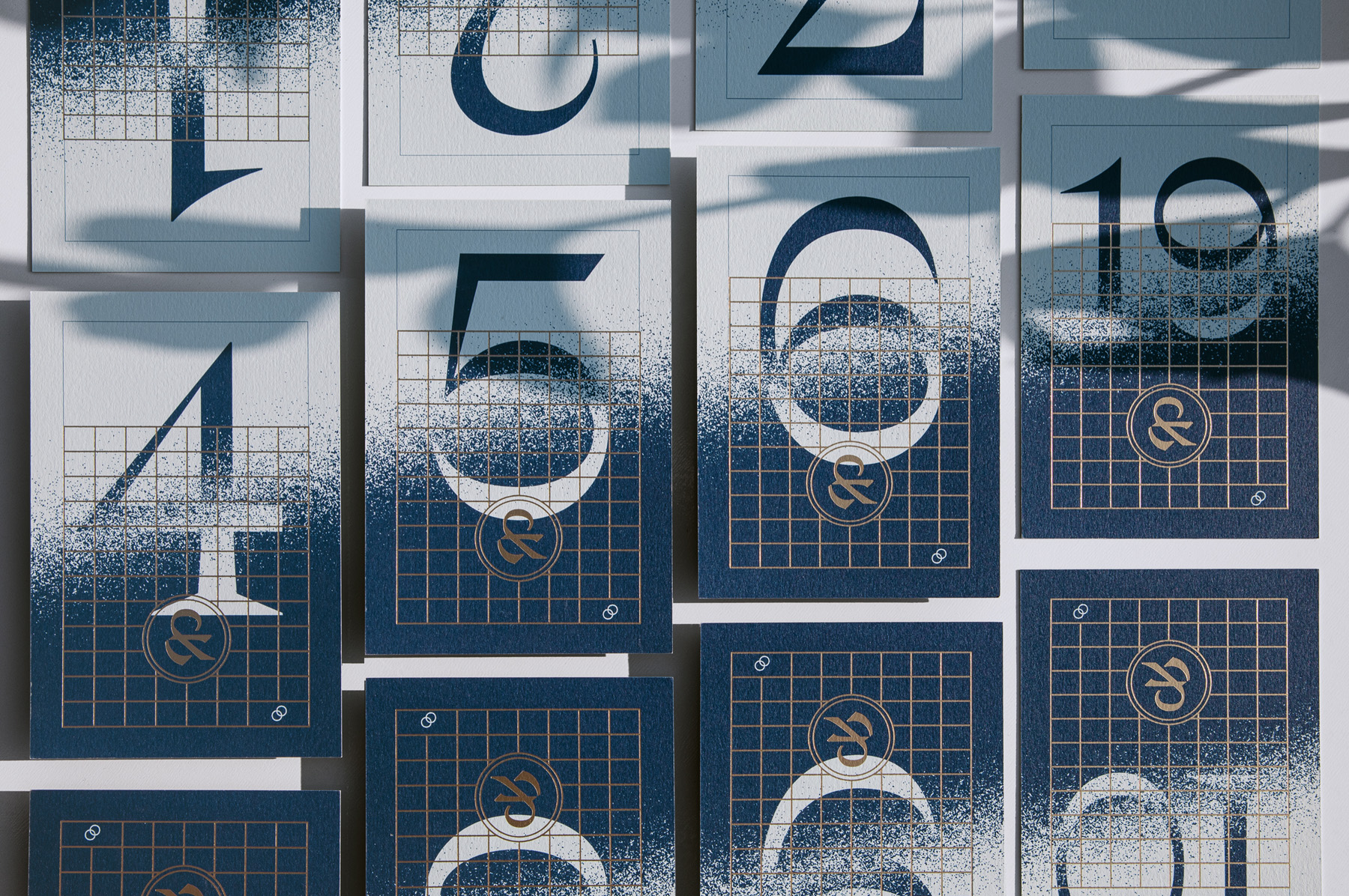
Pieces included: Overall event logo, invitation, RSVP cards, table number cards, envelopes and additional event branding.
Finishing and printing (1-color with gold foil stamping) was handled by Graphic Arts Studio. The chosen paper is Mohawk Keaykolour, Pastel Blue.
🡢 Partagez votre projet avec nous