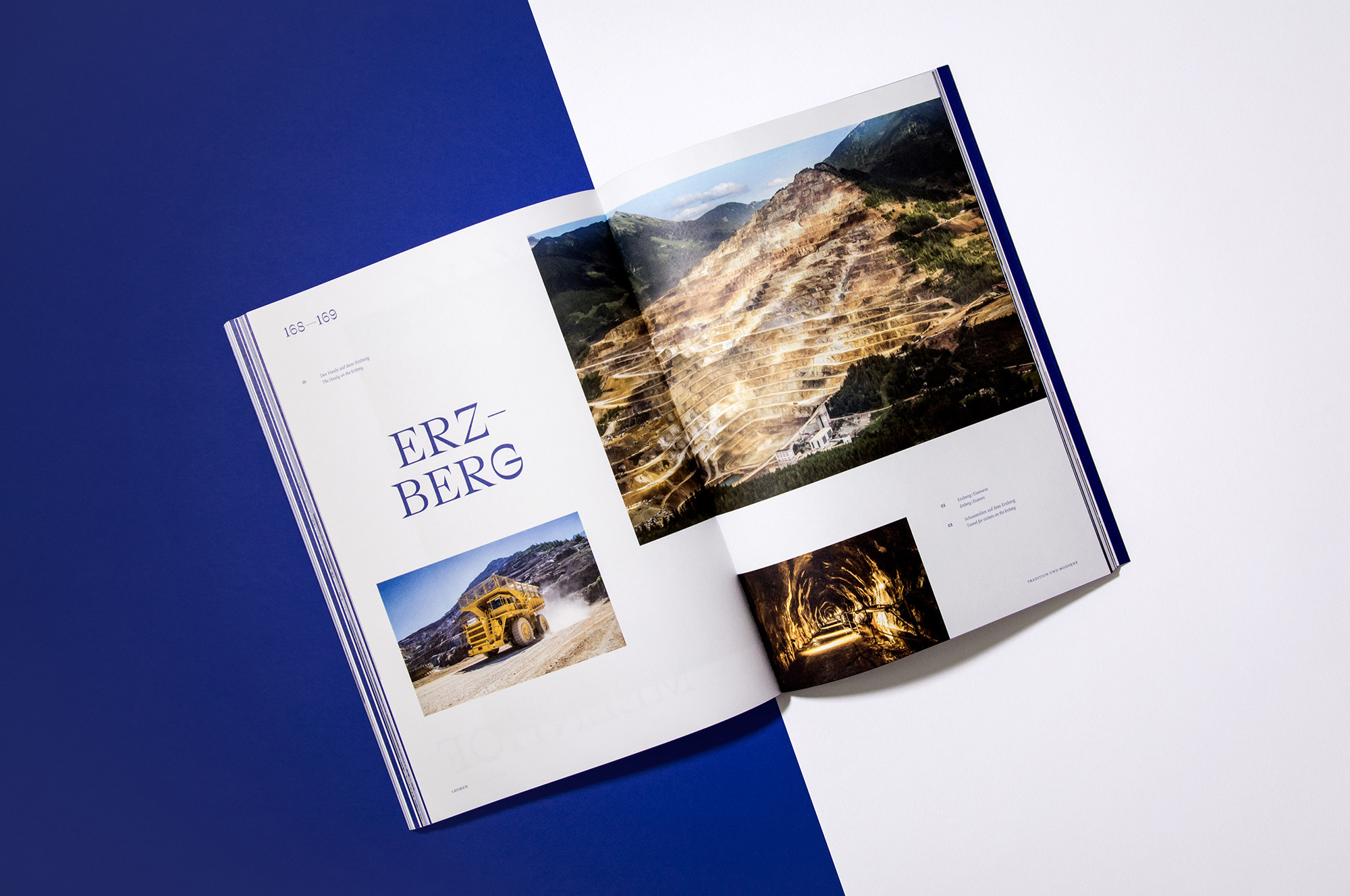
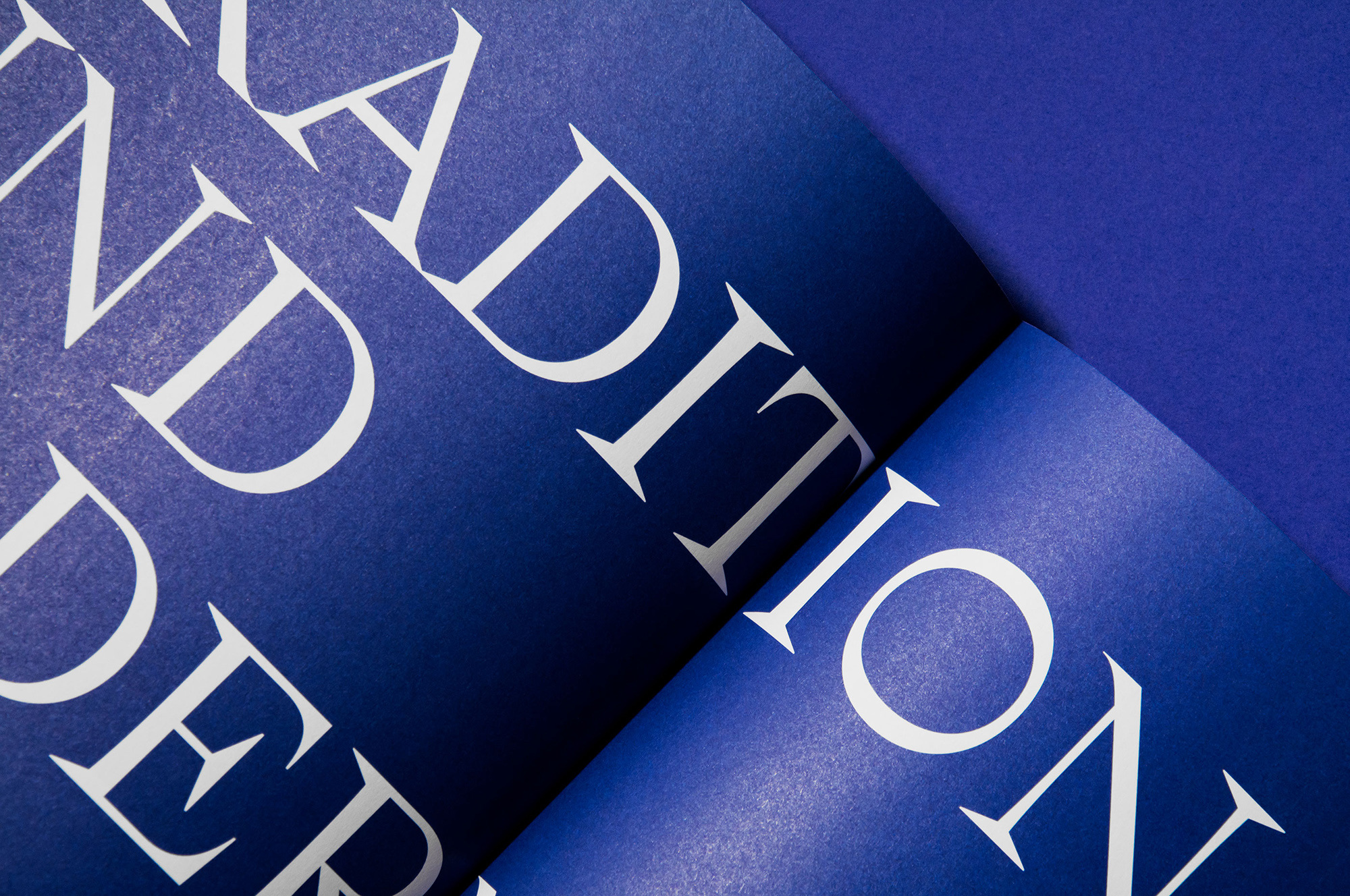
In cooperation with the MuseumsCenter & the City of Leoben, Studio Marie Zieger was in charge of art direction and editorial design for the city’s official self-titled photo chronicle. A new color theme & modular layout were developed to accompany the extensive use of large-scale imagery and to create a more contemporary look. The typography picks up on the theme of mining & steel production that the area is commonly known for.
More fonts in use
Ostia Antica –
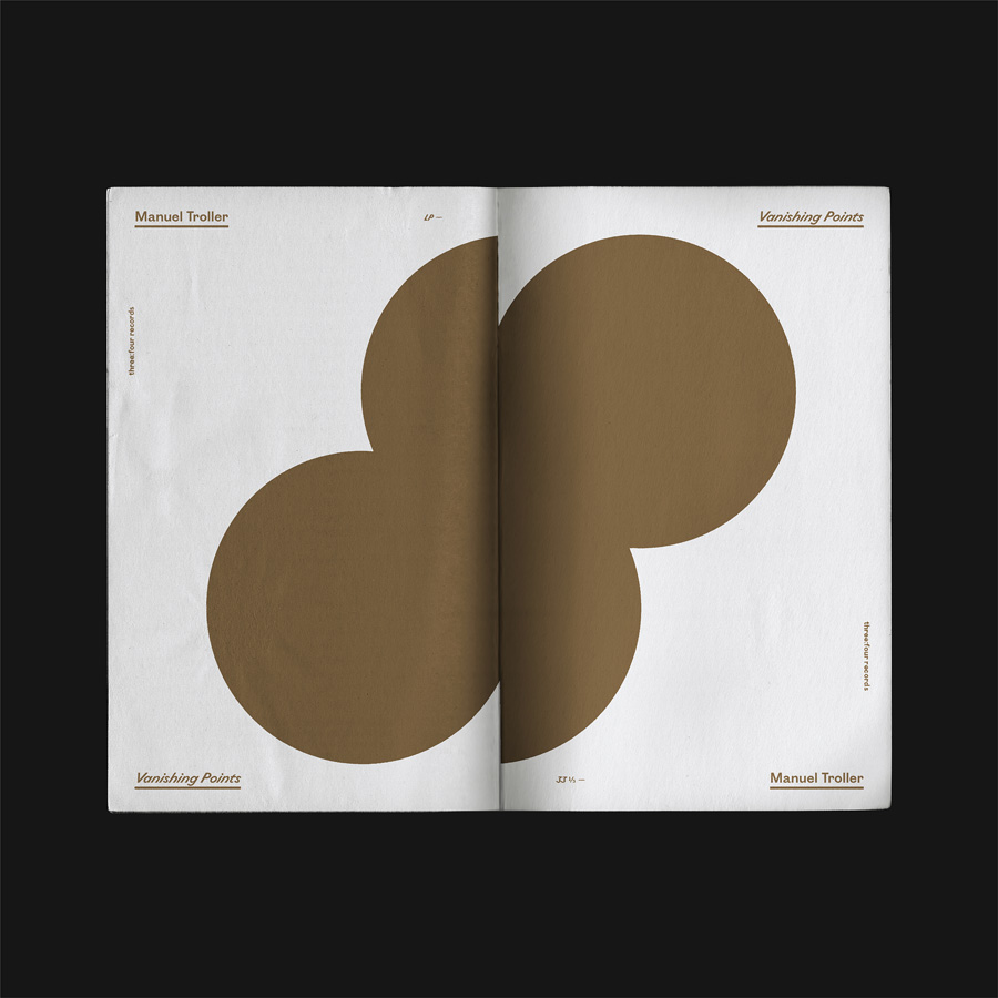
used by Brest Brest Brest for Manuel Troller
Totentanz –
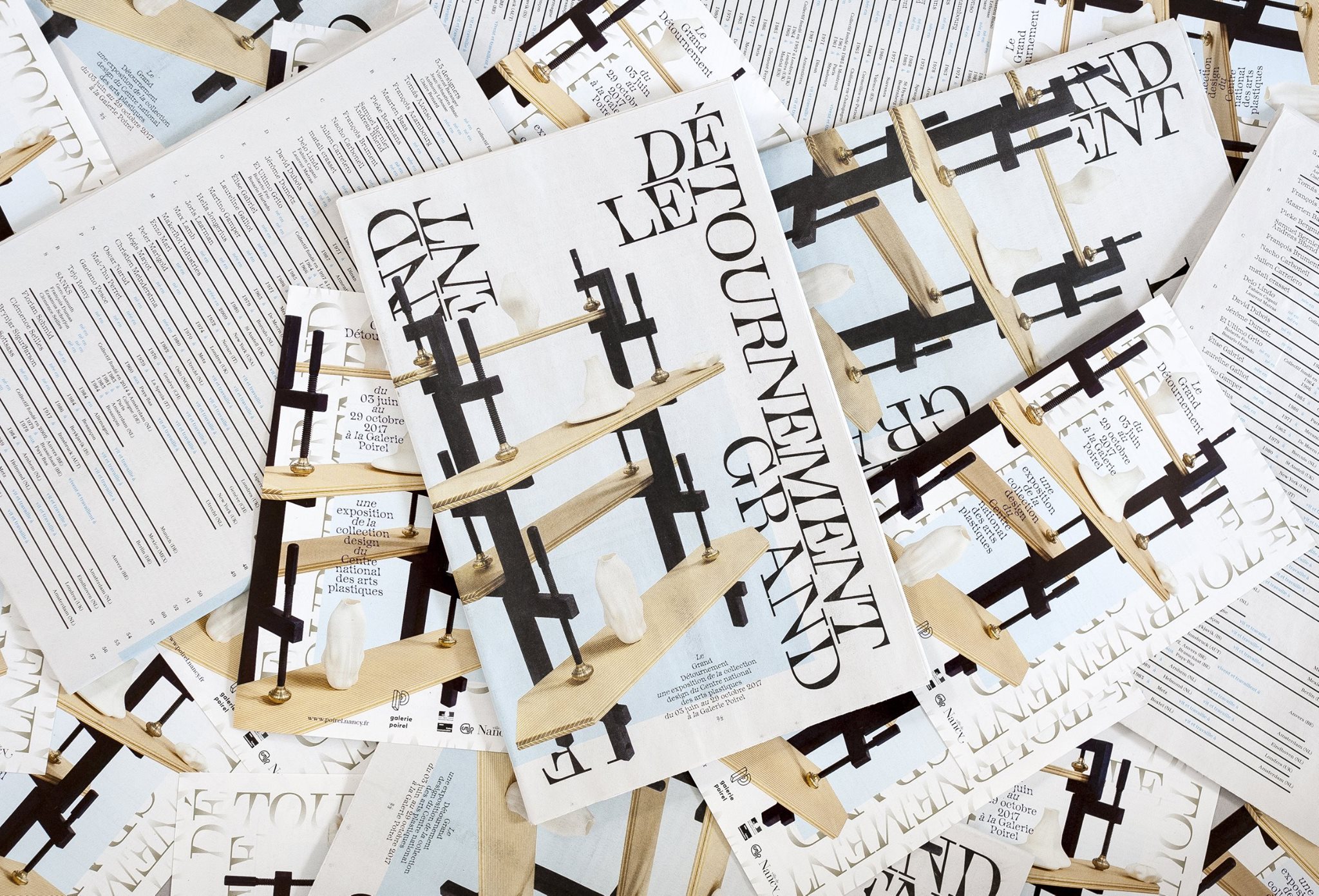
used by Lionel Catelan for Galerie Poirel (Nancy)
Avez-vous utilisé une de nos polices ?
🡢 Partagez votre projet avec nous
🡢 Partagez votre projet avec nous