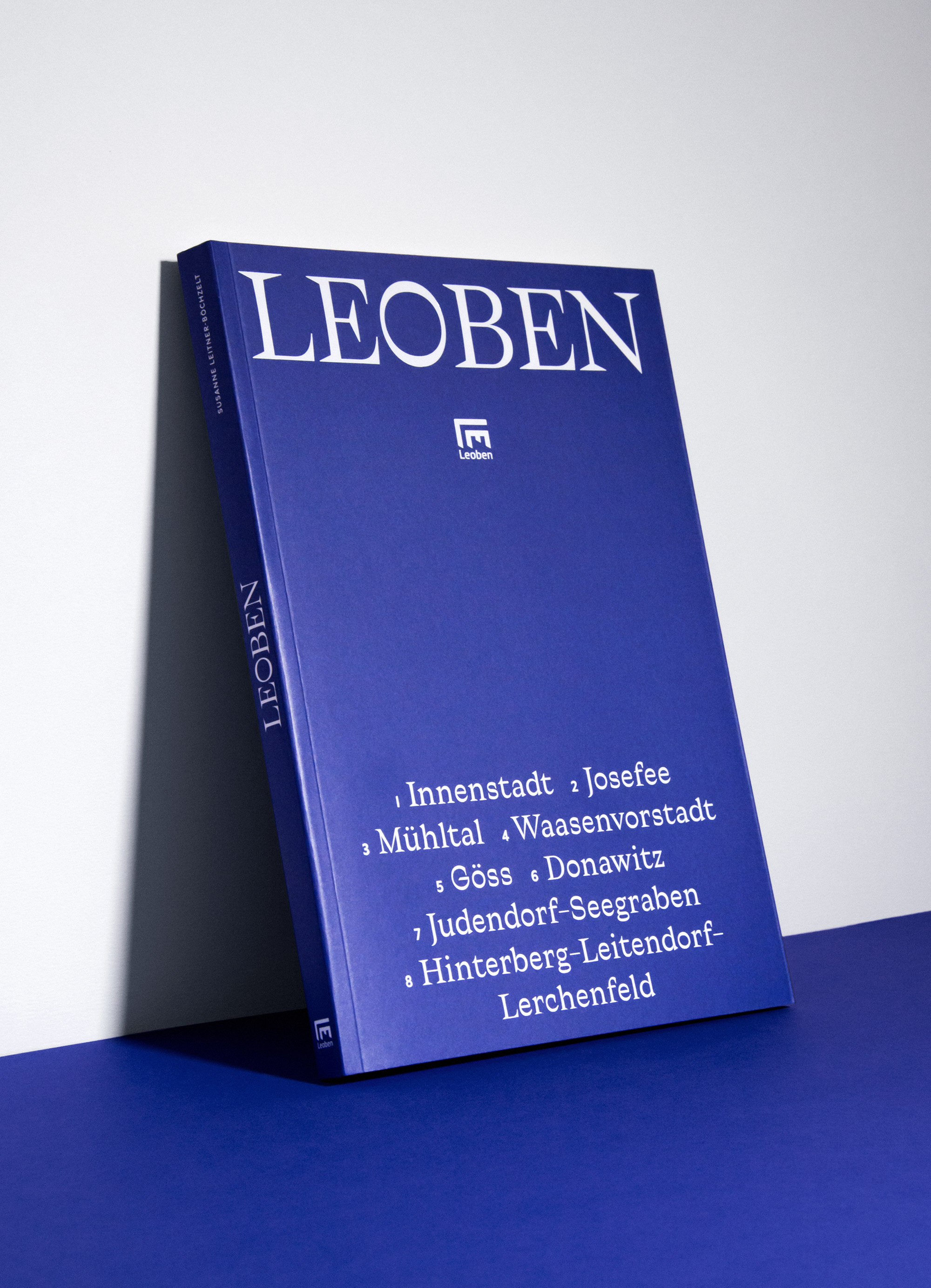
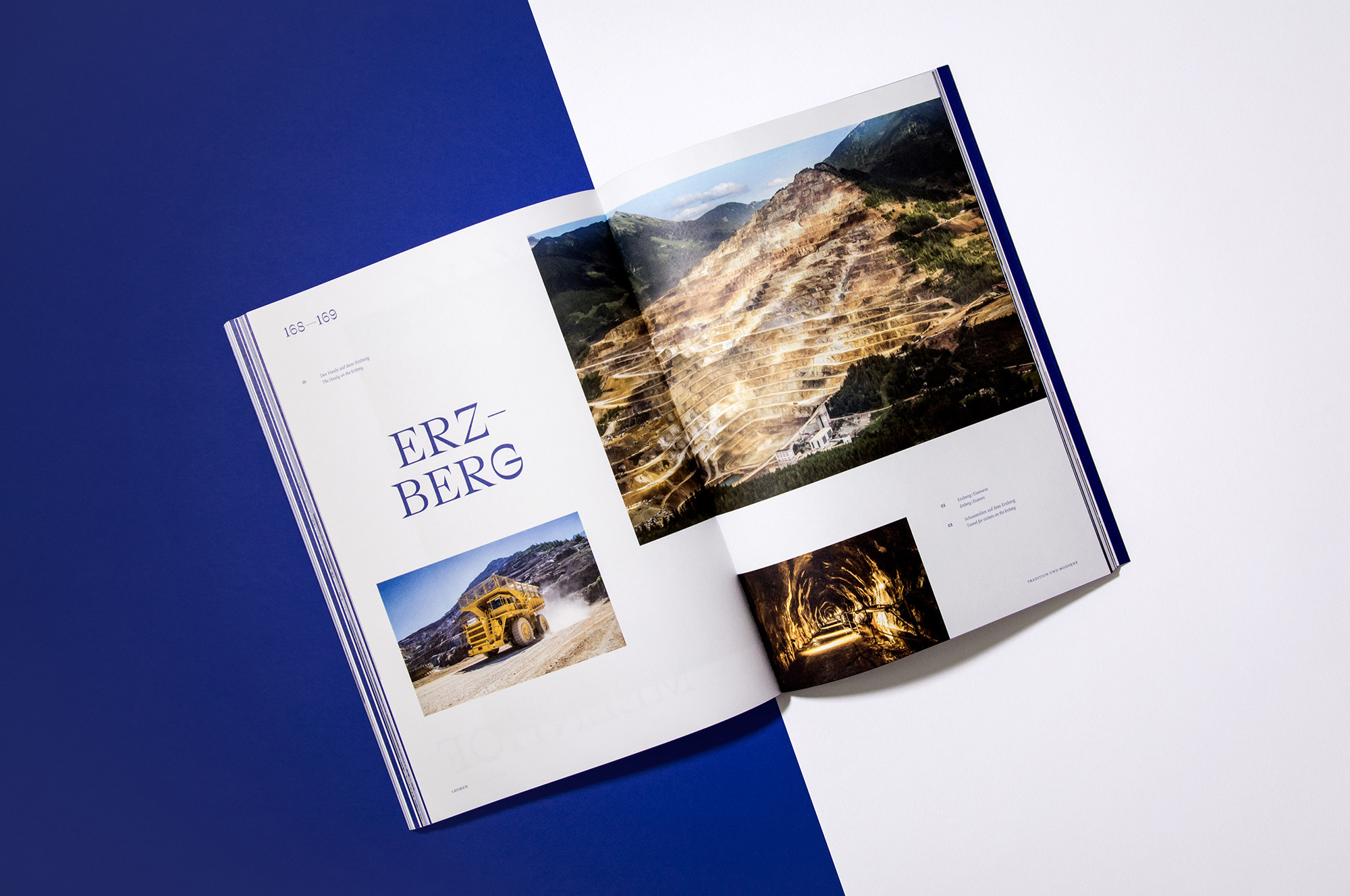
In cooperation with the MuseumsCenter & the City of Leoben, Studio Marie Zieger was in charge of art direction and editorial design for the city’s official self-titled photo chronicle. A new color theme & modular layout were developed to accompany the extensive use of large-scale imagery and to create a more contemporary look. The typography picks up on the theme of mining & steel production that the area is commonly known for.
More fonts in use
Traulha –
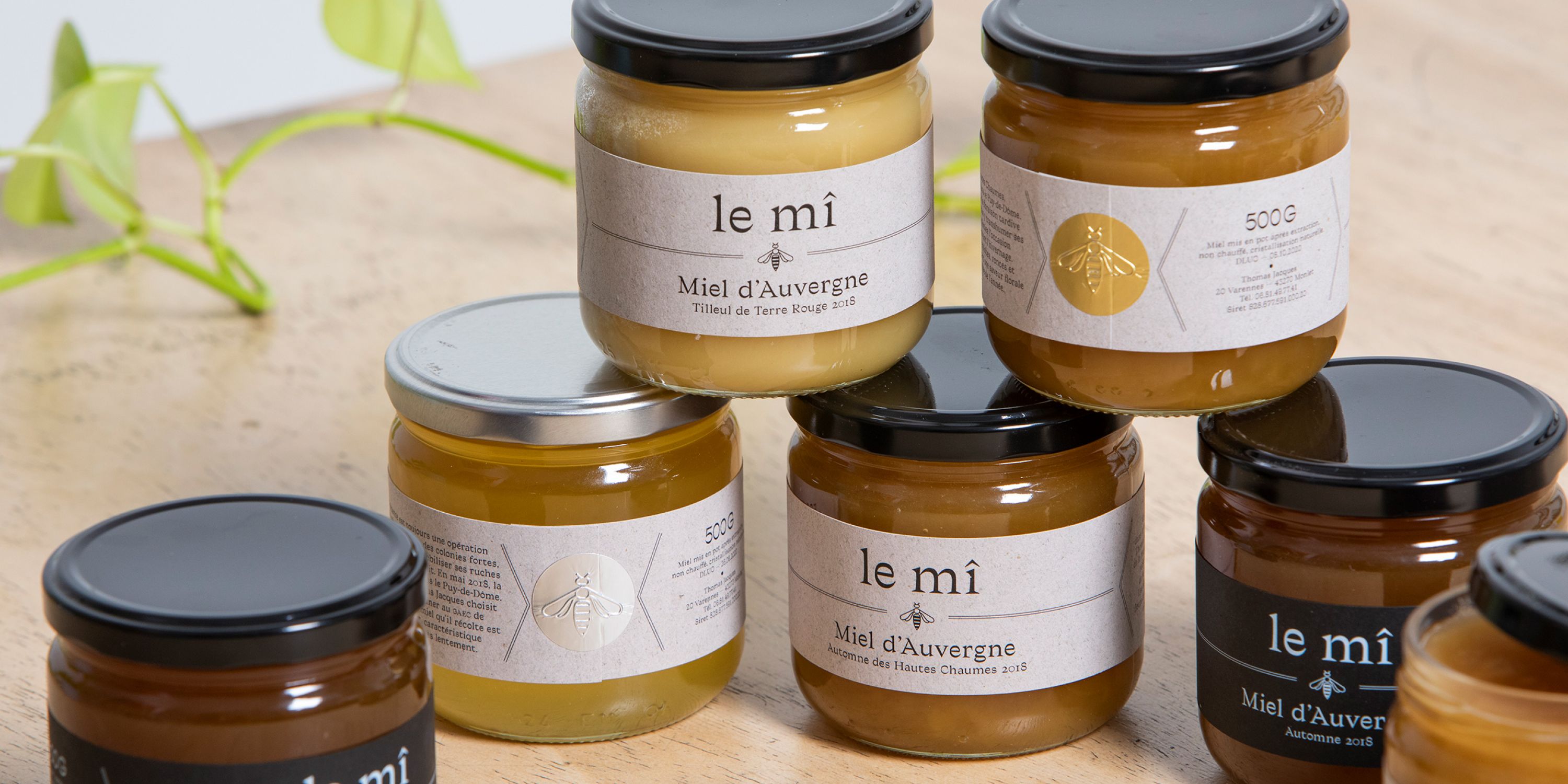
used by Travaux Pratiques for le mî
Roman Grotesque –
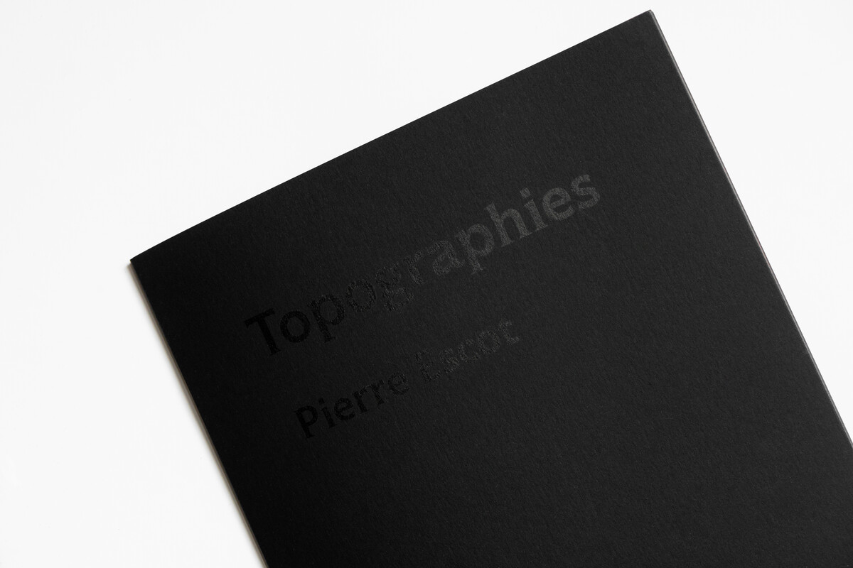
used by Alban Gervais for Éditions Paygraphie
Ostia Antica –
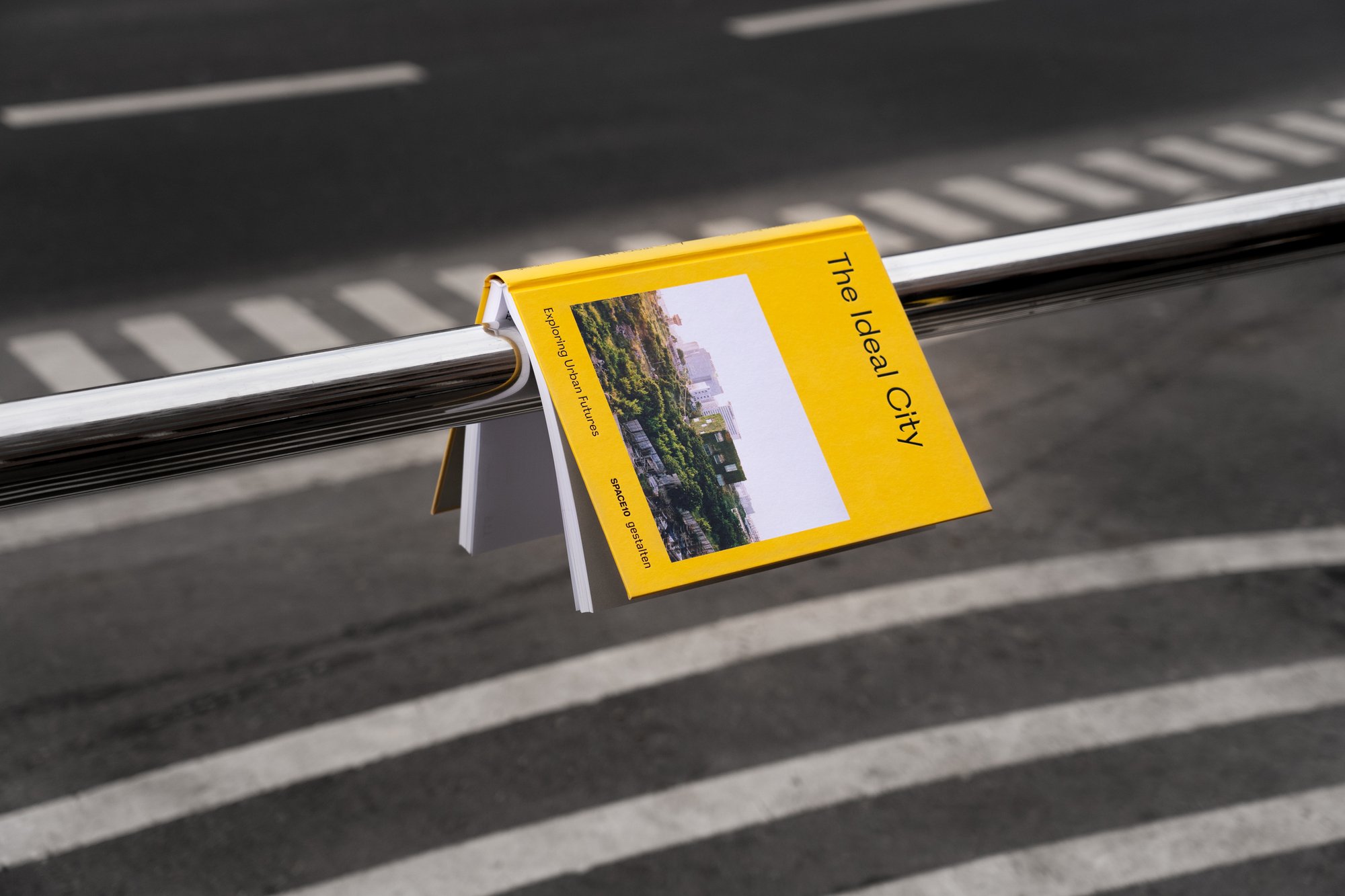
used by Spilenka for Gestalten
Did you use our fonts?
🡢 Share your project
🡢 Share your project