Unity
Love
&
Havin’
Fun
Boogy Brut
- Art Direction:
Julien Priez & Yoann Minet
- Typeface design:
Julien Priez & Yoann Minet
- Design date:
2020
- Published by:
Bureau Brut
- Initial release:
Romans: 2020, Italics: 2022
- Current version:
2.1
But, by the way, who is Boogy Paper?
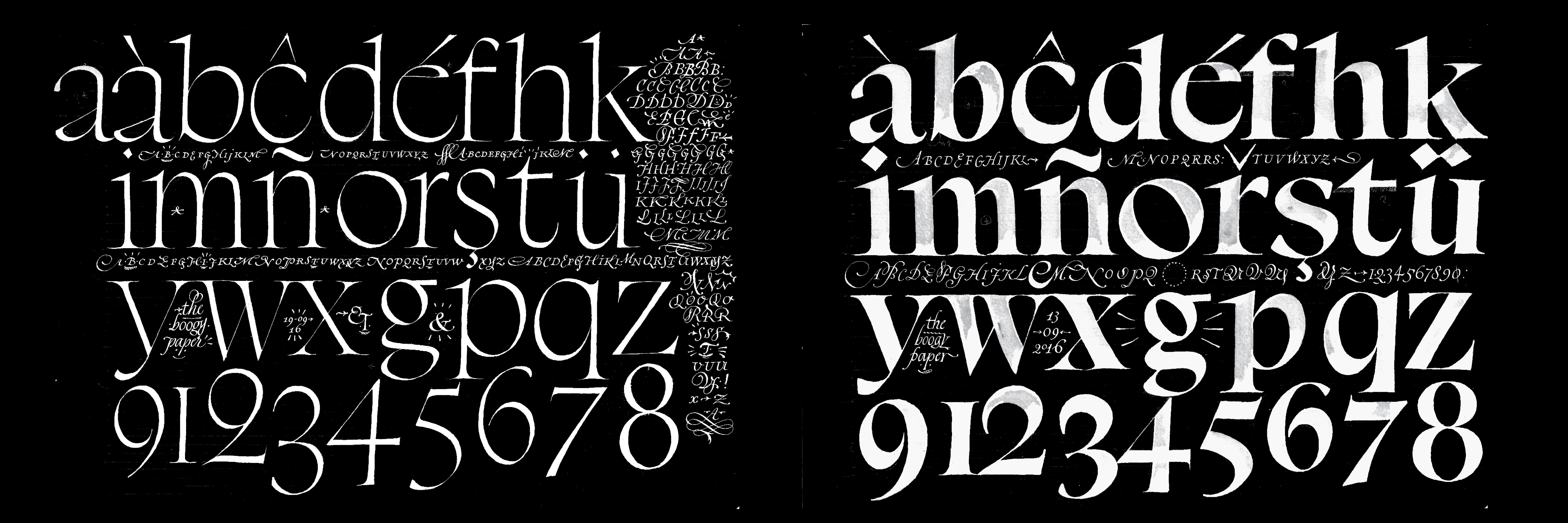
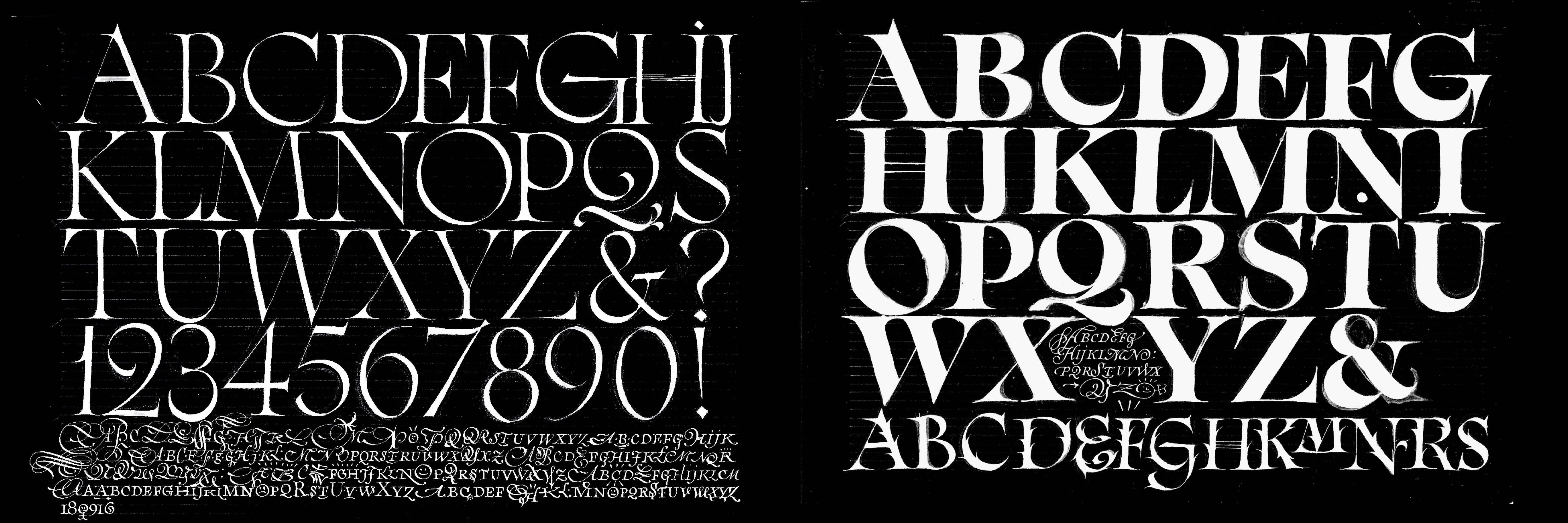
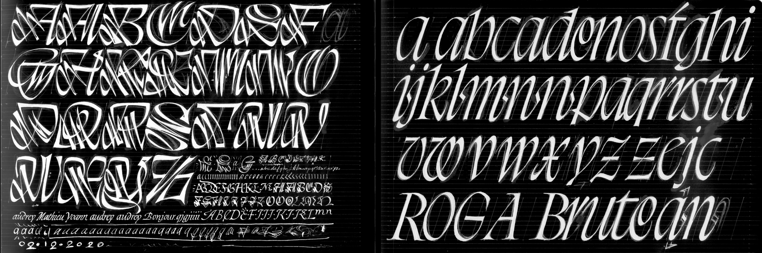
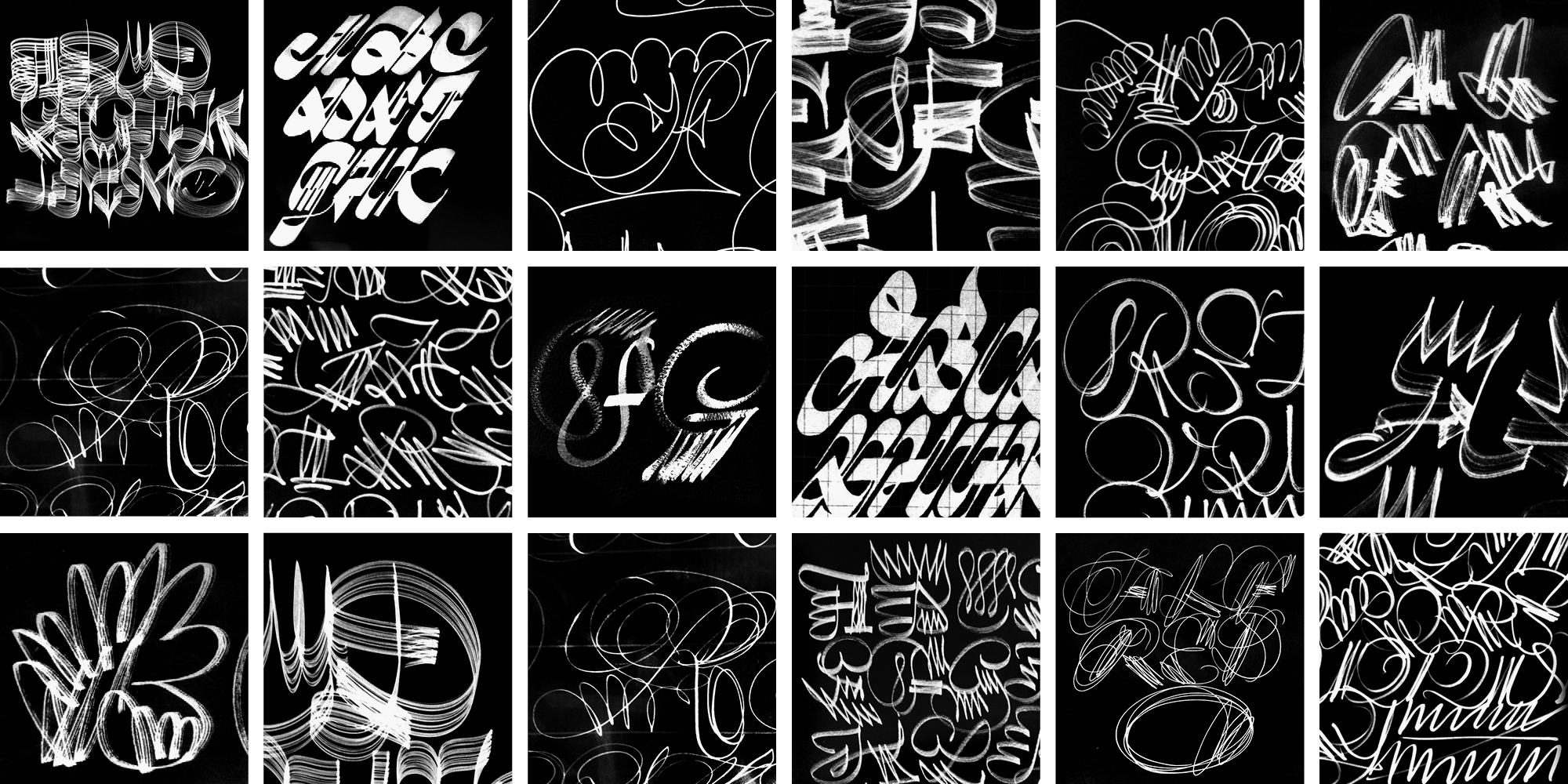
Julien Priez, aka Boogy Paper, is a calligrapher and type designer, and a member of the “High On Type” collective. His work is heavily indebted to designers such as Oscar Ogg or Berthold Wolpe, who similarly envisioned calligraphy and lettering not necessarily as ends in themselves but as key steps within an overall creative process. This approach has informed parts of the design of Boogy Brut, which is a true contemporary digital typographic family and not merely a typeface influenced by calligraphy. Sharply modelled shapes reveal the structural qualites of the written models but do away with the handmade imperfections caused by the writing tools or the texture of the paper. Boogy Brut thus is free from any reference to a particular model, rather a synthesis of various researches and experiments endeavoured by Julien over the past few years.
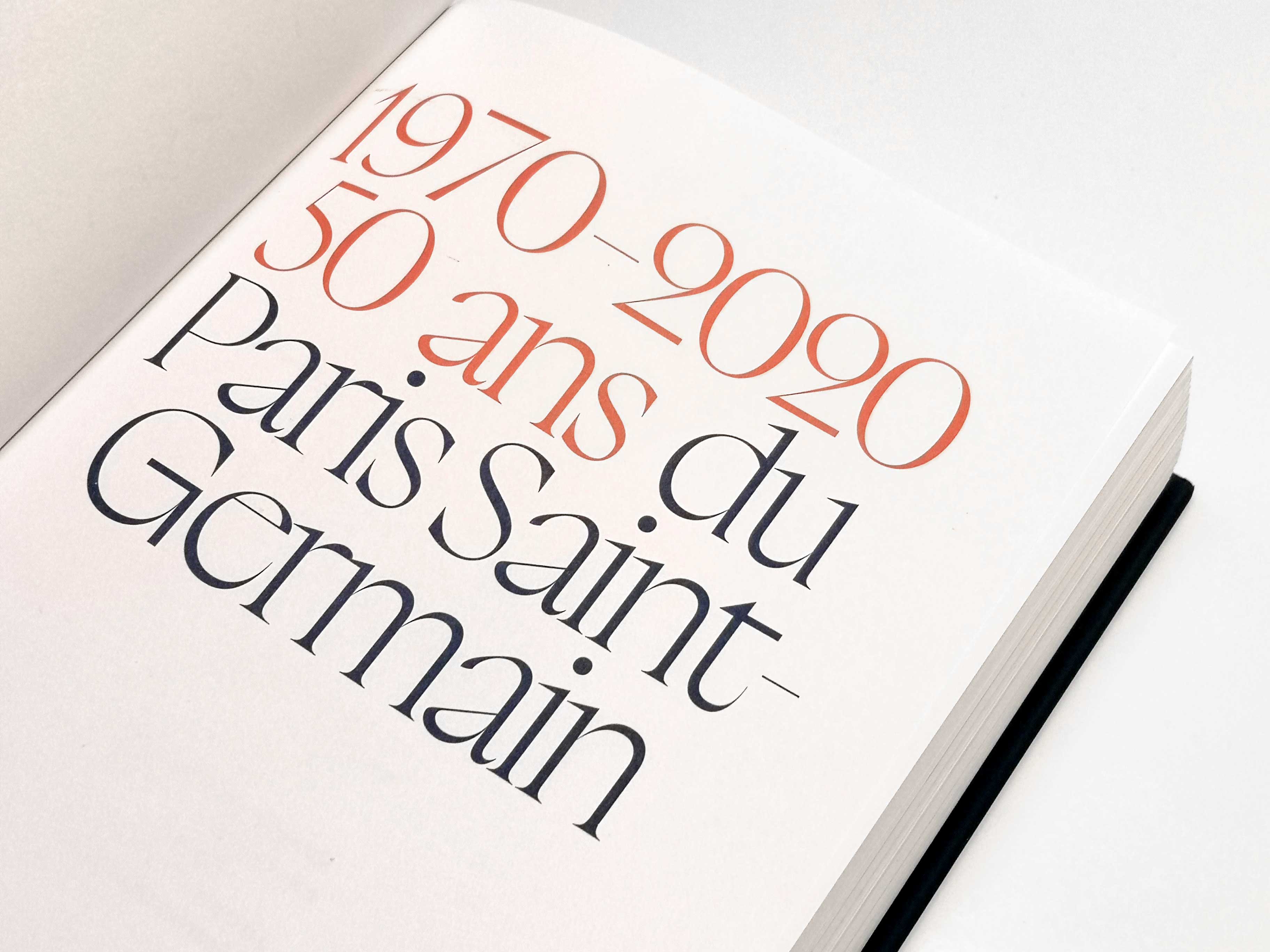
The Boogy Brut family offers a wide spectrum of uses, from drop caps to poster type to text sizes. Every subfamily benefits from a specific formal approach while staying firmly within the frame of the larger whole.
The “Wild” versions are designed like initials: far from the traditional “quest for legibility”, they tread the boundaries between graphic design and pure art.
The “Poster” subfamily, which is intended for display use, is comparatively closer to the calligraphic sources than the other two. In order to achieve the narrowest fit, its shapes have been fine-tuned to allow for very close spacing — for instance, the finials of each letter were drawn so that the transition from one letter to the next remains organic and harmonious, and some pairs even create “natural” ligatures between touching letters.
The last subfamily is optimized for text setting in small sizes, with an extended character set and numerous OpenType features. Nevertheless, this vibrant design has inherited from its “Poster” siblings’ strong temper, and is anything but classical.
Boogy Brut is part of the Boogy Brut Collection
-
- Boogy Brut Light
- Boogy Brut Light Italic
- Boogy Brut Book
- Boogy Brut Book Italic
- Boogy Brut Regular
- Boogy Brut Italic
- Boogy Brut Medium
- Boogy Brut Medium Italic
- Boogy Brut Bold
- Boogy Brut Bold Italic
-
- BBWW
- BBWB
-
- Boogy Brut Poster White
- Boogy Brut Poster White Italic
- Boogy Brut Poster White Wild
- Boogy Brut Poster Black
- Boogy Brut Poster Black Italic
- Boogy Brut Poster Black Wild
Family overview
Type tester
OpenType features
Character set
🡢 Share your project