I write & display
Chaos
Boogy Brut Poster
- Art Direction:
Julien Priez & Yoann Minet
- Typeface design:
Julien Priez & Yoann Minet
- Design date:
2020
- Published by:
Bureau Brut
- Initial release:
Romans: 2020, Italics: 2022
- Current version:
2.1
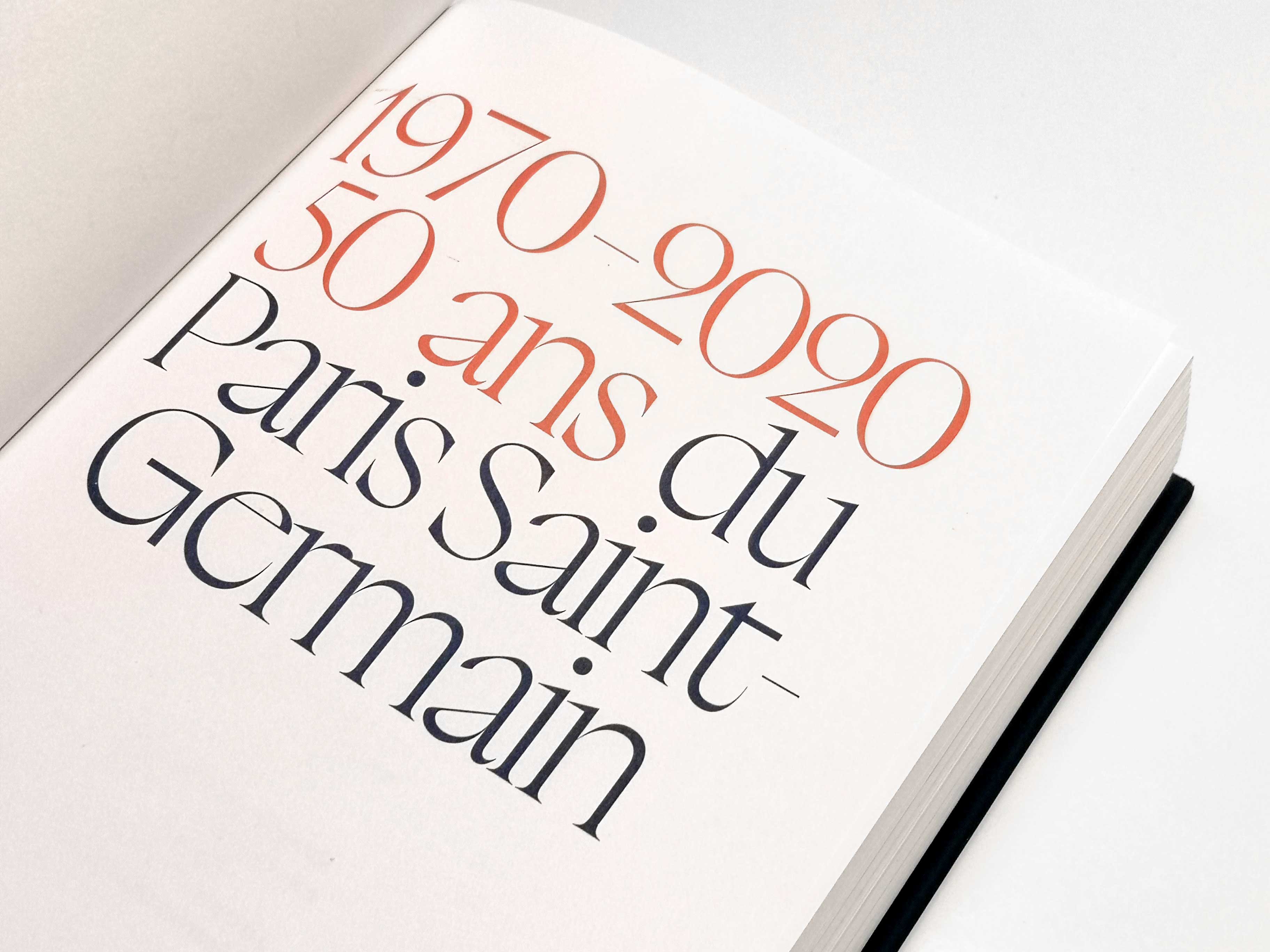
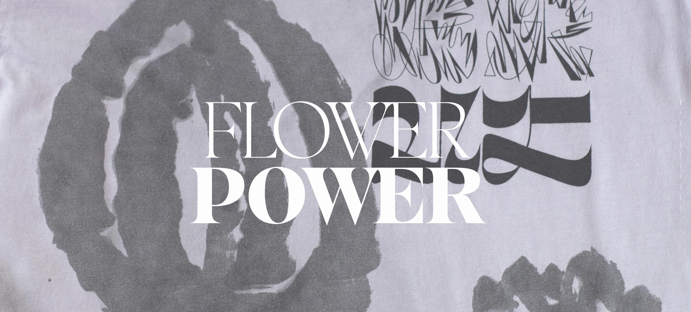
Boogy Brut Poster is one of the starting points of the collection. It was built using the alphabet models drawn by Julien Priez, and it still is the closest version to his initial research. However, it does not aim to copy hand writing. Here, calligraphy is interpreted, simplified and reconstructed like vectorial typographic matter. Inside the collection, Boogy Brut Poster acts as a middle ground between Boogy Brut Wild and Boogy Brut, between the freedom of the image-letter and the discipline of running text. It makes possible the transition between initial letter to paragraph, between gesture and reading. Made for big sizes and displays, the tracking is purposely tight to create more density in spontaneous ligatures and surprising connections.
The italics express this transition by reinterpreting ornamental calligraphic capitals. Their traditionally very wide and difficult nature has been transformed into “introverted swashes”: ornaments contained into the letters’ spacing. It allows creating ornamental capitals freely, without the usual restraint of overflowing swashes or the need for specific adjustments. This construction also enables entire adorned capital creations.
Boogy Brut Poster confronts the main principles of calligraphy: the organic integration of movement and ornament, to the constraint of typographic compositions. It doesn’t replicate a writing style, but it rather translates the expressive qualities into a coherent and flexible typographic system. If most calligraphic typesettings are designed for one particular word or context, Boogy Brut goes even further. It is a sensitive type family, which emotional intensity evolves depending on the scale and context of use. From running text to initials, the collection’s expressiveness becomes gradually more personal, free and unique. 1
- Boogy Brut is made for paragraphs and long texts. It is practical, general and balanced. Boogy Brut Poster is made for words, sentences and short texts. It is impactful, expressive and vibrant. Boogy Brut Wild is made for initials and short typesettings. It is sentimental, personal and eloquent.
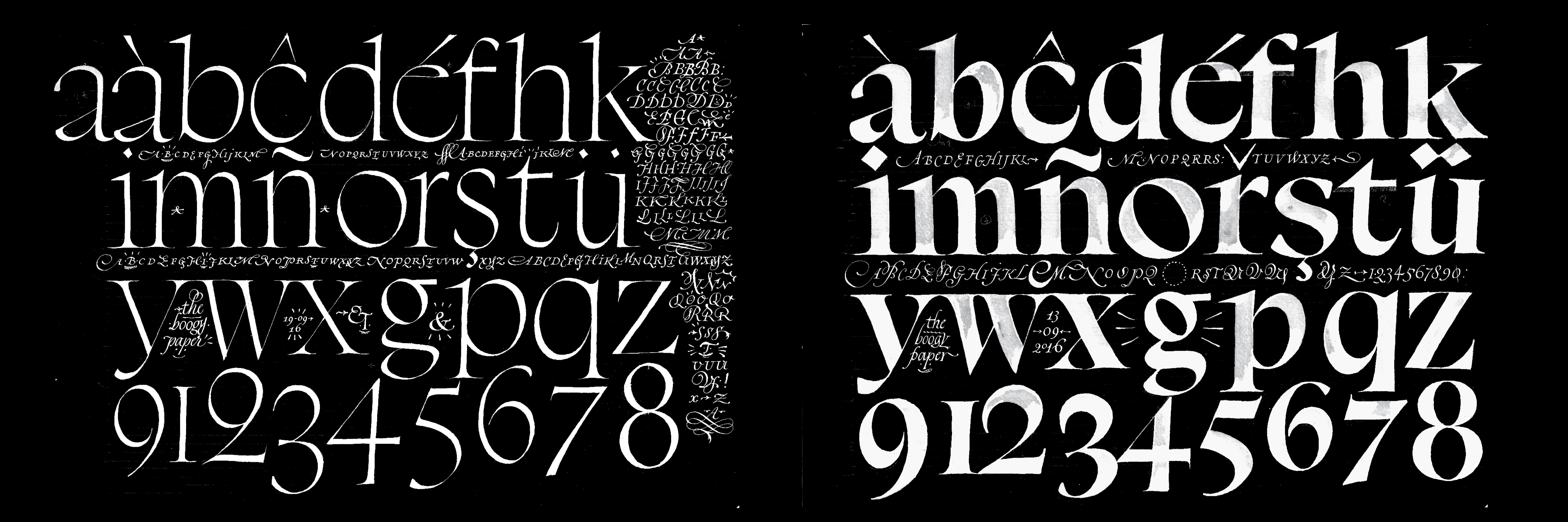
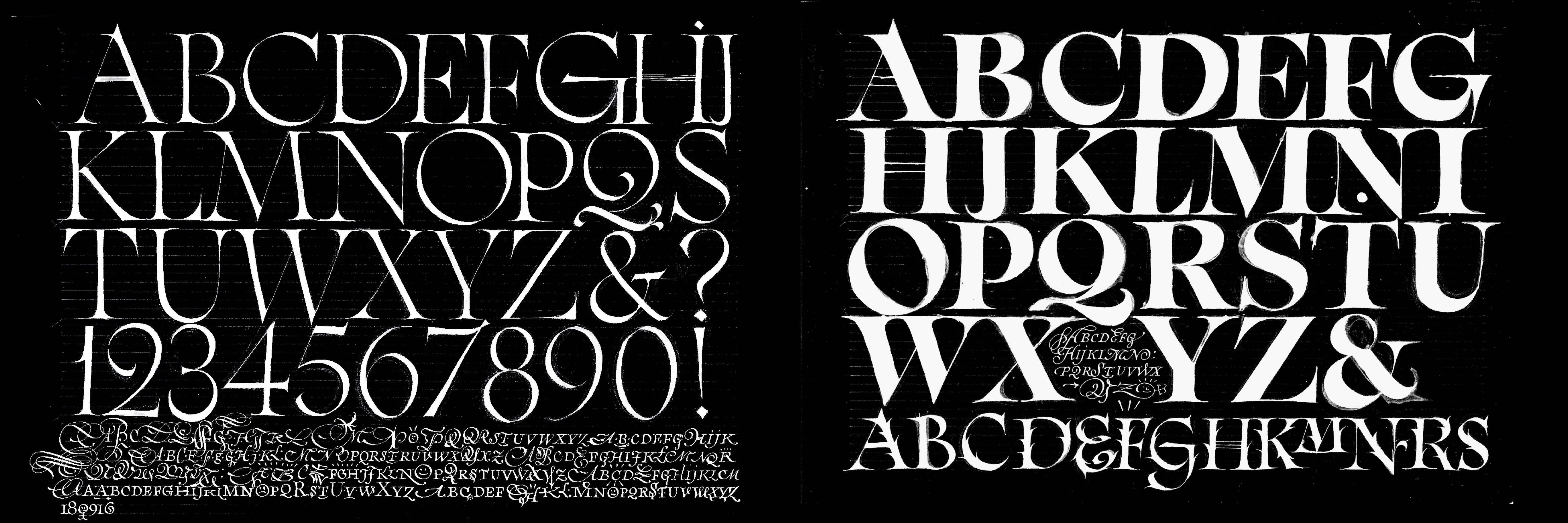
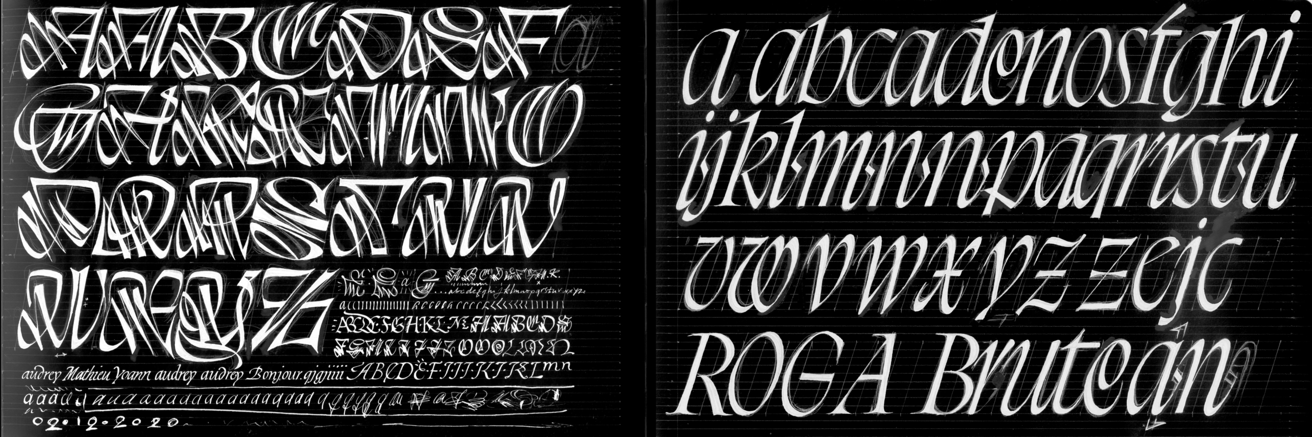
Boogy Brut Poster is part of the Boogy Brut Collection
-
- Boogy Brut Light
- Boogy Brut Light Italic
- Boogy Brut Book
- Boogy Brut Book Italic
- Boogy Brut Regular
- Boogy Brut Italic
- Boogy Brut Medium
- Boogy Brut Medium Italic
- Boogy Brut Bold
- Boogy Brut Bold Italic
-
- BBWW
- BBWB
-
- Boogy Brut Poster White
- Boogy Brut Poster White Italic
- Boogy Brut Poster White Wild
- Boogy Brut Poster Black
- Boogy Brut Poster Black Italic
- Boogy Brut Poster Black Wild
Family overview
Type tester
OpenType features
Character set
🡢 Share your project