It all began in 2019 when we joined the Paris team in charge of the conference cycle: ATypI Paris 2020. Unfortunately, this period was neither a time for celebration nor gatherings, so the event was postponed year after year until finally taking place in 2023.
- Project for:
Association Typographique Internationale
- Location:
Paris, France
- Date:
2023
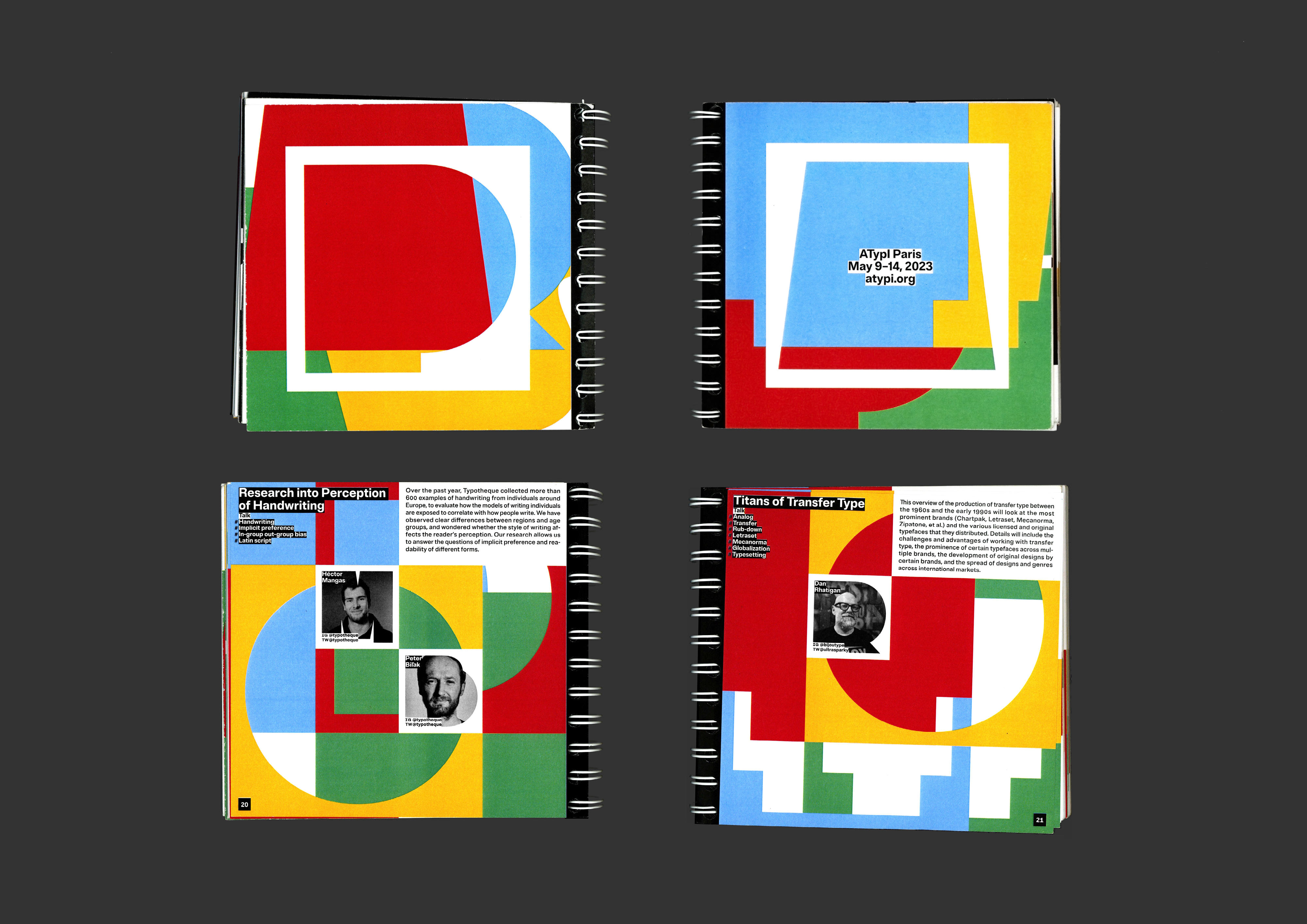
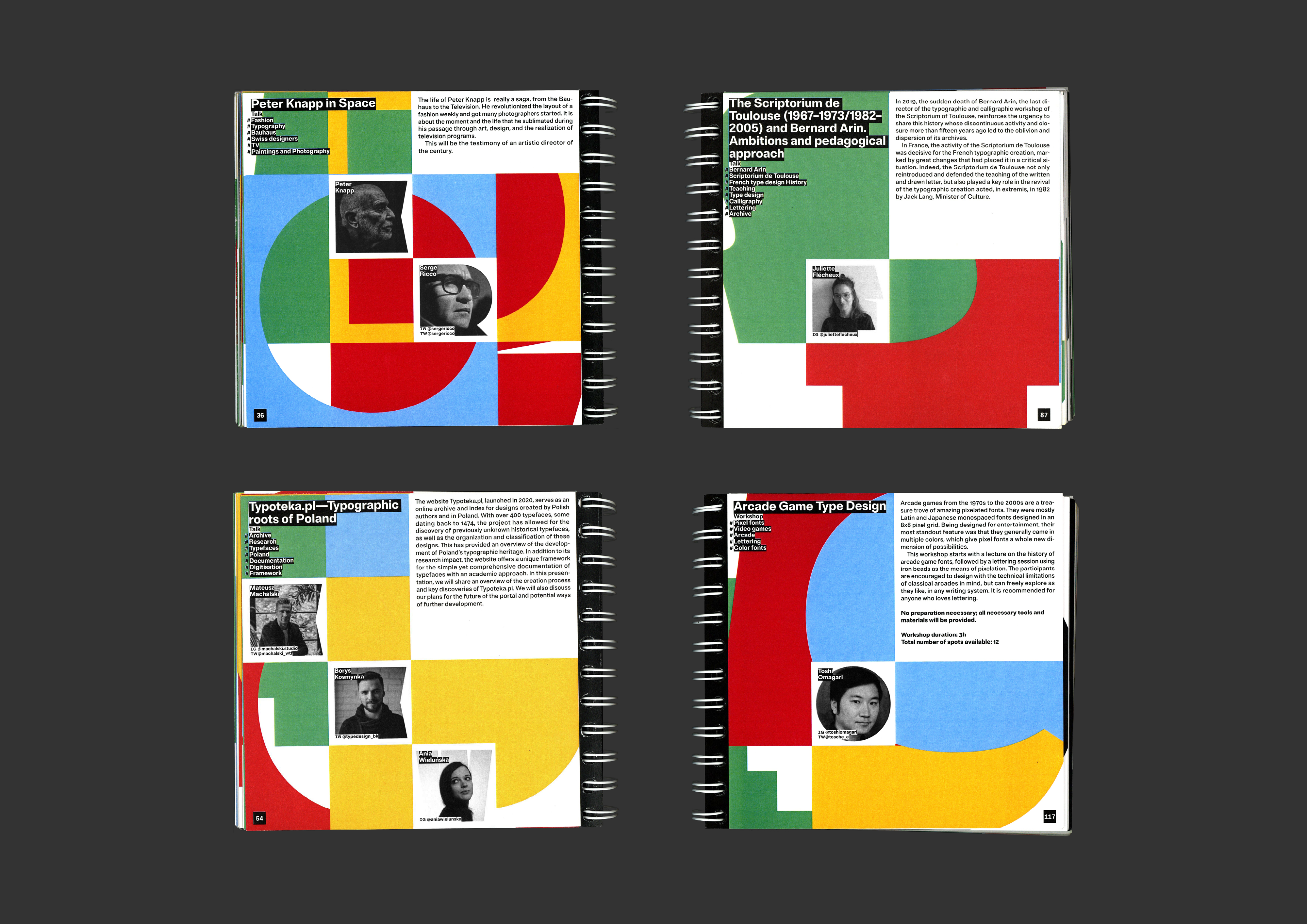
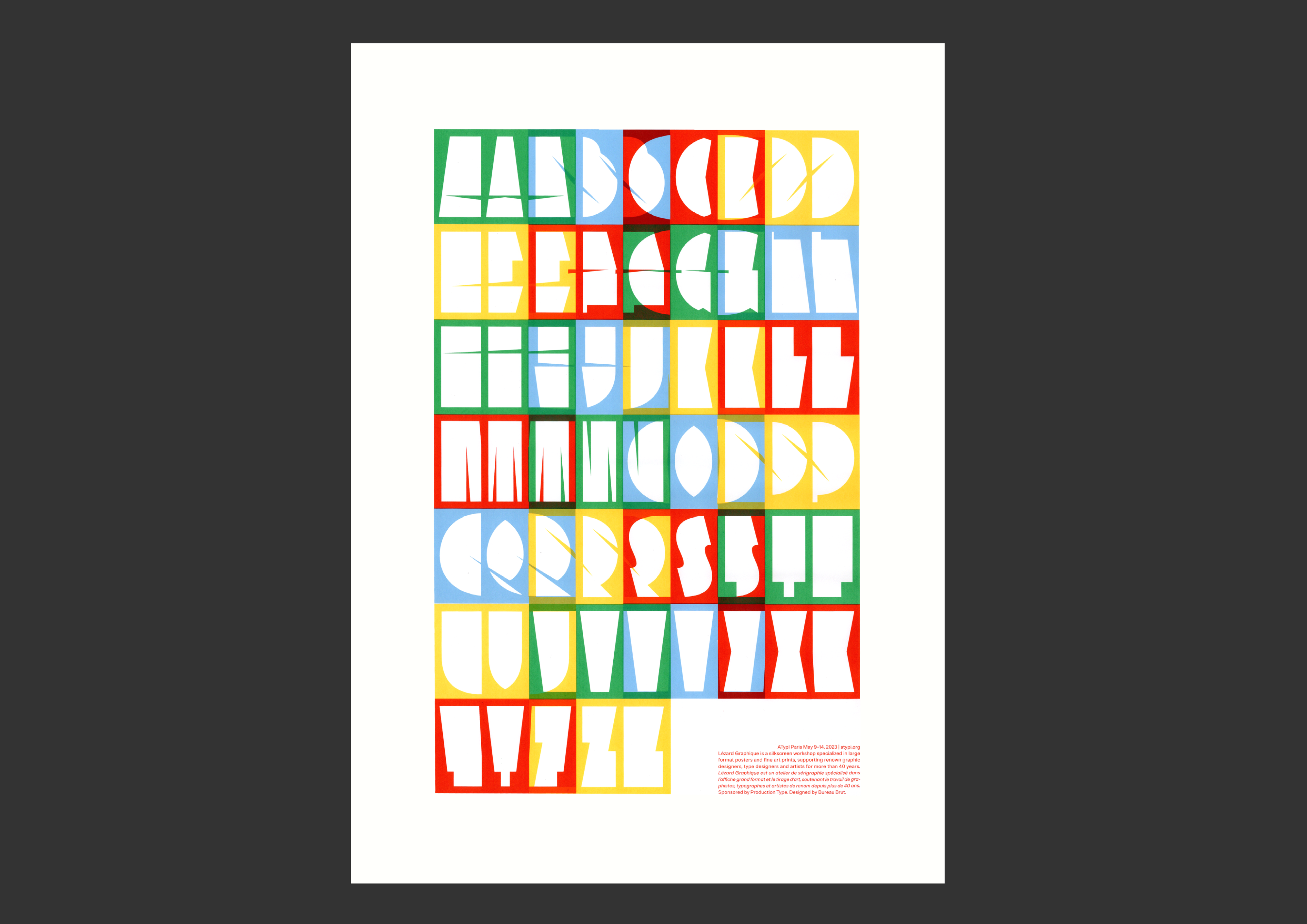
When designing the visual identity, our premise was simple: type designers have remained kids! They assemble, disassemble, or combine elements, replicate old models, or create new ones, and some even try to fit a circle into a square. So, for the 66th anniversary of the association, we wanted to return to this sense of fun and create an identity far from the stereotypical seriousness of a world dominated by black and white.
The graphic language is based on two custom-designed fonts with opposite concepts: a very bold version with the least number of cuts required to create a letter, and a very thin version with the least number of lines required to draw a letter. Adrian Frutiger once said that he wasn’t an architect but a brick maker: ‘I just make good bricks that graphic designers use to build.’ In fact, the graphic designer assembles, dismantles or combines elements together: he’s playing the same game. Therefore, we tried to give a certain materiality to these digital shapes by inflating balloons, sticking stickers, or cutting paper!