
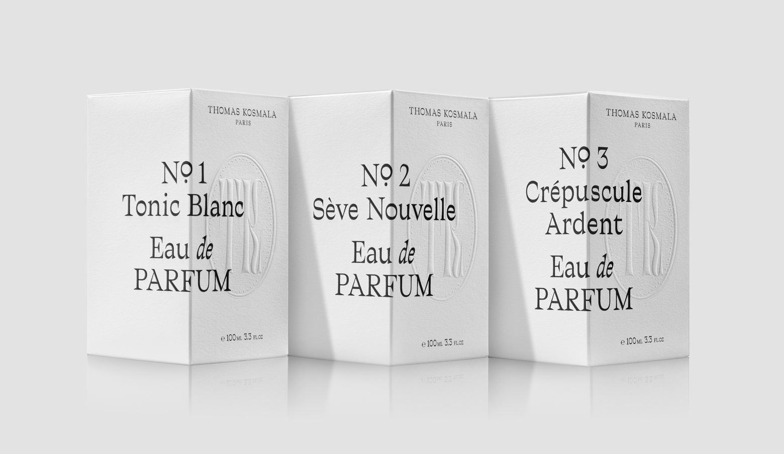
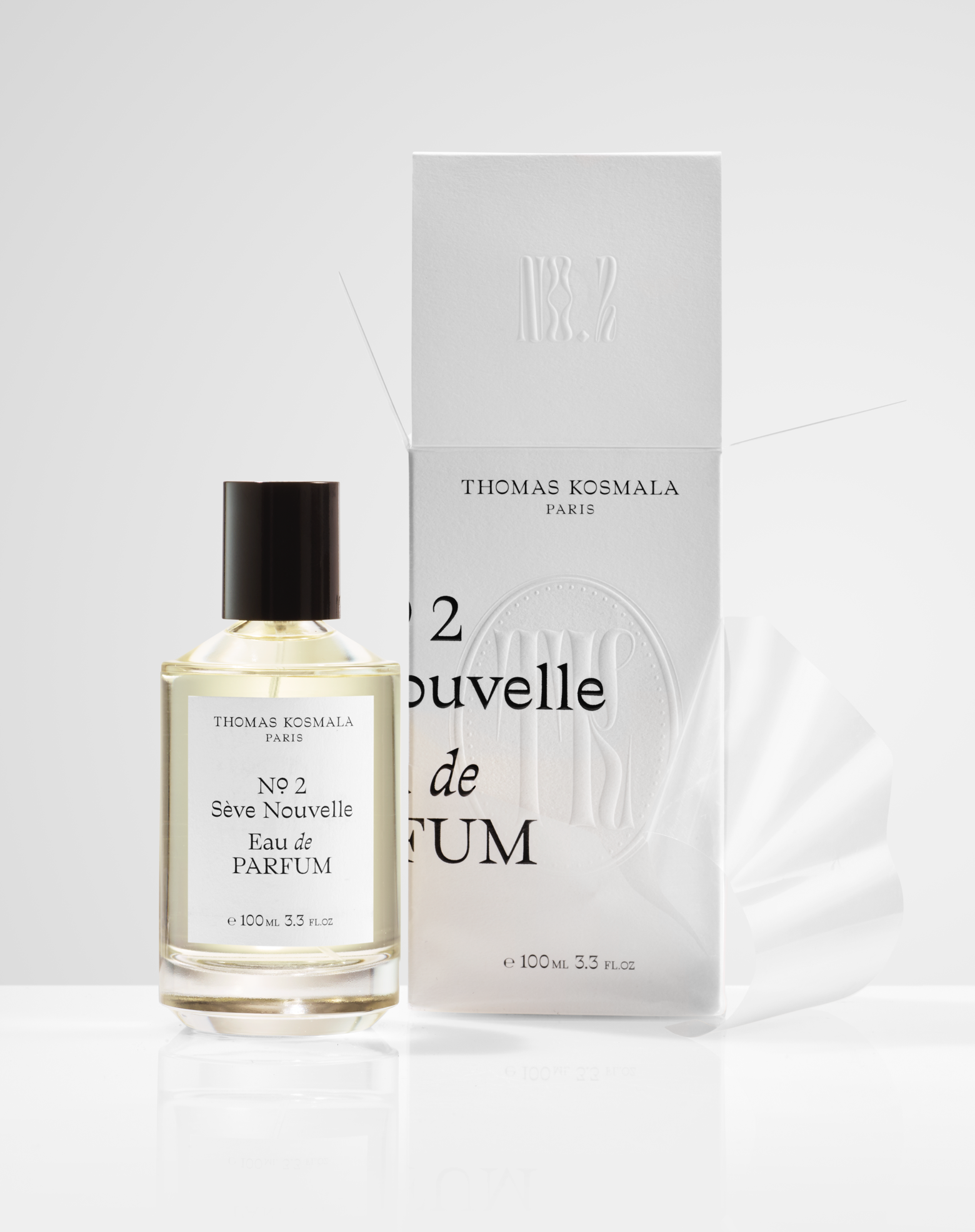
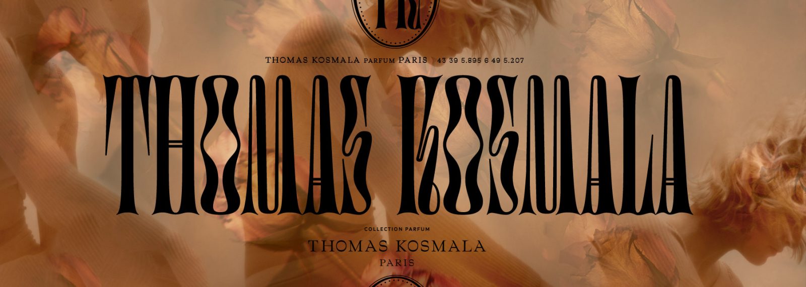
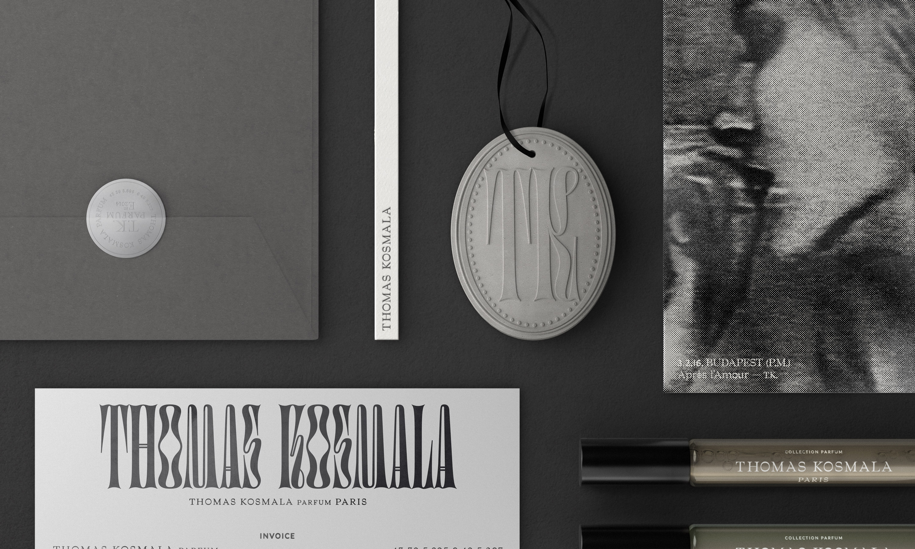
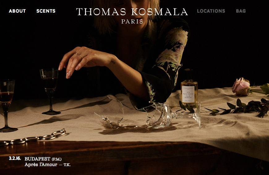
Canadian design agency Concrete revamped French perfumer Thomas Kosmala’s brand in early 2018. They used Bureau Brut’s distinctive Traulha for all texts, perfume names and the name tag, paired with Studio Triple’s Digestive for the monogram and a few discreet recalls of the brand. The identity deploys a subtle use of black and white with a clear attention for the packaging matters: glass, embossed paper… This attention to detail can be found in their use of bokeh in photographs.
The revamped brand marries classic visual cues associated with the traditions of perfumeries with a more contemporary ethos. Sensuous and provocative photography conveys the depth and richness of the scents, but is abstracted in packaging to comply with the conservative sensibilities of the Middle-eastern market.

🡢 Share your project