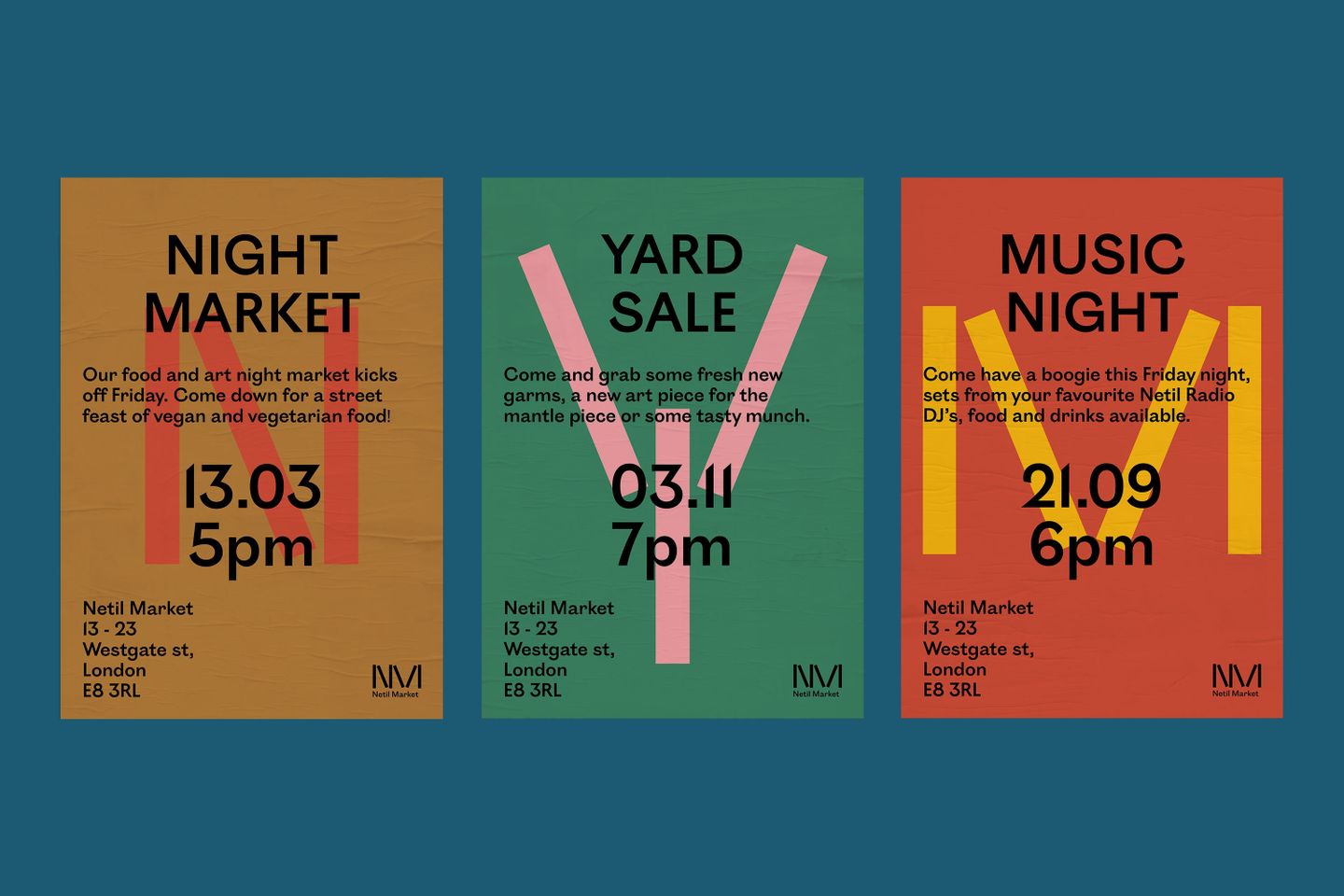
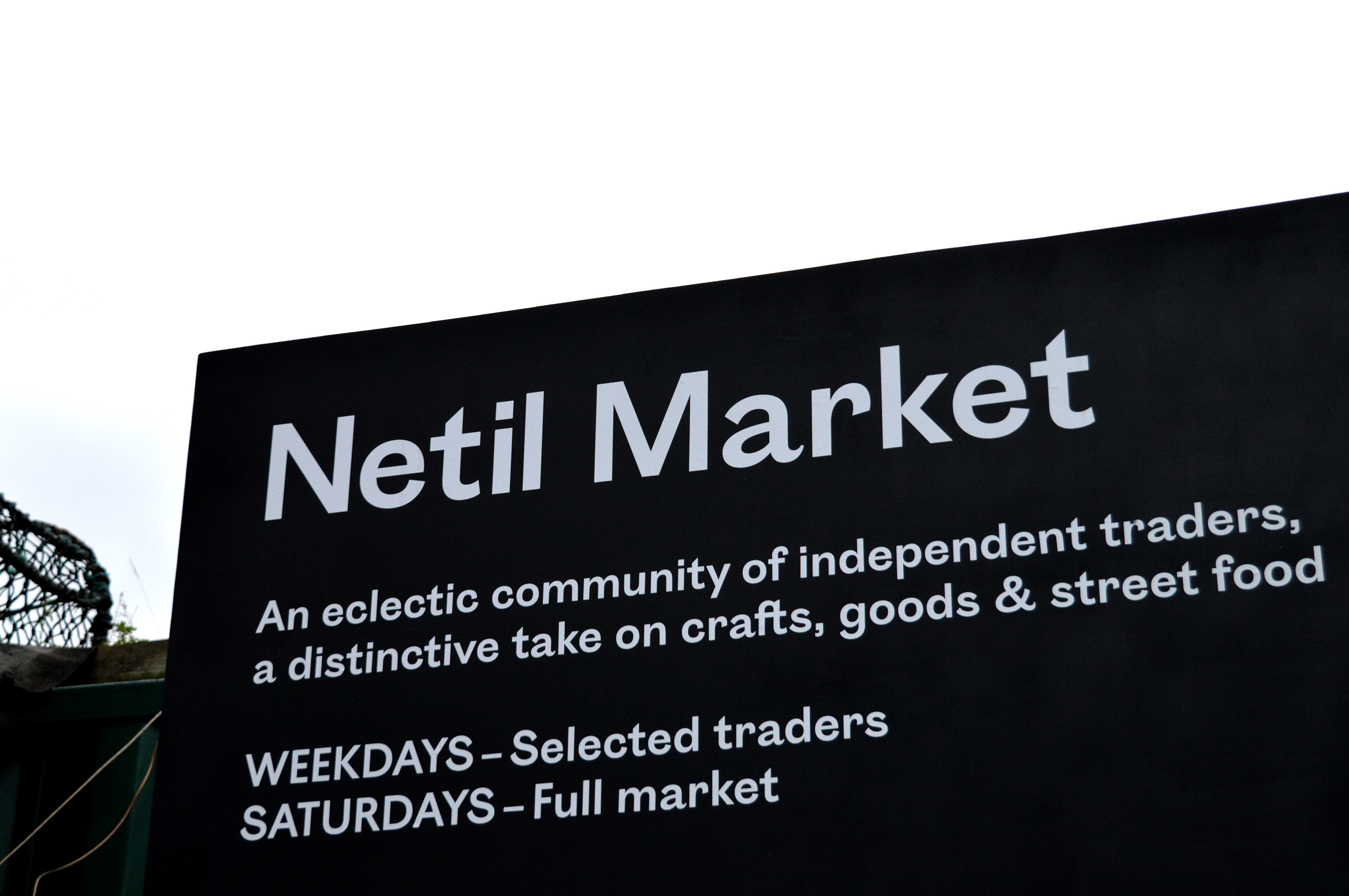
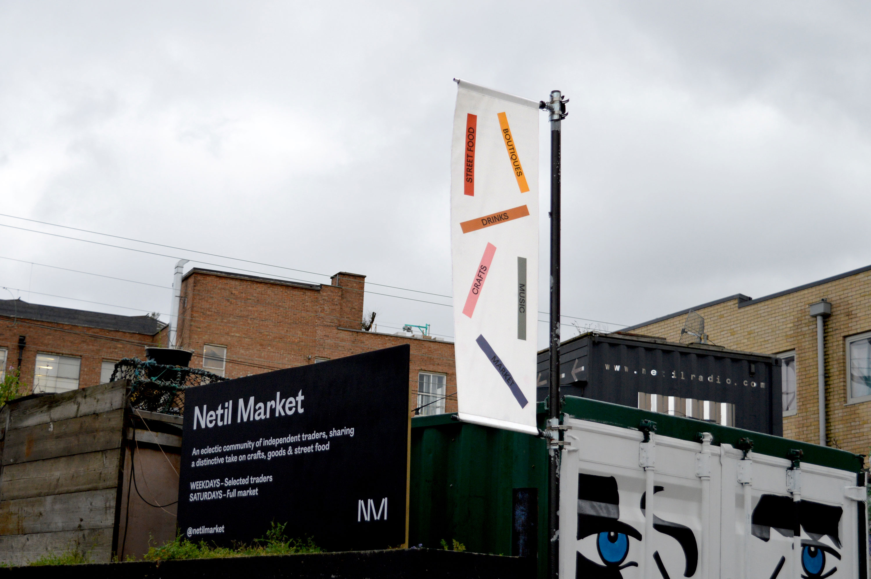
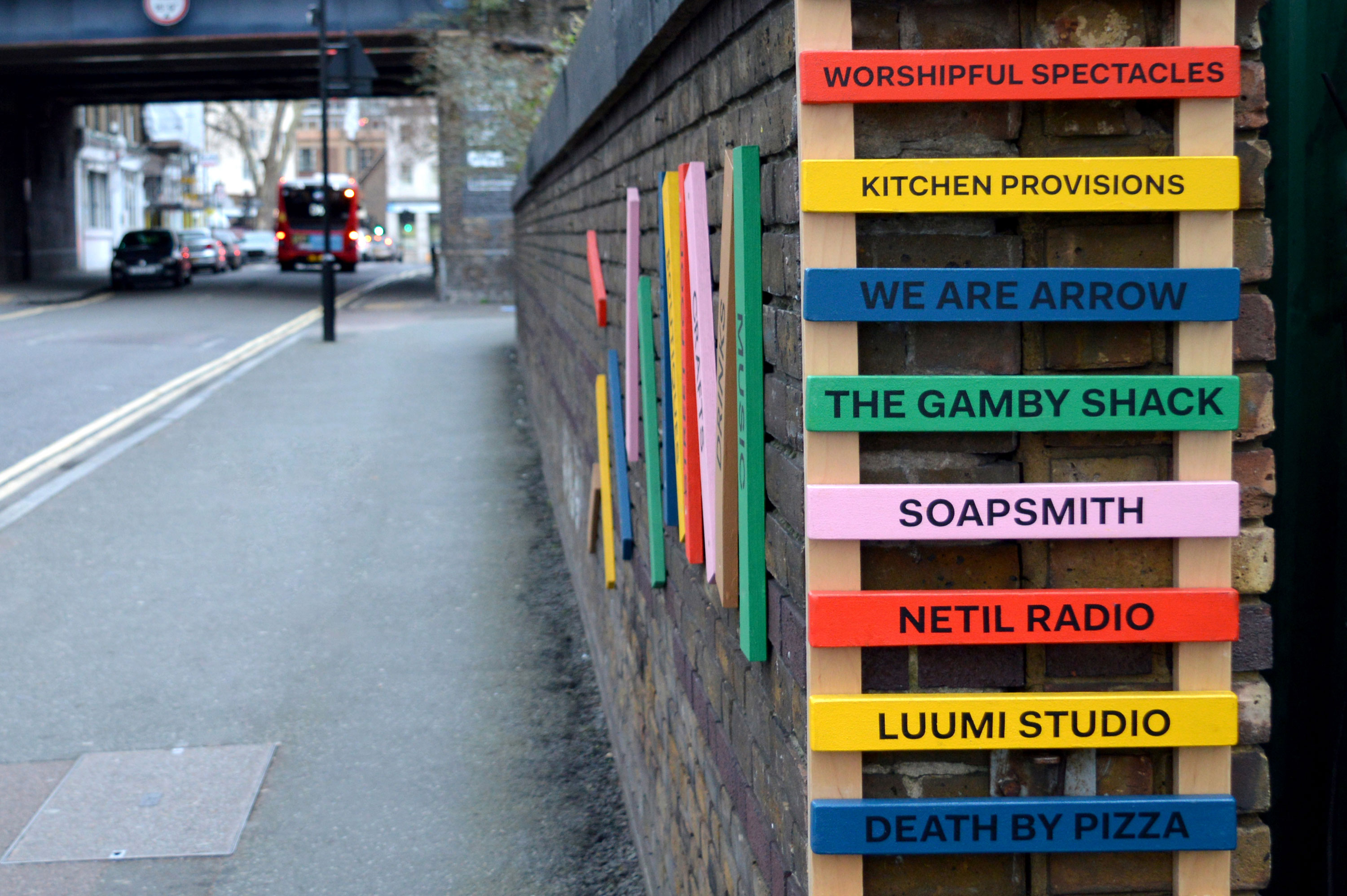
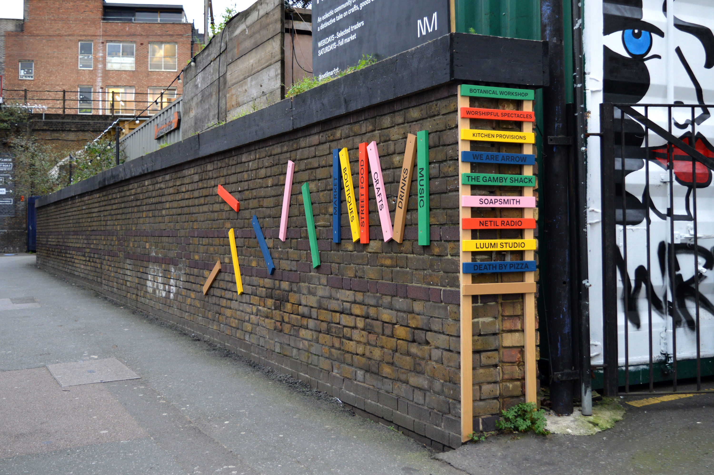
A playful, vibrant identity for Netil Market full of personality, flexibility and a hint of DIY to reflect the eclectic traders within. The identity takes cues from the unique shape of the space, nestled between tracks, roads and buildings. The identity remains the rough around the edges, whilst taking the brand to a more contemporary, and solid visual language.

More fonts in use
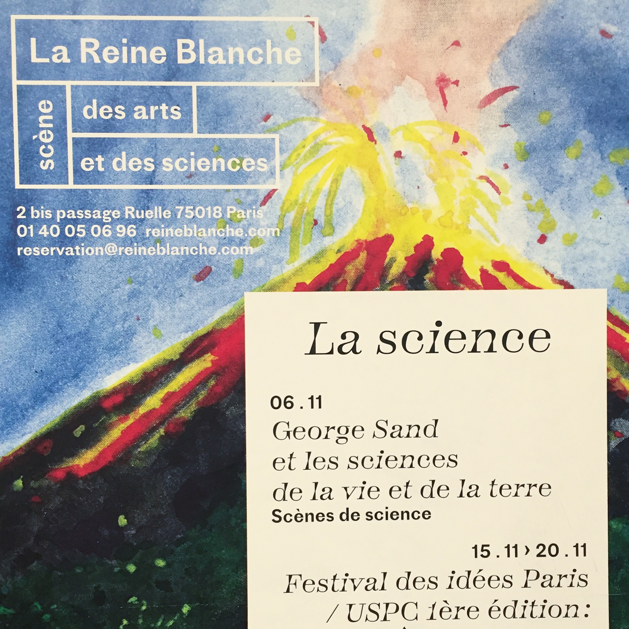
Totentanz –
used by Atelier Papier for Théâtre de la Reine Blanche
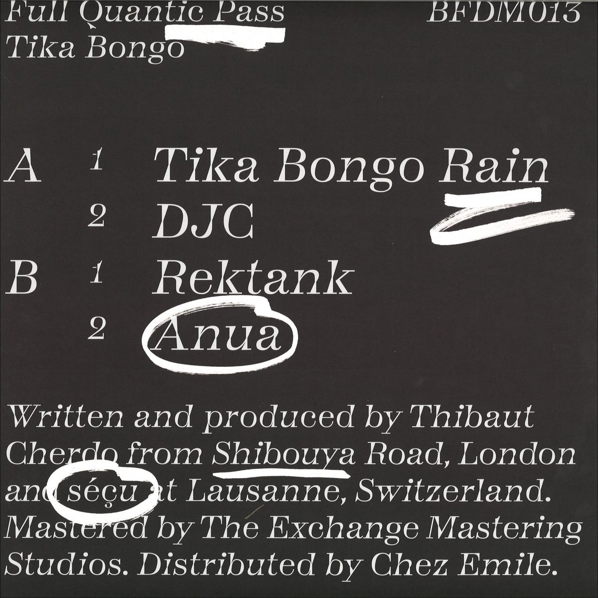
Totentanz –
used by Bureau Bertrand Clément for Full Quantic Pass
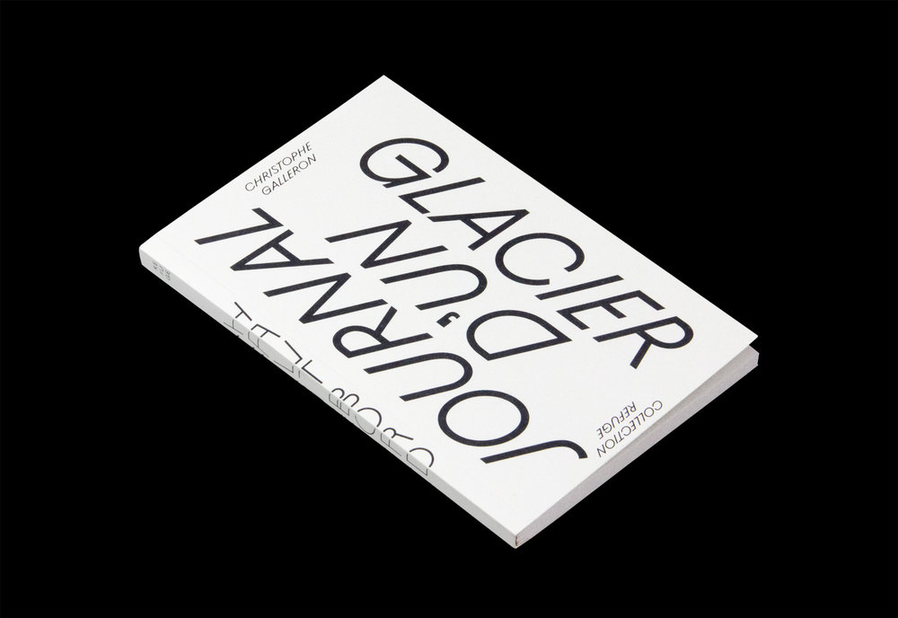
Ostia Antica –
used by Brest Brest Brest for Christophe Galleron
Did you use our fonts?
🡢 Share your project
🡢 Share your project