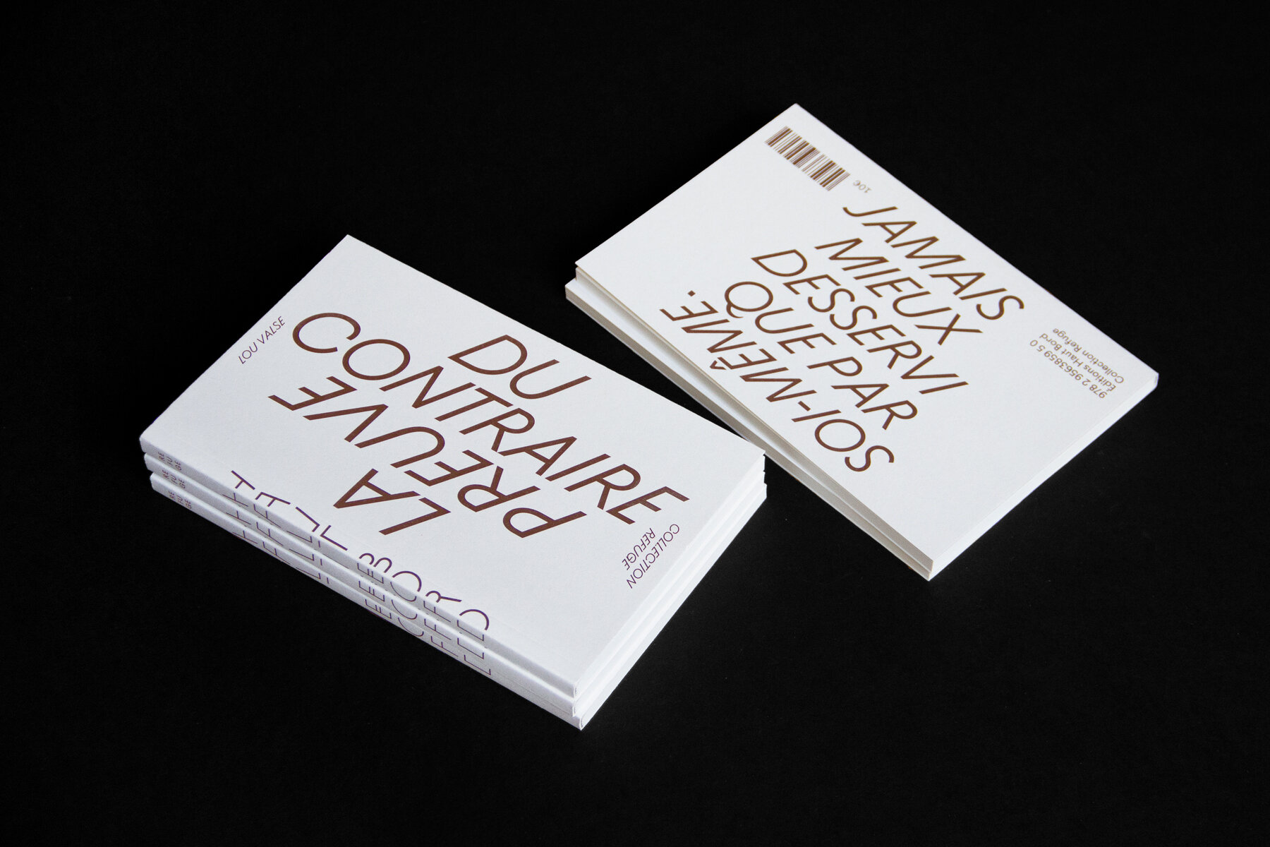
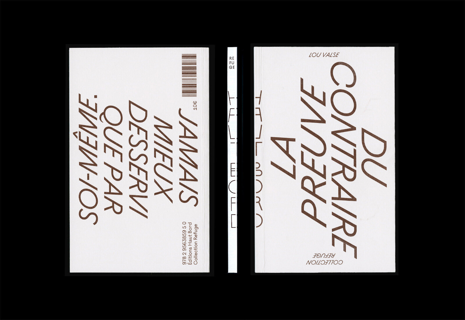
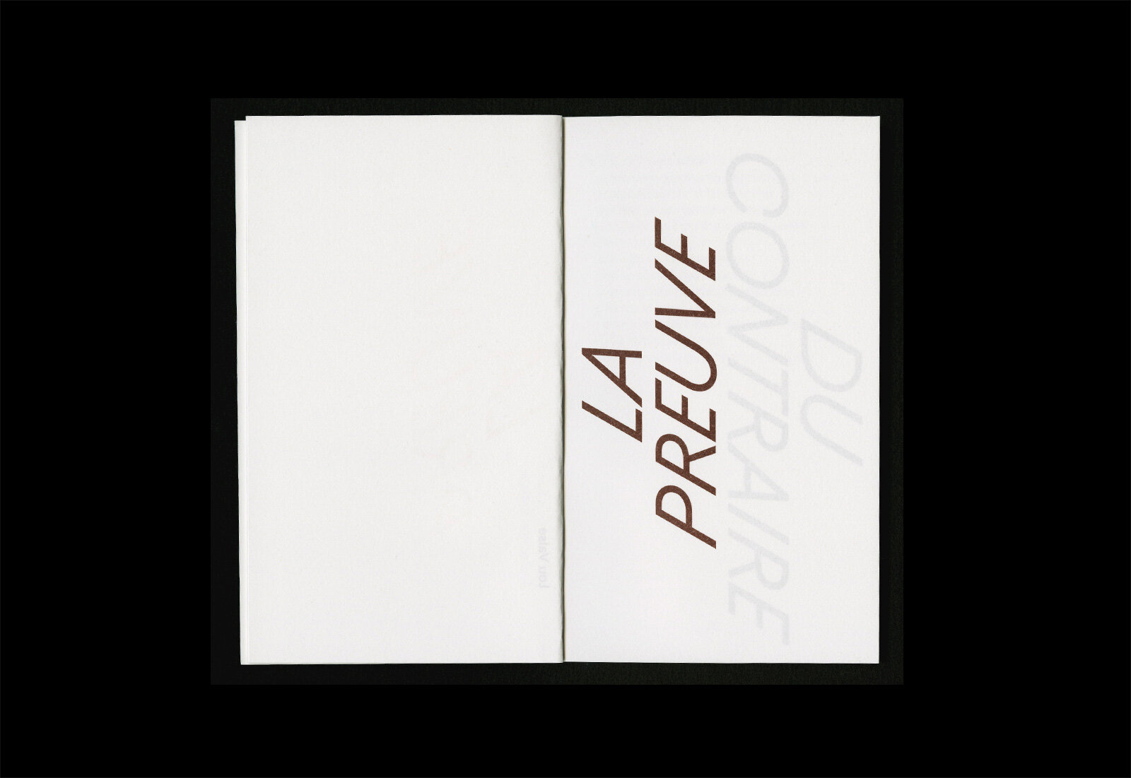
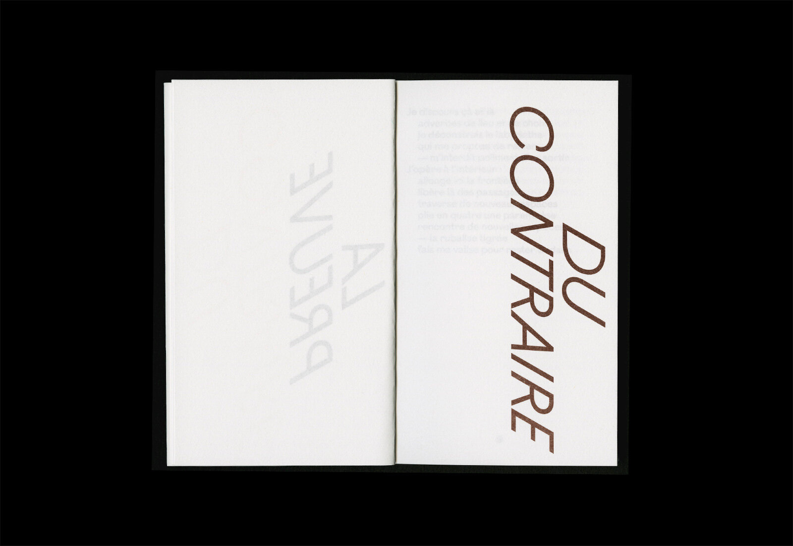
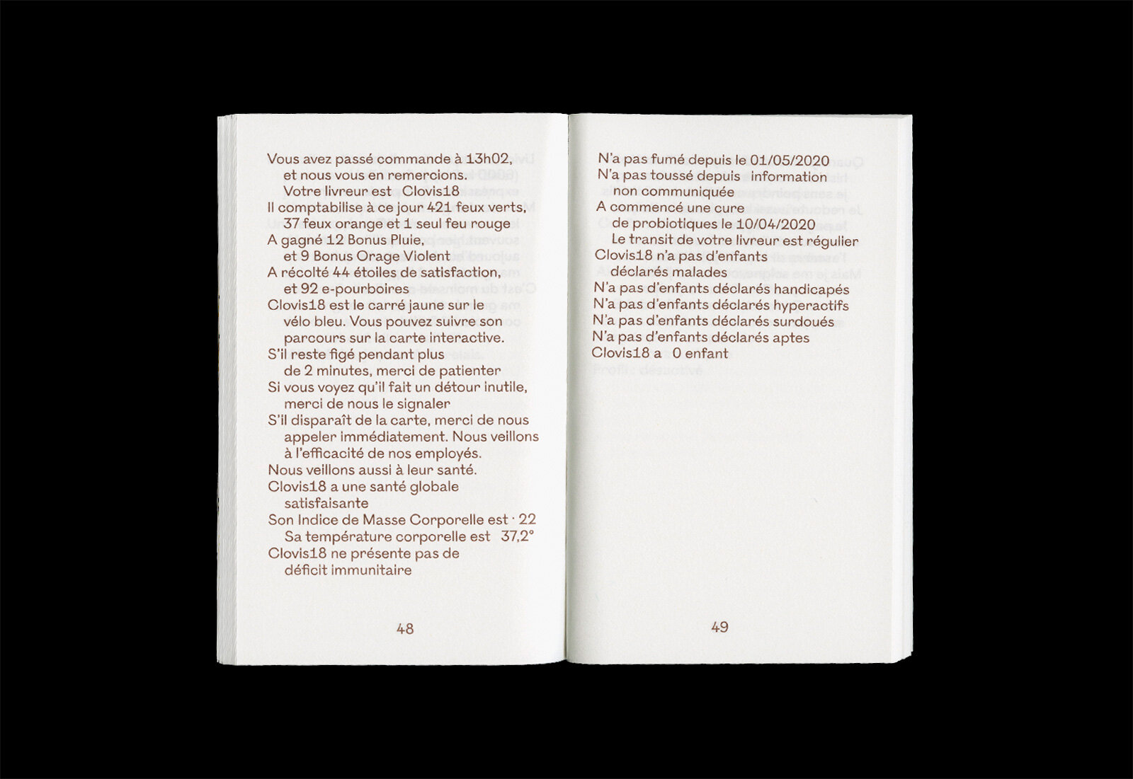
La preuve du contraire, published Éditions Haut Bord and Objet Livre, presents poems / free prose by Lou Valse. From the preface by Muriel Denis:
"The literal and the figurative throughout, the strangeness, the down-to-earth absurdity, the universal place and rupture shared by all, the adventure allowed by a pre-wash… What a jubilation this book is! What freedom in the labyrinth!"
The book, 10.5×17cm, 80 pages, is printed in a single spot color, usingOstia Antica throughout.

More fonts in use
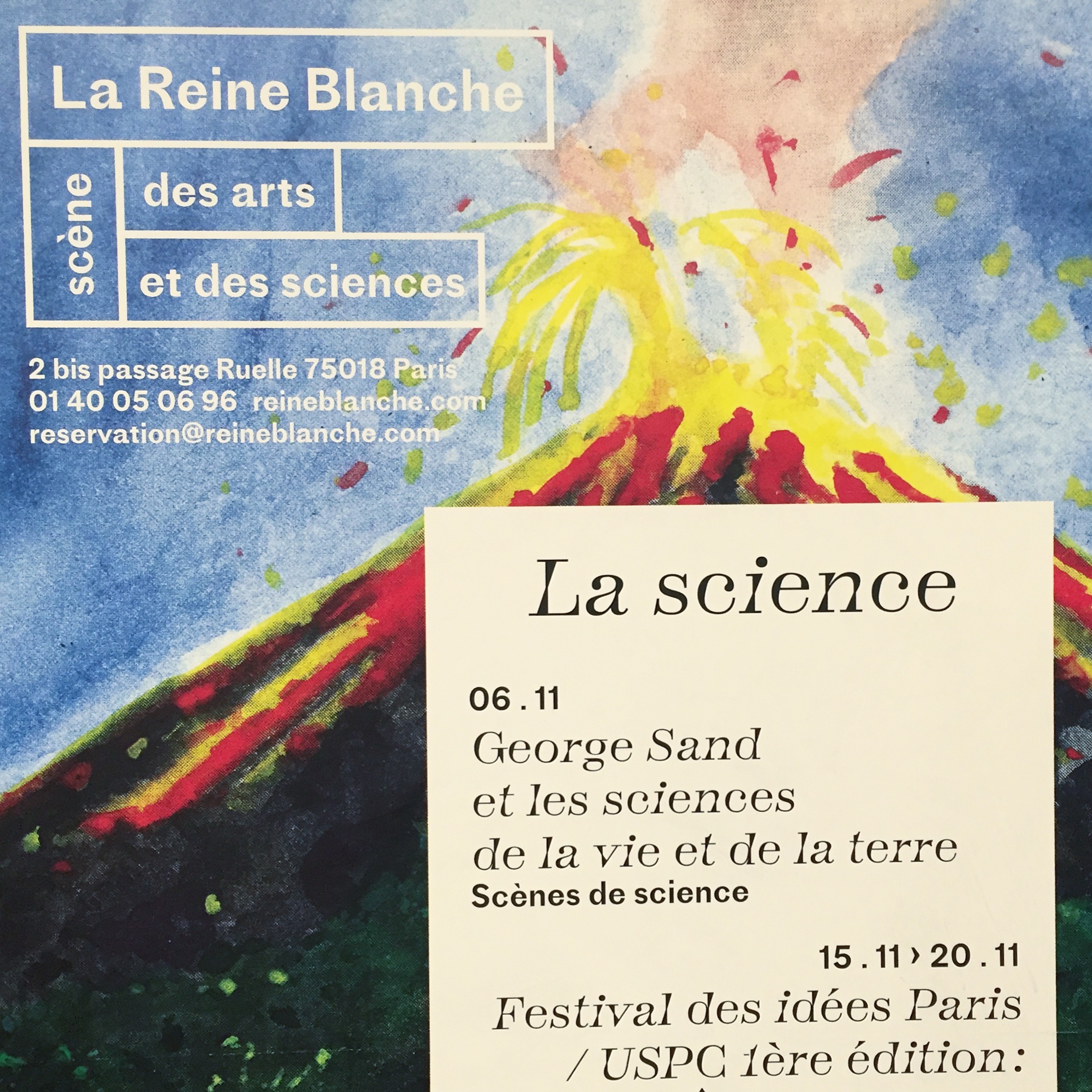
Totentanz –
used by Atelier Papier for Théâtre de la Reine Blanche
Did you use our fonts?
🡢 Share your project
🡢 Share your project