WHO LIKE
TO SLANT
FONTS
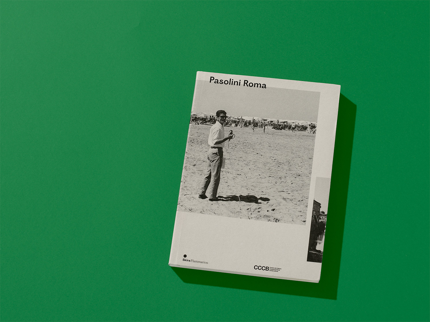
Ostia Antica
Irreverent, tumultuous, and sometimes unsettling, Ostia Antica claims instability and friction.
- Art Direction:
Yoann Minet & Spassky Fisher
- Typeface design:
Regular & Italic: Yoann Minet & Hugo Anglade, others weights: Yoann Minet
- Design date:
Regular & Italic: 2013, others weights: 2018
- Published by:
Bureau Brut
- Initial release:
Regular & Italic: 2015, others weights: 2018
- Current version:
7.1
It voluntarily plays with typographic conventions and shares its taste for criticizing the established order with Pier Paolo Pasolini1, whom its name comes from2.
The capitals were sketched independently of the lowercases; they have a different form and color.
— The capitals borrowed their proportion from the well-known eponymous characters of Edward Johnston, inherited from the Roman capital. Its structure confers a monumental presence to the capitals; particularly suited to headlines and large sizes.
— However, the lowercases are not logically lengthening the capitals. They find their roots in accidental and vibrating grotesques from the 19th century. Their forms are deliberately exaggerated.3
Ostia Antica is not a smooth character: its rugosity can be seen in its vibrations and lively typographic color. Its matter is rich, from lowercase to capital.
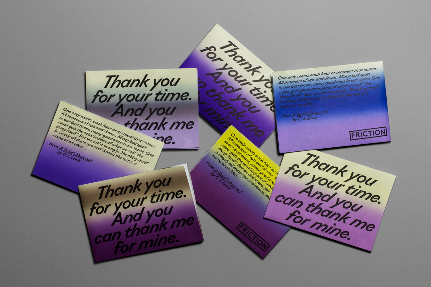
Surely the italic is the most irreverent member of the family. Traditionally, sans-serifs have a 10° slope while Ostia Antica has a 35° slant. It makes fun of the excesses of the digital era and its most famous technique: the computing slant. We have made optical adjustments to guarantee legibility in small and big text sizes. This radical choice creates a material distinct from the Roman—a new type color—designed primarily for emphasis4, while opening new compositional possibilities.
Ostia Antica is available in three weights, with no linear interpolation between them. Each weight has its own particularities; it strengthens the singular personality of the family as well as its complexity and diversity.
- Originally drawn in collaboration with Spassky Fischer for the Pasolini Roma exhibition catalog (Cinémathèque française, 2013). Ostia Antica was originally drawn in a single weight (for Regular and italic styles) for a size-9 text. The family has grown since, welcoming two thinner versions, enhancing its formal language.
- The name “Ostia Antica” refers to the beach of Ostia where Pier Paolo Pasolini was assassinated in 1975.
- The “c” and “e”, for example, show a prognathic jaw, while the “s” unfolds in a strong pyramidal shape.
- In the exhibition catalog, the use of italics was frequent to highlight quotes and references to Pier Paolo Pasolini’s work.
Family overview
Type tester
OpenType features
Character set
🡢 Share your project