Unity
Love
&
Havin’
Fun
Boogy Brut
- Art Direction:
Julien Priez & Yoann Minet
- Typeface design:
Julien Priez & Yoann Minet
- Design date:
2020
- Published by:
Bureau Brut
- Initial release:
Romans: 2020, Italics: 2022
- Current version:
2.1
The Boogy Brut Family is the result of several years of research and experiments around the relationship between calligraphy and typography. Boogy Brut is not a calligraphic font: it is a type family built from the fundamental precepts of calligraphy. Instead of recreating the shapes of hand gestures, the project aimed to extract their most important elements, their structure, rhythm, tension, movement and energy, to recompose them into a perfectly vectorial and contemporary typographic language. The unevenness of calligraphy then disappears to make space for a precise and controlled design, while the gesture stays central to the whole family.2
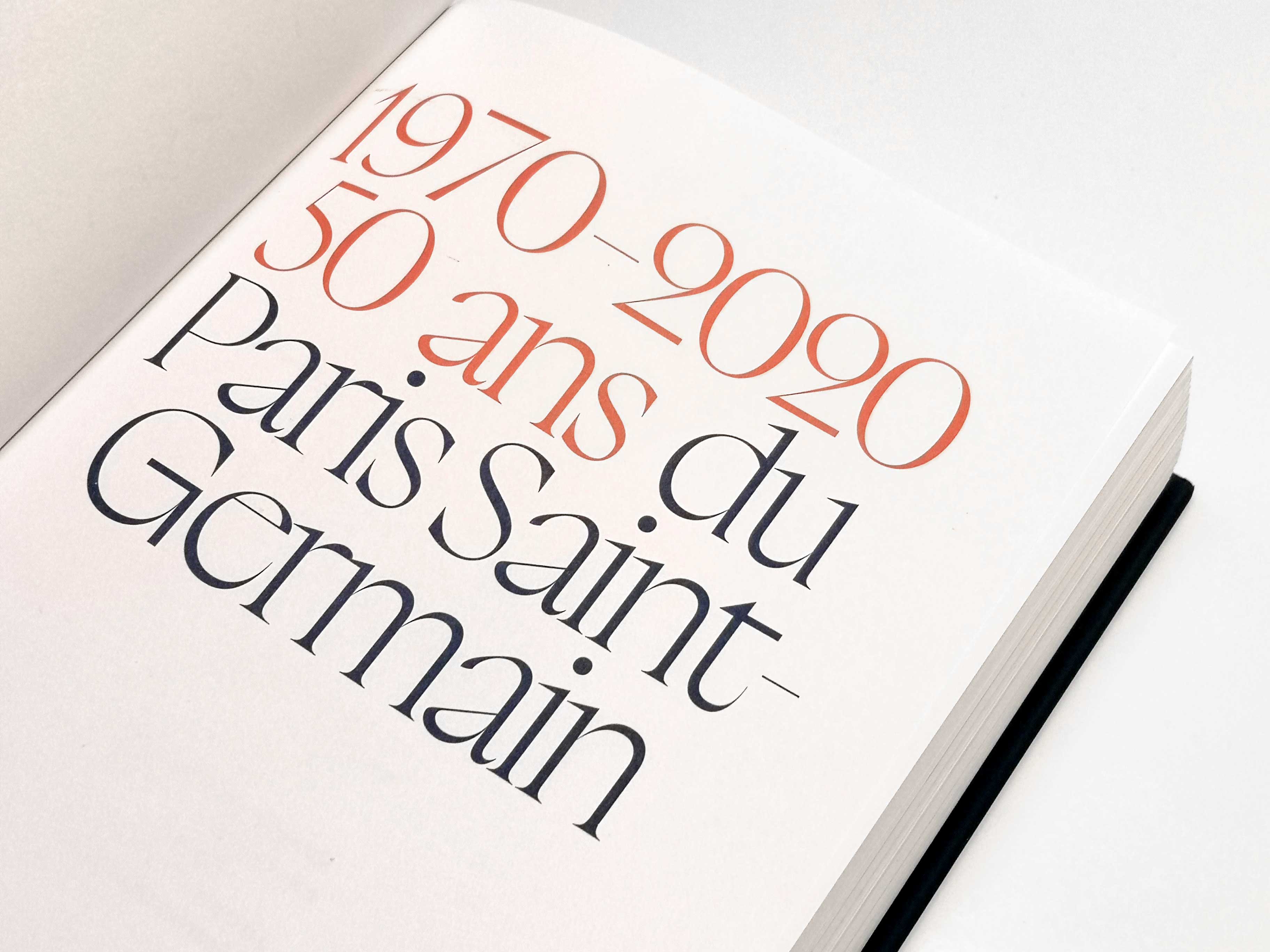
Since its origin, Boogy Brut was conceptualized to be a complete typographic system. The collection was inspired by the organization of the first printed books, and by their way of organizing the body, titles and initial letters. The collection contains three complementary families: Boogy Brut Wild 3, Boogy Brut Poster 4 and Boogy Brut.
Boogy Brut is the running text version. It is a declination of Boogy Brut Poster that keeps the formal principles while being completely redesigned for reading. The proportions, spacing and rhythm are adapted to offer the most comfortable reading experience in small size, without losing the project’s identity. Available in five weights with its italics, it offers a large character set and OpenType features. That makes Boogy Brut a perfect editorial tool, able to fit into a few lines as well as in an entire book. You’re reading it right now. From body copy to titles, Boogy Brut offers a progression from use to expression. The bigger the font, the more visible the personality of the gesture.
- Julien Priez, a.k.a. Boogy Paper, is a designer working with letters in their broad sense, from calligraphy to typography. Both disciplines are intertwined in his work, as his mentors Oscar Ogg and Berthold Wolpe’s work were. For them, calligraphy is not a goal, but a creative process. Julien doesn’t just transcripts hand-writing to digital characters: he uses calligraphy as a tool for observation, analysis and experimentation.
- For Julien, calligraphy is more than one tradition. It is part of many histories: the history of ancient manuscripts, which gave birth to the first printing characters. The history of post-typographic calligraphy, developed in handbooks on writing, and the history of contemporary practices of hand gestures, including graffiti and tagging. Boogy Brut is part of this continuity. It is the result of research around gesture, handwriting, and letters. Calligraphy has become a way to explore typography, its history and its expression potential.
- Boogy Brut Wild explores the most expressive dimension of the letter. Built like a collection of initial letters and singular signs, it turns the letter into an image.
- Boogy Brut Poster is a balance point between expression and usefulness. Built for display sizes, it keeps the uniqueness of calligraphic models while offering a coherent typographic construction.
Boogy Brut is part of the Boogy Brut Collection
-
- Boogy Brut Light
- Boogy Brut Light Italic
- Boogy Brut Book
- Boogy Brut Book Italic
- Boogy Brut Regular
- Boogy Brut Italic
- Boogy Brut Medium
- Boogy Brut Medium Italic
- Boogy Brut Bold
- Boogy Brut Bold Italic
-
- BBWW
- BBWB
-
- Boogy Brut Poster White
- Boogy Brut Poster White Italic
- Boogy Brut Poster White Wild
- Boogy Brut Poster Black
- Boogy Brut Poster Black Italic
- Boogy Brut Poster Black Wild
Family overview
Type tester
OpenType features
Character set
🡢 Share your project